A Complete Methodology for Upgrading Wireframe Pages to Commercial-Grade Visuals with Cursor

A 3-step Cursor workflow for upgrading website wireframes to commercial-grade visuals using AI-extracted design prompts.
This article breaks down a practical workflow for indie developers: use Cursor to extract structured visual prompts from a high-quality reference page, then apply those prompts to transform a basic wireframe into a commercially polished design. Key lessons include narrowing AI instructions to avoid layout drift, choosing cost-effective models for visual tasks, and ensuring commercial font licensing before launch.
The Visual Design Struggle for Indie Developers
For indie developers, implementing features is rarely the biggest pain point — visual design is the real roadblock. You can grind through code, but making a page look "professional, tech-forward, and commercially polished" typically requires specialized design skills or an outsourcing budget.
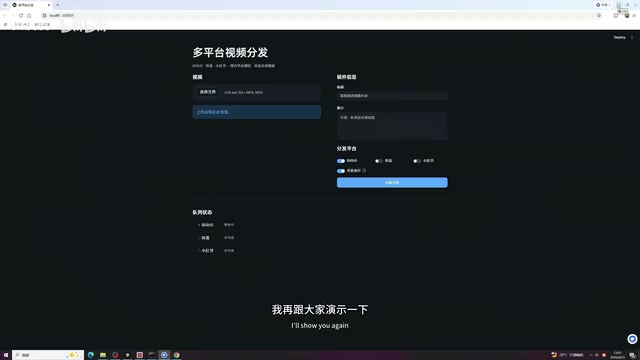
Bilibili creator Pipi recently shared a highly practical workflow: using Cursor and a reference page, she transformed a bare-bones wireframe that only met basic functional requirements into a finished page with real commercial visual value — step by step. No design mockups needed. The core idea is using AI to extract the visual language of great designs and transplant it into your own project.
This article breaks down that methodology and examines its real-world value for indie developer workflows.
The Three-Step Methodology: Extracting "Visual Prompts" from a Reference Page
What makes this approach clever is that it converts the abstract notion of "good design" into reusable, structured prompts, allowing developers without a design background to accurately transplant visual styles.
In the design world, "visual language" refers to a systematic set of visual decision rules, typically covering color tokens, typography scale, spacing system, border radius, shadow levels, and animation curves. Large design teams package these into design systems — like Google's Material Design or Apple's Human Interface Guidelines. For indie developers without a dedicated designer, using AI to "reverse-engineer" design standards from excellent reference pages is essentially a lightweight design system construction process: turning the intuitive sense of "looks good" into structured parameters that machines can understand and execute. This not only improves the success rate of a single migration, but the extracted prompts can be reused as design assets for the project, maintaining visual consistency when adding new pages or feature modules later.
Step 1: Choose a High-Quality Reference Sample
Pipi selected a medical device industry webpage she had previously generated with AI as her reference — featuring a blue-green gradient as the primary color scheme, with a strong overall design sensibility and a tech-forward aesthetic. The quality of the reference sample directly determines the ceiling of the migration result, making this selection step critical.
Step 2: Have AI "Translate" the Design into Prompts
In Cursor, Pipi chose the GPT-4.5 model, citing its "lower token consumption while still achieving the target effect" — a strong cost-to-performance ratio.
Cursor is an AI code editor deeply built on VS Code, with native support for multimodal input (text, code, screenshots) and direct access to multiple LLM APIs, making it an efficient tool for tasks like screenshot-to-code conversion. GPT-4.5 was released by OpenAI in early 2025; compared to GPT-4o, it offers improvements in creative generation and instruction following, but is more economical in token consumption per call than the o1/o3 reasoning model series — well-suited for tasks like visual style extraction and HTML rewriting, which don't require deep reasoning but do need large context inputs. In real-world indie developer use cases, model selection is fundamentally a capability-cost tradeoff: reasoning-intensive tasks (like architecture design or algorithm optimization) justify flagship models, while visual migration tasks are better served by mid-tier, cost-efficient models to keep daily API spending in check.
After dragging the medical device webpage screenshot into Cursor, the core prompt used was:
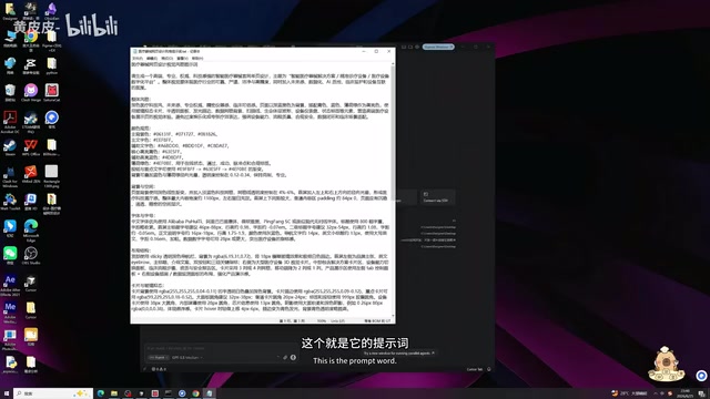
Please organize all the visual style elements from this medical device webpage — including colors, font sizes, animations, buttons, border radius, and other styles — and format them as prompts, output as plain text.
The AI-generated prompts covered professional dimensions including color specifications, overall style, background and spatial relationships, layout, and card/glassmorphism effects. Compared to vague descriptions like "I want a tech feel," structured prompts make the goals for subsequent migration clearer and the results more controllable.
Glassmorphism is a UI design trend that emerged around 2020, characterized by a semi-transparent frosted glass texture, background blur (backdrop-filter: blur), subtle border highlights, and soft shadows. This style was widely popularized by Apple's macOS Big Sur interface and quickly became the dominant design language for SaaS products and tech landing pages. Technically, glassmorphism relies on CSS's backdrop-filter property and rgba semi-transparent backgrounds — though backdrop-filter has limited compatibility in some older browsers, so fallback handling is worth considering during development. For indie developers, glassmorphism's appeal lies in the fact that it creates a premium feel with relatively simple CSS rules, without requiring complex graphic design skills — making it an ideal target style for AI-assisted visual optimization.
Step 3: Combine Three Inputs to Complete the Visual Migration
With the structured prompts in hand, Pipi sent the target page (PP Video tool page) + the reference page HTML + the extracted prompts all together to Cursor, asking it to optimize the target page according to this visual specification to achieve the tech-forward glassmorphism effect.
This combined input approach essentially gives the AI sufficient contextual constraints, narrowing an open-ended creative task into a rewrite task with a clear benchmark, significantly reducing result unpredictability.
Real-World Pitfalls: Handling AI's Unpredictability
This process didn't succeed on the first try. Pipi admitted that the AI's first version was "unsatisfying" — the page was stuffed with a flood of irrelevant content, walls of text that made no sense.
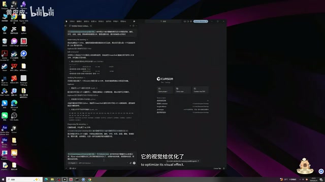
This exposed a common problem with AI-assisted design: when instructions are too broad, AI may take liberties modifying the layout, adding or removing content, and the result drifts far from expectations.
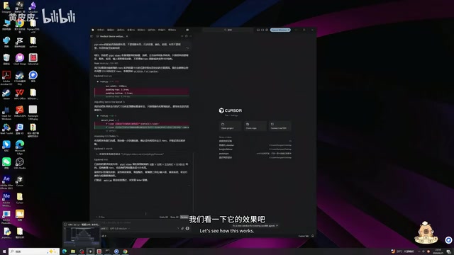
Pipi's solution is worth borrowing — narrow the instruction scope. She asked the AI again to "keep the layout unchanged, only modify colors, backgrounds, and button styles." By clearly limiting the scope of changes, the second version improved noticeably: excess text disappeared, and the visual style shifted to the intended tech aesthetic.
This detail is the most valuable takeaway from the entire method: the efficiency of AI collaboration often depends on how precisely you can decompose your requirements. Rather than issuing broad, sweeping instructions, iterate step by step with clearly bounded scopes.
The Final Result: Two Key Elements for Commercial-Grade Standards
After two rounds of adjustments, the page's visual quality improved significantly — cleaner overall, stronger tech feel, and a smoother user experience.
Beyond the visual effect, Pipi specifically highlighted a detail that's easy to overlook — commercial font licensing. She used Alibaba PuHuiTi, a font free for commercial use.
Font copyright is one of the most commonly overlooked legal risks for Chinese indie developers. In China, font works are protected under the Copyright Law, and using commercial fonts in product interfaces, marketing materials, or SaaS pages without authorization constitutes infringement. Font companies (such as Founder and Hanyi) have pursued multiple lawsuits against businesses in recent years, with settlements ranging from tens of thousands to hundreds of thousands of RMB. The most widely used commercially free Chinese fonts currently include: Alibaba PuHuiTi (released by Alibaba, free for all commercial scenarios), Source Han Sans/Source Han Serif (jointly released by Adobe and Google, SIL open-source license), HarmonyOS Sans (released by Huawei, Apache 2.0 license), and OPPO Sans. Indie developers are advised to specifically verify the licensing scope of all fonts before launching a product — particularly distinguishing between "free for personal use" and "free for commercial use" — to avoid unnecessary legal disputes down the road.
This point is especially critical for indie developers: no matter how beautiful the page, using an unlicensed font still creates legal exposure in commercial contexts. With commercially licensed fonts and AI-powered visual optimization working together, a page like this is fully ready for commercial use.
Three Takeaways for Indie Developers
While the operations in this case are straightforward, the underlying workflow thinking is worth unpacking further.
First, design ability can be "borrowed and transplanted." There's no need to learn color theory, spacing systems, or animation theory from scratch — find a great reference, have AI extract a reusable design specification, then execute against that specification.
Second, use "structured intermediate outputs" to improve success rates. Asking AI to directly produce a finished result is prone to failure, but first generating structured prompts and then working from those prompts dramatically improves success rates. This is essentially decomposing the complex task of "optimizing visuals" into two more controllable subtasks: "extracting the specification" and "applying the specification."
Third, prioritize cost-effectiveness in model selection. Not every scenario requires the most powerful model. Visual adjustment tasks have limited reasoning requirements — choosing a model with lower token consumption that still delivers adequate results is more aligned with indie developers' budget realities.
For indie developers working with limited team size and tight budgets, this approach of rapidly upgrading wireframes to commercial-grade visuals offers a genuinely viable path to reducing costs and improving efficiency. That said, AI's unpredictability is always present — developers still need to maintain control over output quality through clear instructions and iterative refinement.
Related articles

The Truth Behind Codex 'Build a Website in 5 Minutes': AI Isn't Creating Sites—It's Helping You Copy Them
Exposing the truth behind viral Codex 5-minute website videos: creators aren't building original sites with AI—they're copying shared prompts or scraping others' work. Learn AI coding tools' real limits.

Getting Started with AI Agent Development: A Complete Guide from Concept to Practice
A comprehensive guide to AI Agent architecture and development, covering automated marketing, intelligent customer service, and investment analysis scenarios with single and multi-agent collaboration.

The Truth Behind Codex 'Build a Website in 5 Minutes': AI Isn't Creating Sites — It's Helping You Copy Them
Exposing the truth behind viral Codex 5-minute website videos: creators aren't building original sites with AI — they're copying shared prompts or scraping others' work.