Advanced CSS Techniques: color, background, outline, and cursor In-Depth Guide

Advanced techniques for CSS color, background, outline, and cursor properties
This article systematically covers advanced usage of CSS color, background, outline, and cursor properties. Topics include smart use of color keywords, currentColor default behavior, modern color function syntax, background-size's special SVG handling, multiple backgrounds in practice, using background-clip for text gradients and expanding click areas, background-repeat's space/round modes, and outline's ability to avoid layout impact with outline-offset support.
Introduction
In everyday CSS development, properties like color, background, outline, and cursor may seem basic, but they hide many capabilities and tricks that developers often overlook. Based on the second half of Chapter 3 from CSS: The New Frontier, this article systematically covers advanced usage of these properties to help you build a more complete CSS knowledge base.
The Evolution and Practical Tips for the Color Property
Smart Use of Color Keywords
CSS color properties have been continuously evolving, and the supported color functions and features are now quite rich. For color keywords, the most practical use case is quickly labeling colors when writing demos — typing red or blue is much more convenient than entering hexadecimal values.
It's worth noting that some color keywords are equivalent to each other (e.g., grey and gray). CSS Color Level 4 introduced a special color keyword called rebeccapurple, which has a heartwarming backstory — it was named in memory of Rebecca, the daughter of CSS pioneer Eric Meyer. rebeccapurple (#663399) was officially added to the specification in 2014 and is the only CSS color keyword named after a real person, reflecting the development community's deep humanistic care for its pioneers.
CSS Color Level 4 itself is a major color specification upgrade driven by the W3C CSS Working Group. Beyond adding named colors, it introduced modern color space support including oklch, oklab, and display-p3, enabling CSS to describe wide-gamut colors beyond the traditional sRGB color space. As of now, no new CSS color keywords have been added, and future development has shifted toward more color functions and namespace approaches.
transparent and Color Transition Interpolation
The transparent keyword itself isn't complex, but early browsers had issues with their interpolation algorithms when handling color transitions. Color transition interpolation refers to the algorithm that generates intermediate colors between two colors — early browsers would produce gray shadows during transparent transitions because transparent was parsed as rgba(0,0,0,0), and the black channel participated in the calculation, causing unexpected dark colors in the middle of transitions. The good news is that all modern browsers have fixed this issue.
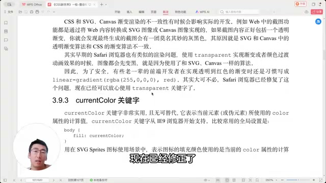
Going further, the modern CSS Transitions Level 4 specification introduced color-space-aware interpolation, allowing developers to specify interpolation in different color spaces such as sRGB, HSL, or oklch via color-interpolation-method. oklch is the recommended choice due to its perceptual uniformity, producing more natural gradient effects — you can choose whether to interpolate colors along the larger or smaller angle, giving you significantly more control.
Default Behavior of the currentColor Keyword
currentColor is extremely useful in real-world development. The most typical scenario involves SVG icons — when you need an icon's fill color to match the surrounding text color, simply use currentColor. In today's component-driven development landscape, currentColor combined with CSS Custom Properties is incredibly powerful — by setting --theme-color on a component's root element and assigning it to color, all child elements using currentColor will automatically respond to theme changes without needing to be overridden individually. SVG icons using currentColor can also perfectly support dark mode switching, making it a fundamental building block for modern theming systems.
However, there's an easily overlooked detail: many properties default to the current color without requiring an explicit currentColor declaration. For example, box-shadow, text-shadow, and border-color all default to the element's color value. Understanding this can help eliminate quite a bit of redundant code.
Modern Syntax for CSS Color Functions
When it comes to using RGB/RGBA functions, modern CSS has become very flexible. In the early days, rgb() and rgba() parameters had to strictly correspond, but that's no longer necessary — write three parameters for RGB, add a fourth for transparency, and the browser will figure it out automatically. Decimals and negative numbers are all fair game.
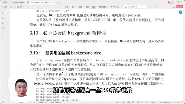
Combined with CSS math functions (calc, min, max, clamp), color values that exceed valid ranges are automatically clipped (gamut mapping): values greater than 1 are treated as 1, and values less than 0 are treated as 0. This auto-clipping feature is especially useful in dynamic color calculation scenarios — for example, in the oklch color space, you can use calc() to dynamically adjust the lightness channel for a hover-brighten effect: color: oklch(calc(var(--base-l) + 10%) var(--c) var(--h)). Even if the calculated result exceeds the valid range, the browser handles it gracefully, eliminating the need for tedious boundary checks and providing a solid foundation for building dynamic CSS color systems.
Deep Dive into the Background Property
Special SVG Behavior in background-size
background-size is most commonly used with cover and contain, but the auto value has a little-known characteristic: if the background image is an SVG without defined width and height, using background-size: auto will cause the SVG to automatically fill the entire background area. This means that in such scenarios, you don't need to specify background-size at all.
The calculation rules for percentage values are also worth understanding — they're computed based on the relationship between the image dimensions and the background element dimensions. In practice, however, using keywords like right and bottom is usually sufficient.
Practical Applications of CSS Multiple Backgrounds
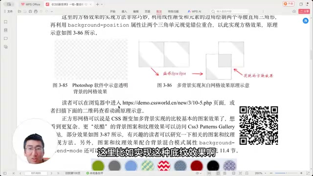
Multiple backgrounds are a powerful tool for creating pure CSS graphical effects. By combining multiple gradient backgrounds, you can create various pattern effects, grid effects, and other complex designs.
Using background-clip for Text Gradients and Expanding Click Areas
background-clip has two highly practical use cases:
Scenario 1: Expanding Click Areas
When simulating checkbox effects, the visual size might only be 18×18 pixels, but that makes the click area too small. The solution is to set a transparent border to enlarge the element's dimensions, then use background-clip: content-box to clip the background so it doesn't extend into the border area. This maintains the visual size while expanding the actual click area.
Scenario 2: CSS Text Gradient Effects
background-clip: text is currently the only way to achieve text gradient effects in CSS. It works by clipping the background paint layer to the outline of the text glyphs, then using -webkit-text-fill-color: transparent to make the text itself transparent, allowing the background to show through the text. This property was originally implemented by the WebKit engine, which is why it long required the -webkit- prefix. Notably, the W3C CSS Backgrounds Level 4 specification has now standardized it, and Firefox 122+ and modern Chrome both support the unprefixed version. However, it's still recommended to keep the prefixed version as a safety measure. Regarding performance, text gradients trigger GPU compositing layers, so be mindful of memory usage in scenarios with large amounts of text.
The standard combination is:
.gradient-text {
  background: linear-gradient(to right, #color1, #color2);
  -webkit-background-clip: text;
  -webkit-text-fill-color: transparent;
}
The space and round Modes of background-repeat
background-repeat supports two tiling modes: space and round. space distributes whitespace evenly between images, while round scales images to fit the container.
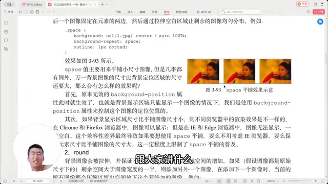
Honestly though, these two values are almost never used in real projects. As a developer with many years of CSS experience, I've never once used them in a production environment.
Shorthand for background-position
A quick tip: center can be omitted. Many people habitually write background-position: top center, but just writing top is sufficient — the browser will automatically fill in center for the other axis. Additionally, background-position supports a four-value syntax that lets you specify both the offset direction and distance simultaneously.
New Capabilities of the Outline Property
outline has two core differences compared to border:
- It takes up no layout space — it doesn't affect the element's box model calculations
- It supports the
outline-offsetproperty — which can accept negative values to shrink the outline inward, simulating an inner image border
Related articles
 Tutorials
ChatGPT Plus Subscription Guide: Are GPT-5.5, image-2, and Codex Worth the Upgrade?
A detailed look at ChatGPT Plus features — GPT-5.5, image-2, and Codex — with a Plus vs Pro comparison and a complete step-by-step subscription guide for users outside the US.
 Tutorials
Harness AI Engineering in Practice: Using Claude Code to Master Enterprise-Level E-Commerce Development
Deep dive into Harness AI Engineering: master enterprise e-commerce development with Claude Code using the Rules, Skills, Wiki, and Changes framework.
 Tutorials
Cursor + Codex Dual-IDE Collaboration: A Practical Methodology for Open-Source Project Customization
A complete methodology for open-source project customization based on real-world experience, detailing the Cursor+Codex dual-IDE workflow, seven-stage process, MVP validation, and AI source code reading techniques.