AI-Generated Data Visualization Dashboards: Prompt Engineering Best Practices and Iterative Development Techniques

A methodology for rapidly generating commercial-grade visualization dashboards using AI through well-crafted prompts.
This article introduces an AI code generation approach for building visualization dashboards. The core methodology requires prompts that cover two dimensions—layout description (page skeleton, grid division) and content description (chart types, data dimensions, interactive elements)—combined with a "whole first, details later" iterative strategy that generates and refines pages step by step to improve AI output quality and development efficiency.
Introduction
Data visualization dashboards are an indispensable component of enterprise management systems. They present complex business data through intuitive charts, helping decision-makers quickly grasp the big picture. However, traditional dashboard development often requires extensive front-end coding—layout adjustments, chart configurations, responsive adaptations—all of which are time-consuming and labor-intensive.
This article introduces a visualization dashboard development approach based on AI code generation. By crafting well-designed prompts and leveraging AI tools like Claude Code, you can rapidly generate commercial-grade dashboard pages, dramatically improving development efficiency.
Core Components of a Visualization Dashboard
A typical workspace homepage dashboard usually contains the following key modules:
- Top-level statistical indicators: Key KPI data cards such as revenue, order volume, user count, etc.
- To-do area: Current work tasks that need attention
- Data chart area: Various statistical charts including line charts, bar charts, pie charts, etc.
- Responsive layout: A grid system that adapts to different screen sizes
From a technical implementation perspective, modern visualization dashboards typically rely on mature chart libraries working in tandem with layout frameworks. Take ECharts (Apache ECharts) as an example—the most widely used charting library in China. Originally open-sourced by Baidu and later donated to the Apache Foundation, it offers dozens of chart types including line charts, bar charts, pie charts, scatter plots, and heatmaps, with built-in rich interaction capabilities (such as data zoom, legend toggling, and tooltip hover hints). On the layout side, the mainstream approach uses responsive grid systems built with CSS Grid or Flexbox—for example, dividing the page into 12 or 24 columns where each chart component occupies a certain number of column widths, automatically reflowing at different resolutions. Understanding this tech stack helps you use more precise technical language when writing prompts, resulting in higher-quality, more maintainable AI-generated code.
Two Core Elements of Prompt Design
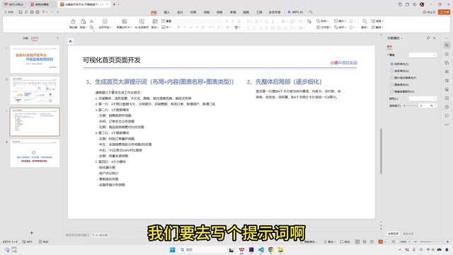
When using AI to generate dashboard pages, prompt quality directly determines output effectiveness. A good prompt needs to cover two core dimensions: layout description and content description.
Prompt Engineering is a core skill for collaborating efficiently with Large Language Models (LLMs). Its essence is using structured, precise natural language instructions to guide the model toward converging on target results within its vast output space. Research shows that output quality for the same task can differ by orders of magnitude under different prompt strategies. For code generation scenarios, effective prompts typically need to include three layers: the constraint layer (tech stack, framework versions, coding style guidelines), the structure layer (page skeleton, component hierarchy), and the semantic layer (business meaning, data logic). Missing any of these layers may cause the AI to generate code that is syntactically correct but deviates from business expectations. This is precisely why this article splits prompts into "layout description" and "content description"—the former corresponds to the structure layer, the latter to the semantic layer, and both are indispensable.
Layout Description: Defining the Page Skeleton
Layout is the skeleton of the page. You need to clearly communicate to the AI the structural arrangement of each row:
- What design style the overall page adopts (e.g., modern minimalist, tech-forward, etc.)
- The responsive layout approach
- How the first, second, third, and fourth rows are divided in terms of grid allocation
- The number of columns and their proportional relationships within each row
Content Description: Specifying Data Presentation for Each Section
Once the layout is established, you need to specify the exact content for each section:
- Chart types: line charts, bar charts, pie charts, area charts, etc.
- Data dimensions: e.g., sales trends displayed as line charts, order distribution as pie charts
- Interactive elements: time filters (by week/month/quarter/year), custom date ranges, etc.
Different chart types each have their optimal use cases for data expression, backed by theoretical foundations in information visualization. Line charts excel at expressing trend changes in continuous time series—the human eye is highly sensitive to line slope, making them ideal for time-series data like sales trends and user growth. Bar charts encode values through length, facilitating horizontal comparisons between different categories—suitable for comparing sales across channels or ranking department performance. Pie charts (and their variant, donut charts) use area and angle to express proportional relationships, but research shows human eyes judge angles less precisely than lengths, so pie charts are better suited for scenarios with few categories (typically no more than 5) with obvious differences between them. Area charts are extensions of line charts that emphasize cumulative or total changes through filled regions, commonly used to show stacked relationships among multiple metrics. When writing content descriptions, choosing appropriate chart types based on data characteristics ensures the AI-generated dashboard communicates information more accurately and effectively.
Development Strategy: An Iterative Approach from Whole to Parts
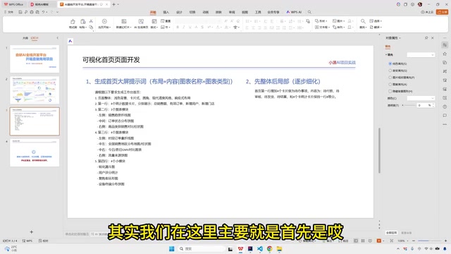
No matter how detailed your prompts are, AI is unlikely to generate a perfect final result in one shot. Therefore, you need to follow an "whole first, details later" iterative strategy.
This strategy aligns closely with the classic Incremental Development philosophy in software engineering. Traditional waterfall development requires complete requirement definition before coding, while incremental development breaks the system into small, independently deliverable units, delivering a working subset with each iteration and progressively approaching the final goal. Applying this philosophy to AI code generation offers several advantages: First, the context window of large language models is limited—inputting too many constraints at once causes the model to lose focus, while step-by-step input keeps each generation task within the model's optimal processing range. Second, each iteration provides an opportunity for human verification, allowing timely detection of deviations and corrections in the next round of prompts, preventing errors from spreading across modules. Finally, once the framework-level structure is established, subsequent style tweaks and interaction refinements typically require only local modifications, significantly reducing rework costs.
Step 1: Generate the Overall Framework with Prompts
Input the prompt containing layout and content descriptions into an AI tool (such as Claude Code) to generate the page's basic framework. The goals for this step are:
- Correct overall layout structure
- All chart components in place
- Basic data display logic working
Claude Code is a developer-focused AI programming tool from Anthropic, built on the Claude large language model. Unlike general-purpose conversational AI, Claude Code is optimized for engineering tasks—it can understand code context, execute terminal commands, read and write the file system, and maintain code consistency across multi-file projects. In dashboard development scenarios, Claude Code's advantage lies in its ability to not only generate code snippets for individual components but also understand the entire project's directory structure, automatically reusing existing style variables and utility functions when generating new modules to maintain unified code style. Additionally, Claude series models excel at following complex structured instructions, achieving relatively high parsing accuracy for prompts containing multi-level nested layout descriptions. Of course, similar AI programming tools on the market include GitHub Copilot, Cursor, and others—developers can choose the tool that best fits their workflow. The prompt strategies introduced in this article are equally applicable to these tools.
Step 2: Gradually Refine with Follow-up Prompts
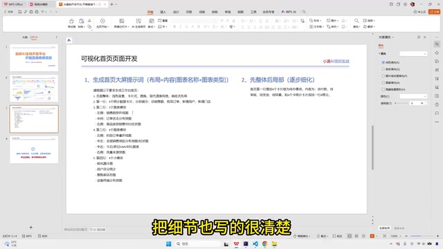
After generating the overall framework, progressively refine the details through follow-up prompts:
- Add the to-do module: Insert to-do cards in the first row area, describing their layout and interaction patterns
- Optimize chart interactions: Add time dimension switching to the top-right corner of charts (by week/quarter/year/custom date)
- Adjust visual styles: Modify chart colors, font sizes, spacing, etc.
- Improve data tooltips: Configure tooltip display content and format on hover
Practical Tips for Improving AI Dashboard Development Efficiency
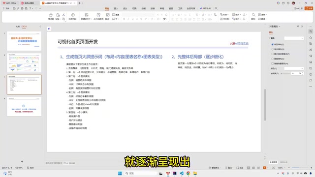
Based on this methodology, here are some proven practical recommendations:
Templatize Prompts for Reuse
Organize commonly used dashboard layout descriptions into templates. For subsequent projects, you only need to swap in specific business content. For example:
Generate a workspace homepage based on the following requirements:
- Overall style: [modern minimalist/tech-forward/business professional]
- Layout: responsive grid layout
- Row 1: [statistics cards, 4 equal columns]
- Row 2: [left side line chart occupying 2/3, right side pie chart occupying 1/3]
- Row 3: [full-width bar chart]
The value of prompt templatization goes beyond saving repetitive input time—it reduces output uncertainty through standardization. In software engineering, this parallels the concept of Design Patterns—abstracting proven solutions into reusable templates to avoid starting from scratch every time a similar problem arises. For team collaboration scenarios, it's recommended to include prompt templates in version control systems (like Git), managed alongside code. You can categorize template libraries by business scenario: sales dashboard templates, operations monitoring templates, financial report templates, etc. Each template should document not only the layout description but also its applicable scenarios, known limitations, and verified refinement prompt sequences. As the team's template collection grows, the startup cost for new projects continuously decreases, ultimately forming organization-level AI-assisted development knowledge assets.
Iterate Module by Module Instead of All at Once
Don't try to describe every detail in a single prompt. Build the skeleton first, then refine each module individually. This way, the AI's understanding is more accurate and generation quality is higher.
Specify Design Guidelines Explicitly in Prompts
During the refinement phase, maintain consistency in the overall design language—color themes, border radius, shadow styles, etc. You can explicitly specify design guidelines in your prompts to prevent style inconsistencies across multiple iterations.
In practice, it's recommended to reference specific Design Token concepts in your prompts to constrain visual standards. Design tokens are a methodology for abstracting design decisions (colors, font sizes, spacing, border radius, etc.) into named variables—first systematically promoted by Salesforce Lightning Design System and now standard practice in enterprise design systems. In prompts, you can describe design specifications like this: "Primary color uses #1890FF, success state uses #52C41A, warning state uses #FAAD14, danger state uses #FF4D4F; card border-radius is uniformly 8px, shadows use box-shadow: 0 2px 8px rgba(0,0,0,0.08); chart padding is uniformly 16px." This level of precision with specific values effectively prevents the AI from introducing visual inconsistencies through "creative freedom" across multiple iterations.
Related articles
 Tutorials
ChatGPT Plus Subscription Guide: Are GPT-5.5, image-2, and Codex Worth the Upgrade?
A detailed look at ChatGPT Plus features — GPT-5.5, image-2, and Codex — with a Plus vs Pro comparison and a complete step-by-step subscription guide for users outside the US.
 Tutorials
Harness AI Engineering in Practice: Using Claude Code to Master Enterprise-Level E-Commerce Development
Deep dive into Harness AI Engineering: master enterprise e-commerce development with Claude Code using the Rules, Skills, Wiki, and Changes framework.
 Tutorials
Cursor + Codex Dual-IDE Collaboration: A Practical Methodology for Open-Source Project Customization
A complete methodology for open-source project customization based on real-world experience, detailing the Cursor+Codex dual-IDE workflow, seven-stage process, MVP validation, and AI source code reading techniques.