CSS Developer Preferences Unpacked: Adam Argyle on His Favorite Colors, Units, and Properties

Adam Argyle's CSS preferences vs. community votes reveal OKLCH's rise, display reigning supreme, and grid still stumping developers.
This article covers CSS expert Adam Argyle's answers to five rapid-fire preference questions alongside community vote results. rebeccapurple topped the named color poll; OKLCH surprisingly won the color format vote, confirming its growing mainstream adoption; display dominated the favorite property category with 23 votes while Adam's pick overflow got none; rem led the units poll with ch close behind; and grid topped the "always have to look up" list, with gradients and box-shadow following. The results highlight how developers blur the line between "favorite" and "most used," and point to CSS features where syntax memorability remains a real challenge.
A lighthearted "frontend rapid-fire Q&A" turns out to carry some genuinely revealing signals about the CSS ecosystem. In this session, CSS expert Adam Argyle quickly answered five questions about his CSS preferences — and comparing his answers to community vote results paints a fascinating picture of how frontend developers really feel about colors, units, and layout properties.
Color Preference: Deep Pink Meets Rebecca Purple
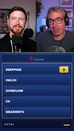
When asked about his favorite CSS named color, Adam didn't hesitate: deeppink. Interestingly, three community members voted the same way. But the real winner was rebeccapurple, which topped the poll with 29 votes.
This result isn't all that surprising. Rebecca Purple is a named color in the CSS spec with deep emotional significance for the community, so strong support makes perfect sense. Meanwhile, basic colors like red and blue barely registered — red got just two votes, and blue didn't even make the chart. As the conversation pointed out, people don't necessarily love those colors; they just use them the most.
rebeccapurple was officially added to the CSS Color Level 4 specification in 2014, with a color value of #663399. It was named after Rebecca, the six-year-old daughter of CSS legend Eric Meyer, who passed away from a brain tumor. Eric Meyer has long been a champion of CSS education and advocacy, and the community proposed — and successfully added — this color to the spec as a tribute to Rebecca and a show of support for her father. It remains the only CSS named color based on a real person's name, representing one of the frontend community's rarest moments of collective emotional connection. Its top ranking in a "favorite named color" poll is entirely fitting.
Color Format: The Unexpected Rise of OKLCH
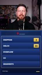
Adam's answer for favorite color format was OKLCH — though he assumed it was too niche a choice. The results proved him wrong: OKLCH came in first in the community vote.
"I thought it was too obscure — I can't believe people are really adopting it." That reaction says a lot. As a format grounded in a perceptually uniform color space, OKLCH has seen a noticeable uptick in adoption across the frontend community. It offers clear advantages over traditional hex or rgb when working with gradients, building color palettes, and calculating accessible contrast ratios. This vote signals that OKLCH has graduated from "experimental curiosity" to an everyday tool in mainstream developers' workflows.
OKLCH is a color format based on the OKLab perceptually uniform color space, with three components: Lightness, Chroma, and Hue. Compared to hex, rgb, or hsl, OKLCH's biggest strength is perceptual uniformity — when you adjust lightness or hue values, the change your eye perceives is linear and consistent. HSL, by contrast, has well-known visual distortions in this regard. This property makes OKLCH far more reliable for generating gradient scales, building design system palettes, and computing accessibility contrast. Since 2023, Chrome, Firefox, and Safari all natively support oklch() syntax, and build tools like PostCSS offer compatibility fallbacks — key reasons why it made the leap from experimental feature to mainstream toolbox staple so quickly.
Favorite Property: overflow Falls Flat, display Dominates
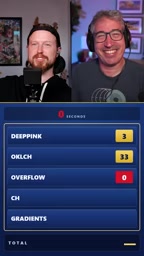
For "favorite CSS property," Adam gave a distinctly personal answer: overflow. Yet not a single community member voted for it.
The clear winner was display with 23 votes, followed by flex with 5. Even Adam admitted he couldn't have predicted that. He colorfully compared the voters to "a lizard lunging straight at a plate" — display is the first property the brain reaches for, foundational and powerful, but calling it a favorite feels a little odd.
This reflects a common pattern: when asked about their "favorite," developers tend to instinctively name the most central and frequently used property, rather than the ones that genuinely spark joy. As the gateway to the entire layout system, display becomes the reflexive choice.
Favorite Unit: ch vs. rem
Adam's favorite unit is ch (the character unit), which is especially handy for controlling text container widths and achieving optimal line lengths. In the community vote, ch came in second with 53 votes (note: numbers varied slightly in the conversation), while the top spot went to rem with 27 votes.
rem topping the chart is no surprise — it's the cornerstone of responsive design and accessibility best practices, relied upon in virtually every modern project for scalable typography. ch landing in second place reflects a growing developer awareness of typographic detail and reading experience.
The ch unit represents the width of the character "0" in the current font, and it's commonly used to cap text container line lengths. Typography best practices generally recommend line lengths between 45 and 75 characters, so a declaration like max-width: 65ch provides an intuitive way to keep paragraphs within a comfortable reading range — no pixel math or percentages required. rem (root em), meanwhile, is relative to the <html> element's font size, defaulting to 16px in most browsers. Its core value lies in accessibility: when a user adjusts their default font size in browser settings, a layout built with rem scales proportionally, while px-based values remain fixed and unresponsive to user preferences.
Properties You Always Have to Look Up: Gradients and Grid Tie
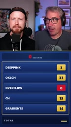
The final question hit close to home: which CSS property syntax can you never quite remember and always have to look up? Adam's answer was gradients, which came in second with 14 votes.
Top honors went to grid with 22 votes. Flex and various alignment/distribution properties combined for around 10 votes. Surprisingly, box-shadow also pulled in 10 votes for third place — Adam seemed genuinely puzzled, since he finds shadow syntax fairly intuitive.
Grid's complexity is a well-acknowledged pain point. The many ways to combine grid-template-areas, grid-column, and related properties make accurate recall difficult. Gradient syntax shares the same problem — directions, color stops, and positional values in varying combinations are easy to fumble. The distribution of these "always-have-to-Google" properties is, in a sense, a map of where CSS API design still has room to improve.
What This Q&A Reveals About the Frontend Ecosystem
A quick, casual Q&A like this might seem trivial, but it offers a genuine window into developer mental models. OKLCH's strong showing confirms real progress in modern color management; display and rem topping their respective categories reveals how easily developers conflate "favorite" with "most used"; and grid and gradients perennially dominating the "always look it up" list is a persistent reminder to spec authors and tooling developers alike: syntax memorability is still worth optimizing for.
For working frontend engineers, this data also serves as a useful calibration — checking whether your own preferences align with community trends might surface some underappreciated features worth a closer look.
Related articles

Amphibious Transforming Drone: Beyond 100x Power Savings, What Are the Real Needs?
Is the amphibious transforming drone just a gimmick? Starting from the 100x power difference of the M4 Morphobot, explore real application scenarios and thesis topic ideas, analyzing boundary conditions where pure drones and pure ground robots both fail.

Warhound Raises $200 Million: Genetically Engineered "War Dogs" Paired with Anduril Gear
Warhound raises $200M, backed by Ben Lamm and Palmer Luckey, to genetically engineer dogs for military and law enforcement use and equip them with Anduril gear. This article analyzes its technology direction, funding logic, and ethical controversy.

Claude API Comes to Google Cloud: IAM Integration and SDK Access Guide
Anthropic hosts the full Claude API on Google Cloud with IAM-controlled permissions and unified billing. This guide covers the Vertex AI and Anthropic-hosted entry points, IAM role configuration, and SDK access.