How to Read AUC Area Charts: A Complete Guide to ROC Curve Interpretation and Model Evaluation

A systematic guide to interpreting AUC area charts and model evaluation standards
This article systematically explains how to interpret AUC area charts in machine learning. Starting from the definition and plotting principles of ROC curves, it presents five dimensions for evaluating curve quality (starting point, endpoint, AUC value, diagonal distance, smoothness), establishes AUC scoring standards (above 0.9 is excellent, 0.8–0.9 is good, etc.), compares PR curves with ROC curves for imbalanced data scenarios, and emphasizes that AUC should be used alongside other metrics for comprehensive evaluation.
In machine learning model evaluation, AUC (Area Under Curve) is one of the most commonly used metrics for measuring the quality of classification models. Many people feel confused about how to read and interpret AUC area charts when they first encounter them. This article will help you systematically master this core evaluation metric from multiple angles, including ROC curve interpretation methods, AUC value assessment criteria, and the differences between PR curves and ROC curves.
How to Interpret ROC Curves
What Is an ROC Curve?
The ROC curve (Receiver Operating Characteristic Curve) is plotted with the False Positive Rate (FPR) on the x-axis and the True Positive Rate (TPR) on the y-axis. In simple terms, we want TPR to be as high as possible (positive samples correctly identified) while keeping FPR as low as possible (negative samples not misclassified as positive). Therefore, the closer the ROC curve is to the upper-left corner, the better the model performance.
The ROC curve originated from Signal Detection Theory during World War II, when the U.S. military used it to analyze radar signals—determining whether signals on a radar screen were enemy aircraft or noise interference. After the war, this method was introduced into medical diagnostics to evaluate the sensitivity and specificity of diagnostic tests. It wasn't until the 1990s that machine learning researchers widely adopted it for classification model performance evaluation.
Understanding ROC curves requires first grasping the four basic concepts of the Confusion Matrix: True Positive (TP, positive sample correctly predicted as positive), False Positive (FP, negative sample incorrectly predicted as positive), True Negative (TN, negative sample correctly predicted as negative), and False Negative (FN, positive sample incorrectly predicted as negative). Specifically:
- TPR = TP/(TP+FN), also called Sensitivity or Recall
- FPR = FP/(FP+TN), equal to 1 minus Specificity
The ROC curve is drawn by sorting the model's predicted probabilities from high to low, selecting different classification thresholds sequentially, where each threshold corresponds to a pair of (FPR, TPR) coordinates. Connecting all these points forms the ROC curve.
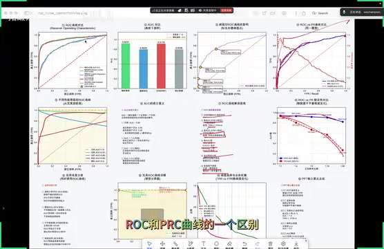
Five Dimensions for Evaluating an ROC Curve
Once you have an ROC curve, you can quickly assess model performance from these five perspectives:
1. Look at the starting point: The higher the TPR value at the starting point, the better. The ideal case is TPR=1 and FPR=0, meaning all positive samples are correctly identified with zero false alarms.
2. Look at the endpoint: The endpoint corresponds to the FPR value, representing the state where all positive samples have been output by the model. The endpoint itself isn't critical—what matters is whether the curve's trajectory from start to end is smooth.
3. Look at the AUC value: This is the most direct quantitative metric; specific assessment criteria are covered in the next section.
4. Compare with the diagonal: The farther the curve is from the diagonal and the closer it is to the upper-left corner, the better the model performance. The diagonal represents a random classifier and serves as the performance baseline—if the model's curve follows the diagonal, it's no better than random guessing.
5. Look at curve smoothness: A smooth curve indicates a stable model with sufficient sample size; if the curve appears jagged, it often means the model is unstable or the sample size is insufficient.
How to Read AUC Values: Assessment Criteria and Model Comparison
AUC Value Assessment Criteria
AUC values range from 0 to 1, with higher values indicating stronger classification ability. The commonly accepted industry standards are:
| AUC Range | Model Performance |
|---|---|
| AUC > 0.9 | Excellent |
| AUC 0.8–0.9 | Good |
| AUC 0.7–0.8 | Fair |
| AUC 0.5–0.7 | Poor |
| AUC = 0.5 | Equivalent to random guessing |
It's important to note that AUC measures the model's ranking ability—whether the model can rank positive samples ahead of negative samples—rather than specific classification accuracy. When AUC equals 1, all positive samples have higher predicted scores than negative samples; when AUC equals 0.5, the model cannot distinguish between positive and negative samples at all.
From a probabilistic perspective, AUC has a very intuitive interpretation: it equals the probability that a randomly selected positive sample has a higher predicted score than a randomly selected negative sample.
In terms of computation, AUC can be calculated through numerical integration of the area under the ROC curve using the Trapezoidal Rule, or equivalently through the Mann-Whitney U statistic—which essentially counts the proportion of all positive-negative sample pairs where the positive sample's score is higher than the negative sample's score. For large-scale datasets, an efficient algorithm first sorts all samples by predicted score, then uses the sum of ranks of positive samples to quickly compute the result, with time complexity O(n log n). AUC's threshold-independence makes it particularly suitable for model selection when the final classification threshold hasn't been determined.
Comparing Two Models: Three Typical Scenarios
When comparing the performance of two models, AUC area charts provide intuitive judgment criteria. Based on the positional relationship between two ROC curves, there are three scenarios:
Scenario 1: One curve completely envelops the other
If Model B's ROC curve is entirely above Model A's curve, then B has a larger AUC area, and Model B's performance is definitively better than Model A's. This is the simplest and most intuitive judgment—you can tell the result at a glance.
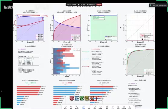
Scenario 2: Two curves cross each other
When two ROC curves intersect, you cannot judge which is better by visual inspection alone. In this case, you need to calculate the area enclosed by each curve and the axes separately—the model with the larger AUC value has better overall performance. The intersection point divides the region into different parts, and you must compute the overall AUC values comprehensively before drawing conclusions.
Scenario 3: Perfect classification with AUC = 1.0
AUC = 1.0 represents a perfect classifier, where the ROC curve hugs the upper-left corner and the model makes no classification errors. However, this situation almost never occurs in real-world projects.
Core conclusion: The larger the AUC, the better the classification quality.
Differences Between PR Curves and ROC Curves
How to Read PR Curves
The PR curve (Precision-Recall Curve) uses Recall as the x-axis and Precision as the y-axis. Unlike ROC curves, PR curves aim for the curve to be as close to the upper-right corner as possible, maintaining both high precision and high recall simultaneously.
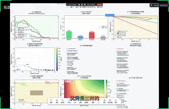
When interpreting PR curves, pay attention to the following key points:
- Starting point: When recall is low, precision should be close to 100%, indicating that the model's predictions are highly accurate at high confidence levels
- Endpoint: The slower precision decreases, the better—there should be no cliff-like drops
- Area: The larger the area under the curve, the better the model's overall performance
- Smoothness: Severe fluctuations indicate model instability
The Core Difference: Sensitivity to Sample Distribution
The most critical difference between ROC curves and PR curves lies in their sensitivity to changes in the positive-to-negative sample ratio:
- ROC curves: When the positive-to-negative sample ratio changes, the ROC curve's shape remains largely unchanged, offering greater stability
- PR curves: When the sample distribution changes, PR curves typically exhibit significant fluctuations
Therefore, in scenarios with severely imbalanced classes, ROC curves often provide more stable evaluation results. Conversely, PR curves are more valuable when focusing on minority class performance—for example, in fraud detection or disease diagnosis, where we care more about "how accurate are the detected positives" and "how many positives were missed." In these cases, PR curves better reflect the model's actual effectiveness than ROC curves.
The fundamental reason PR curves are more valuable in imbalanced scenarios is that Precision (Precision = TP/(TP+FP)) doesn't involve the number of True Negatives (TN) in its calculation. Take fraud detection as an example: normal transactions (negative samples) might account for 99.9%, while fraudulent transactions (positive samples) account for only 0.1%. Even if the model produces many false positives, the FPR change remains tiny due to the enormous negative sample base, making the ROC curve still look "impressive"—creating the illusion of good model performance. In contrast, precision in the PR curve directly reflects the severity of false positives—if the model misclassifies 1,000 normal transactions as fraud, precision drops significantly, making the problem immediately apparent.
The area under the PR curve is called AP (Average Precision), widely used in object detection (such as PASCAL VOC and COCO dataset evaluations), and mAP (mean Average Precision) is the standard evaluation metric for object detection models.
Practical Considerations
Beware the "Perfect Model" Trap
In practice, if someone claims their model achieves 99% or even 100% accuracy, this is usually not credible. A truly reliable model that can stably achieve around 80% accuracy after thorough training and tuning is actually more trustworthy.
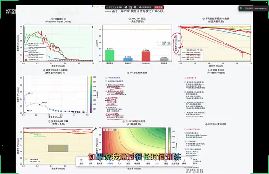
This principle is highly practical: perfect models virtually never exist in reality, because data inherently contains noise and uncertainty. Excessively high accuracy often indicates overfitting, or problems with the evaluation methodology itself (such as data leakage, overlap between test and training sets, etc.).
Overfitting refers to the phenomenon where a model performs exceptionally well on training data but significantly worse on unseen new data. Its essence is that the model has "memorized" noise and specific patterns in the training data rather than learning true underlying patterns. The classic method for identifying overfitting is comparing training set AUC with validation set AUC—if training AUC is close to 1.0 while validation AUC is noticeably lower, that's a typical signal of overfitting.
Data Leakage is a more insidious problem, referring to the unintentional use of information during training that shouldn't be available. Common forms of leakage include: features containing direct derivatives of the target variable, time series data not split chronologically causing "future information" to leak into the training set, and data preprocessing (such as normalization or missing value imputation) performed on the entire dataset before train/test splitting.
Cross-Validation is an important technique for mitigating these issues. K-fold cross-validation provides more reliable estimates of a model's generalization ability by splitting data multiple times and averaging performance.
AUC Is Not a Universal Metric
Although AUC is an excellent comprehensive metric, it measures the model's ranking ability and cannot directly tell you "what the precision and recall are at a specific threshold." In business scenarios with explicit requirements for precision or recall, you need to combine PR curves, F1-Score, confusion matrices, and other metrics for comprehensive evaluation to make informed model choices.
In real-world machine learning projects, a complete evaluation framework typically includes multiple complementary metrics:
- Confusion Matrix is the most fundamental tool, displaying the specific counts of TP, FP, TN, and FN in matrix form, serving as the basis for computing all other metrics
- F1-Score is the harmonic mean of precision and recall, with the formula 2×Precision×Recall/(Precision+Recall), suitable for scenarios where both precision and recall are important and need to be balanced
- When the business places different emphasis on the two, you can use Fβ-Score for weighting—β>1 emphasizes recall more (e.g., disease screening, where it's better to over-test than to miss cases), β<1 emphasizes precision more (e.g., spam filtering, where it's better to miss some spam than to misclassify legitimate emails)
- Log Loss evaluates the calibration quality of the model's output probabilities—two models with identical AUC may have very different probability calibration quality, which is especially important in scenarios requiring reliable probability estimates (such as risk scoring or ad click-through rate prediction)
- In multi-class tasks, AUC needs to be extended to Macro-AUC or Micro-AUC, which measure overall multi-class classification performance from different perspectives
Summary
The AUC area chart is a core tool for evaluating classification model performance. By mastering the five dimensions for interpreting ROC curves (starting point, endpoint, AUC value, distance from diagonal, smoothness), understanding three model comparison scenarios (complete dominance, curve intersection, perfect classification), and clarifying the appropriate use cases for PR curves versus ROC curves, you can make more accurate decisions during model selection and optimization.
Remember the core principle: The larger the AUC, the stronger the model's classification ranking ability—but no single metric can solve all problems. Always choose the appropriate evaluation approach based on specific business requirements.
Related articles
Deep Dive into AI Agent Skill Design: …
Deep Dive into AI Agent Skill Design: Engineering Practices from Anthropic and Perplexity
A deep dive into Skill design philosophy from Anthropic's Claude Code team and Perplexity's Agent team, covering the Tax Test, Gotchas Flywheel, progressive disclosure, and Eval-First practices for building high-quality AI Agent skill systems.
Deep Dive into OpenAI's Official GPT-5…
Deep Dive into OpenAI's Official GPT-5.6 Prompting Guide: The Shift from Manual to Automatic
A deep dive into OpenAI's official GPT-5.6 Sol prompting guide: conciseness-first, outcome-oriented design, autonomy boundaries, tool routing, and reasoning intensity tuning.
 Deep Dives
Deep Dive into How OpenClaw (Open-Source Crayfish) AI Agent Works
Deep analysis of OpenClaw AI Agent internals: System Prompt, tool calling, SubAgents, Skill system, memory, and Context Engineering explained.