Iosevka: The All-Rounder of Open-Source Monospace Fonts

Iosevka is a dual-style, strictly monospace open-source programming font for developers and terminal users.
Iosevka is an open-source monospace font designed for code editing, terminals, and Markdown, offering both sans-serif and slab-serif styles while maintaining strict monospace metrics. The article explains why monospace fonts remain irreplaceable for structured text, indentation alignment, and diff comparison, and how Iosevka goes beyond usability to pursue character recognition and reading comfort. Its open-source license allows free viewing, modification, customization, and distribution, even embedding in products. Developers, terminal power users, design-conscious users, and open-source enthusiasts are encouraged to evaluate it.
What Is Iosevka?
If you spend your days working with code editors, terminals, or Markdown documents, you're probably picky about monospace fonts. Iosevka is an open-source font family built specifically for these scenarios, with a clear positioning: dual sans-serif and slab-serif styles, strict monospace, and fully open source.
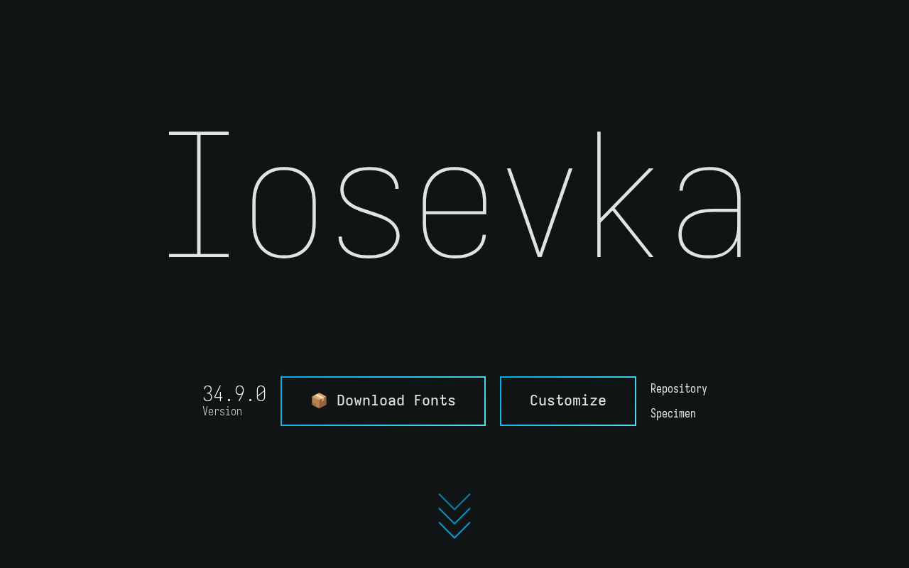
Unlike many coding fonts that offer only a single style, Iosevka covers both sans-serif and slab-serif appearances, letting users switch freely based on personal taste or use case. All glyphs follow the monospace principle, meaning that in code indentation, table alignment, and terminal output, characters occupy identical horizontal space without misalignment.
The project sparked discussion on Hacker News, showing that the developer community's demand for high-quality monospace fonts remains strong. When a font attracts this much attention, it's usually the result of long-term refinement and validation in real-world use.
The difference between sans-serif and slab-serif: Sans-serif fonts have no decorative strokes at the ends of letterforms, giving them a clean, crisp appearance that's typically easier to recognize at small sizes and on high-pixel-density screens. Slab-serif fonts, on the other hand, feature thick rectangular serifs at stroke ends, giving them more visual weight and greater stroke differentiation, making it easier for the eye to track along the baseline during extended reading. For coding fonts, this choice isn't purely aesthetic—serifs help quickly distinguish similar glyphs like l and 1, or I, while sans-serif performs better with anti-aliasing at low resolutions. By offering both styles, Iosevka essentially hands the trade-off between "glyph recognition" and "rendering clarity" to the user.
What strict monospace means: Most so-called "monospace fonts" only guarantee consistent widths for Latin letters and digits, while punctuation, arrows, box-drawing characters, and CJK characters often vary in width, causing misalignment in terminal tables or code comments containing Chinese text. Strict monospace requires all half-width glyphs to occupy exactly the same advance width, using "half-width conversion," "narrowing," or "escaping" where necessary to maintain grid consistency. Iosevka constrains glyph widths uniformly by design, so alignment in terminals, diff views, and ASCII tables doesn't break when characters change—a key reason it's favored by many terminal users.
Why Monospace Fonts Still Matter
In an era of highly developed graphical interfaces, monospace fonts may seem like a relic—but they remain irreplaceable. Code is fundamentally structured text, and indentation levels, column alignment, and diff comparison all depend on absolute consistency in character width. Proportional fonts let i and W occupy different widths, causing code layout to collapse instantly.
Iosevka's value lies in not stopping at "usable." Monospace is just the baseline; it also pursues glyph recognition and aesthetics. For developers staring at screens for hours each day, reading comfort directly affects fatigue and efficiency. A well-designed monospace font makes easily confused characters like 0 and O, 1 and l, I immediately distinguishable.
The Practical Significance of Dual-Style Design
The slab-serif style features prominent slab serifs at character ends, giving it a more grounded visual feel suited to extended reading; the sans-serif style is cleaner and more modern, often clearer on low-resolution screens. Iosevka leaves the choice to users rather than deciding for them—an openness that embodies the spirit of open source.
The relationship between monospace fonts and ligatures: Many modern coding fonts (including some Iosevka variants) support programming ligatures, rendering symbol combinations like !=, =>, === as single glyphs to reduce visual noise. Ligatures and strict monospace aren't contradictory—as long as the ligature glyph's width still equals the grid width of the original character count, cursor positioning and column alignment remain intact. This is often misunderstood: ligatures change display form, not logical character count; the editor's column numbers, selection ranges, and diff highlighting are still calculated by the original characters. Iosevka's ligature support is configurable, letting users decide whether to enable it.
Unique Advantages of the Open-Source Model
Iosevka uses an open-source license, meaning anyone can view, modify, and distribute the font files. For a tool at the infrastructure level like a font, the benefits of open source go far beyond "free."
Developers can customize Iosevka—adjusting weights, modifying specific character shapes to match personal preferences, or even embedding it in their own products. This freedom is hard to find with commercial fonts. At the same time, open source means the font undergoes continuous community review and contribution, so glyph errors and rendering issues are discovered and fixed faster.
From an ecosystem perspective, Iosevka has built a user community around itself. It appears in terminal emulators, code editors, and even e-book readers. This cross-platform adaptability further solidifies its position as a general-purpose monospace font.
Common types of font open-source licenses: Font projects commonly use the SIL Open Font License (OFL), Apache License 2.0, and GPL with font exception clauses. OFL is currently the most mainstream font-specific license, allowing free use, modification, and redistribution, but requiring derivative fonts not to use the original Reserved Font Name to avoid confusion. This means that if someone modifies and releases a font based on Iosevka, they typically need to rename it before distribution. Understanding this helps clarify the boundaries of "freely customizable": open source doesn't mean you can arbitrarily appropriate the original project's name, but rather that you can do secondary development and embedding while complying with license terms.
Who Should Consider Using Iosevka
Not every user needs to switch fonts, but the following groups are worth seriously evaluating Iosevka:
- Developers who write code for extended periods: Monospace alignment and character recognition directly affect the coding experience
- Heavy terminal users: Need fonts that stay clear across multiple font sizes
- Designers who value aesthetic consistency: Want code presentation to match product interface style
- Open-source tool enthusiasts: Prefer software that can be freely modified and distributed
If you're unhappy with how your current font handles certain characters, or simply want to try a new style, Iosevka's low migration cost makes it worth a try. Since it's an open-source project, there are no barriers to obtaining and installing it.
Summary
Iosevka's significance goes beyond being "just another monospace font." Through its dual-style design, strict monospace metrics, and open-source license, it occupies a unique position in the developer toolchain. The discussion heat on Hacker News also confirms the community's emphasis on such foundational tools. For technical users seeking both efficiency and aesthetics, Iosevka is a worthwhile addition to the toolbox.
One-line Summary
Iosevka is a dual-style, strictly monospace open-source programming font suited for developers and terminal users.
Paragraph Summary
Iosevka is an open-source monospace font designed for code editing, terminals, and Markdown scenarios, with its standout feature being dual sans-serif and slab-serif styles while adhering to strict monospace metrics. The article notes that monospace fonts remain irreplaceable for structured text, indentation alignment, and diff comparison, and that Iosevka goes beyond "usable" to pursue character recognition and reading comfort. Its open-source license allows users to freely view, modify, customize, and distribute the font, or even embed it in products, with the community providing continuous review and contributions. The article recommends that developers who code for long hours, heavy terminal users, designers who value aesthetic consistency, and open-source enthusiasts seriously evaluate Iosevka as a worthwhile addition to their foundational toolchain.
Related articles

Why Does the Tesla Roadster Need to Fly? A Deep Dive into Musk's Wild Demo
Tesla's Roadster launch showed wall-climbing, upside-down driving, and flying stunts—but The Vergecast notes the demo car may lack a battery, the Rocket version is invite-only and not street-legal, and the website terms don't guarantee delivery. After nine years of delays, why does this car still need to exist?

AI Is Not a Replacement: Human-AI Collaboration Through the Lens of Factory Root Cause Analysis
Starting from factory root cause analysis, this article explains how AI accelerates evidence chain construction rather than replacing human experts, exploring the pragmatic implementation logic and business value of 'AI supporting people rather than replacing them.'

AI Agent Decision Auditing: Building an Evidence Chain in Regulated Workflows
Starting from a Reddit discussion, this article analyzes three core issues in AI agent decision auditing within regulated workflows: what fields audit records should contain, how to handle feedback latency for erroneous decisions, and how to continuously calibrate LLM judge consistency with human judgment.