Let CSS Handle the Layout Math: Adaptive Grids with :has()
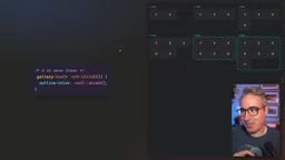
Use :has() and :nth-child() to let CSS automatically switch grid column counts based on child element count, replacing JS counting.
The article tackles poor fixed-column grid layouts at different item counts by using CSS :has() with :nth-child() to let containers sense child count and conditionally override the --gallery-columns custom property, achieving adaptive columns with a single grid-template-columns declaration. Chaining :last-child and :not() expresses precise ranges like "exactly N" and "N or more." No runtime overhead, SSR-friendly, and better decoupling than JS counting or modifier classes.
Why Fixed Column Counts Always Feel Wrong
Anyone who does front-end development has run into this scenario: a card grid where 2 items should show as 2 columns, 4 items still as 2 columns, but 6 items feel better as 3 columns. The problem with hardcoding numbers in grid-template-columns is that it knows nothing about content—only about the values you set.
In a tutorial by YouTube creator Kevin Powell, he demonstrates a simple but common predicament: minmax() can make column widths adaptive, but when the item count is an even number like 2, 4, or 6, automatic wrapping often produces unsatisfying results—2 items end up on 1 row, 5 items get squeezed into 5 columns. Patching with media queries and modifier classes quickly balloons into a swamp of conditional logic.
The solution should flip the approach: instead of the developer telling CSS how to arrange things, let CSS first count how many children are inside, then decide how to arrange them.
Using :has() to Let Selectors "Count"
The modern CSS :has() pseudo-class provides a declarative capability: a parent element can set styles based on the matching state of its own children. Combined with :nth-child(), you can express conditions like "if this grid has at least 6 children."
.gallery:has(> :nth-child(6)) {
  --gallery-columns: 3;
}
This selector reads as: select those .gallery elements that have a 6th child. Since :nth-child(6) matches "the 6th child exists," it naturally means "6 or more." To precisely target "exactly 5," you need to chain two conditions: a 5th child exists, and that 5th child is also the last child.
.gallery:has(> :nth-child(5):last-child) {
  --gallery-columns: 2;
}
The demo in the screenshot is exactly this logic: when the grid has exactly 5 items, the highlight state kicks in and the column count variable is overridden.

:has() is a CSS relational pseudo-class, stably supported in mainstream browsers including Chrome, Safari, and Firefox since 2023. It allows matching a parent element based on whether descendant or sibling elements exist. :nth-child() matches based on an element's position among its siblings (counting from 1). When combined, :has(> :nth-child(6)) means: the parent element has a 6th direct child, i.e., at least 6 children. This "existence means at least" semantics comes from how :nth-child matches—as long as the Nth child exists, the selector holds true; you don't need to explicitly write "greater than or equal to."
Tucking the Column Count into a Single Custom Property
True maintainability comes from separating the "default value" from the "override value." Declare a CSS variable with a fallback first, and let all rules only override it, rather than repeating grid-template-columns everywhere.
.gallery {
  --gallery-columns: 3;
  display: grid;
  grid-template-columns: repeat(var(--gallery-columns), 1fr);
}
Then each :has() rule does only one thing: reassign --gallery-columns. Different element counts trigger different rules, but they all flow into the same layout declaration. This approach is far lighter than reading children.length in JS, concatenating class names, and manipulating the DOM—no runtime overhead, no hydration issues, and the server-rendered HTML arrives with the correct layout already in place.
CSS custom properties (CSS Variables) are declared via --name and referenced with var(--name, fallback), following inheritance and cascade rules. In this approach, --gallery-columns is declared on .gallery, its value gets overridden by more specific :has() rules, and ultimately gets read by the repeat() in grid-template-columns. Since variable substitution happens at the computed value stage, the browser doesn't need to re-parse entire rules—performance overhead is minimal, and server-rendered HTML carries the correct variable values directly, avoiding layout jank.
Combining Rules to Handle Edge Cases
A single condition is often not enough. The typical scenarios addressed in the video are:
- When the count is even and the last child, reduce columns to 2 (handling the 2 and 4 item cases)
- But when the count reaches 6 or more, 3 columns actually looks better, so the previous rule needs to be "excluded"
The way to exclude is to nest :not() inside :has(), forming a selector like "4 or fewer." By chaining multiple pseudo-classes and :not() inside :has(), you can construct quite precise count-range conditions:
.gallery:has(> :nth-child(7)) {
  --gallery-columns: 4;
}
Here, the existence of a 7th child means "7 or more," and the column count rises to 4. The entire set of rules amounts to just a few lines of selectors, yet covers everything from 2 to 7+ items.

Interestingly, this style of writing inside :has() does come with a readability cost. The author also acknowledges that if you want a more readable version, you can split it into separate selectors with individual comments, rather than chaining all the logic into one line. That's a stylistic trade-off and doesn't affect the capability boundary.
:not() is a CSS negation pseudo-class used to exclude elements matching a selector; when nested inside :has(), it expresses "there is no child element satisfying a certain condition." For example, :has(> :nth-child(4):not(:last-child)) means a 4th child exists and it's not the last one, i.e., at least 5 children. Through this nesting, you can combine range conditions like "4 or fewer" and "7 or more" without writing a separate rule for each count.
Why This Is Worth More Than JS or Modifier Classes
Powell repeatedly emphasizes one point in the video: layout calculations should be left to CSS, not patched with JavaScript or component-level conditional logic. There are three layers to the reasoning.
The first layer is performance and correctness. CSS style matching happens within the rendering pipeline—it doesn't trigger additional script execution, and it won't cause layout flicker due to DOM update timing issues.
The second layer is decoupling. A component doesn't need to know what container it's placed in or how many siblings are in that container—it just provides a --gallery-columns hook, and the outside world can override it with any selector. This is much cleaner than writing a .cols-2, .cols-3 modifier class for every count.
The third layer is the reality he mentions in the course promotion section: even when relying heavily on AI-generated code in daily work, understanding the underlying language remains a prerequisite for debugging and optimizing output. When AI hands you a layout piled up with media queries, whether you can spot the problem at a glance and rewrite it into a declarative :has()-based solution depends on your grasp of selector capabilities. This is especially relevant for developers who currently depend on AI-assisted coding.

Practical Advice
This technique's prerequisite is browser support for :has(). It's now stably available in mainstream browsers, but projects needing compatibility with older environments should still evaluate it. In practice, I recommend consolidating count detection into a single @layer or a clearly commented style block, and pairing it with visual regression tests covering the boundary counts of 2, 4, 6, and 7 items—these are exactly where fixed-column approaches most easily go wrong.
What's truly worth remembering isn't any specific piece of code, but the shift in thinking: layout rules can be written based on the content itself, rather than on a handful of scenarios the developer pre-assumed. CSS's expressive power is far broader than the subset many people are accustomed to using.
One-line Summary
Use :has() and :nth-child() to let CSS automatically switch grid column counts based on child element count, replacing JS counting.
Paragraph Summary
The article addresses the problem of fixed-column grids laying out poorly at different item counts by proposing that modern CSS's :has() pseudo-class combined with :nth-child() lets parent containers perceive child element count and conditionally override a custom property --gallery-columns, achieving adaptive column counts with just one grid-template-columns declaration. By chaining :last-child and :not(), you can express precise count ranges like "exactly N" and "N or more." Compared to JavaScript counting or modifier classes, this approach has no runtime overhead, is server-rendering friendly, and decouples components more thoroughly. The author also emphasizes that even with AI-generated code, understanding CSS's underlying selector capabilities remains a prerequisite for debugging and optimization.
Related articles

Helix Integrates With the AI You Already Use: The Same Lead Data Works Across Claude, ChatGPT, and Cursor
Helix embeds into Claude, ChatGPT, and Cursor: three users, three AIs, the same set of numbers. You just approve—Helix handles the rest automatically.

AI Won't Replace Developers: The 50-Second Workflow of Copilot, Cursor, and v0
Jonathan's talk on the real value of AI coding tools: how v0 generates React+Tailwind components from natural language, why good prompts need component, state, theme, and interaction, and why AI only amplifies great developers.

Free Cursor + Grok: MLH Global Hack Week Limited-Time Offer
MLH Global Hack Week offers a free one-month X Premium subscription with Cursor and Grok models. Learn how to register, complete challenges, redeem codes, and note the 30-day account age requirement.