Material 3 1.5.0 Stable Release: Material 2 Officially Retired

Material 3 1.5.0 stable ships expressive components, halves experimental APIs, and officially deprecates Material 2.
Material 3 1.5.0 reaches stable, with three core changes: expressive design components land in force, including Fab Menu, morphing toggle buttons, wavy progress indicators, floating toolbars, and time pickers, plus a new color producer for smooth text color animations; experimental annotations drop from 120 to 58 (a 52% reduction), with many expressive components graduating to stable and lowering production upgrade risk; and sliders migrate to a state-based model, with major keyboard navigation and focus traversal improvements for date pickers, time pickers, sliders, and scaffolds. Meanwhile, Material 2 is officially deprecated, with the official recommendation to upgrade to 1.5.0—staying put will accumulate technical debt.
Material 3 1.5.0 has reached stable status. This update isn't just about adding a few new controls—it marks the official retirement of Material 2. If you're still using the old theme, your migration window is closing.
Expressive Design: New Components Land in Force
The most visible changes in 1.5.0 come from "Expressive Design." This release brings several new components: Fab Menu, morphing toggle buttons, wavy progress indicators, floating toolbars, time pickers, and smooth text color animations powered by a brand-new color producer.
These components previously existed mostly in experimental form. Now they're significantly more visually bold while staying consistent with the Material 3 design language. For apps seeking a personalized interface, these are capabilities you can ship directly—not half-finished pieces you have to assemble yourself.
Experimental Annotations Cut by 52%, Many Components Graduate
Developer feedback was taken to heart. The team reduced experimental annotations by 52%, from 120 down to 58. This means significantly less uncertainty across the API surface, and fewer compile warnings and adaptation costs when upgrading.

That said, nearly all the new expressive components have graduated from experimental to stable, including toggle buttons, wavy progress indicators, search bars, sliders, and button groups. For production environments, this is more valuable than new features—you no longer have to hesitate over "will this API change tomorrow?"
Experimental Annotations are annotations in Compose used to mark APIs that are still in an experimental stage, typically written as @ExperimentalMaterial3Api. APIs marked with this annotation produce compile-time warnings, alerting callers that the interface's signature or behavior may change in future versions, with no guarantee of binary compatibility. To use these APIs in production code, developers often need to explicitly add @OptIn annotations to suppress warnings—which adds boilerplate and means teams must continuously track version changes to assess upgrade risk. A reduction in experimental annotations directly reflects a stabilizing API surface and is an important indicator of a library's maturity.
Sliders Move to a State-Based Model, Accessibility Fully Reworked
The slider component has migrated to a state-based model (slider state). This change makes value management and interaction logic clearer, and better aligned with Compose's state-driven pattern.
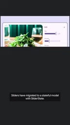
Accessibility is another major focus of this update. Keyboard navigation and focus traversal for date pickers, time pickers, sliders, and scaffolds have all been substantially improved. For apps that need to support keyboard operation or assistive technologies, these improvements directly affect usability—not just compliance patching.
State-based Model is one of the core patterns of Compose's declarative UI, with typical examples being TextFieldState, DrawerState, and so on. Compared to the traditional "value + callback" pattern (such as value: Float paired with onValueChange: (Float) -> Unit), the state model encapsulates a component's internal state as a separate object held and observed by the caller. The benefits: state can be read and modified outside the Composable, making it easier to manage centrally in a ViewModel; the state object can also carry richer interaction semantics (such as distinct states for dragging, animating, disabled, etc.), and it lets accessibility services and keyboard operations more precisely perceive the component's current phase. After migrating the slider to a state model, its value management and interaction logic are more consistent with Compose's state-driven paradigm, and room is left for future extensions (such as range selection and custom steps).
Material 2 Officially Deprecated, Migration Window Narrows
As the Material 3 component ecosystem stabilizes, Material 2 has been officially deprecated. The official recommendation is straightforward: upgrade your dependency to Material 3 1.5.0 and bring the new expressive components into your app.

From an engineering perspective, deprecation means no further feature development or security maintenance. Teams staying on Material 2 may not feel immediate pain, but technical debt will accumulate over time. A more pragmatic approach is to break migration into separate tasks: first replace themes and base components, then gradually adopt expressive components.
For full details on this update, check out the Compose 1.1.3 blog post. For most teams, now is the right time to put the dependency version bump on the agenda.
Differences Between Material 2 and Material 3 go beyond visual style. Material 3 introduces dynamic color (generating theme colors based on the user's wallpaper), an updated typography and shape system, and "expressive"-oriented component behavior specifications. The two theme systems (M2 Theme and M3 Theme) are incompatible in color roles, type scale, and default component styling, so migration typically requires replacing the theme wrapper, remapping color tokens, and checking each component's default appearance changes. Official deprecation of Material 2 means that branch will no longer receive new components, accessibility fixes, or security patches, and staying on it long-term will gradually lose compatibility guarantees with new Compose versions.
Related articles

Google Play Age Signal API: A Privacy-Friendly Approach to Age-Appropriate Experiences
Google Play launches the Play Age Signal API, helping developers obtain age range information in a privacy-friendly, user-controlled way to build age-appropriate experiences without collecting sensitive data.

YouTube's $3 Billion Settlement Over Teen Addiction Lawsuits: A Turning Point for Platform Liability
YouTube is accused of addictive design harming children and plans a $3 billion settlement with thousands of school districts plus teen protections. This analysis covers settlement details, industry impact, and platform liability boundaries.

Honeypot Trap Warning in the AI Community: Almost No One Is Immune
Experts warn that almost everyone in AI could be targeted by honeypot traps. This article analyzes why social engineering attacks are especially effective in the AI community, outlines common attack paths, and offers defense recommendations for individuals and organizations.