Midjourney v8.2 Minimalist Ink-Wash Prompt Template: A Detailed Breakdown and Practical Guide
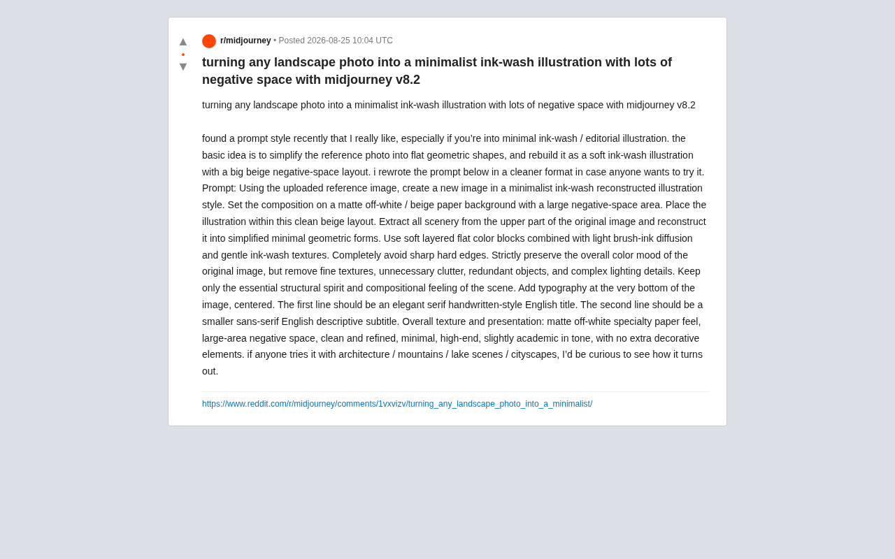
A structured breakdown of a Midjourney v8.2 prompt that transforms landscape photos into minimalist ink-wash illustrations.
This guide dissects a Midjourney v8.2 prompt template that reconstructs landscape photos into minimalist ink-wash illustrations with generous white space. It breaks down the prompt into four functional modules — canvas definition, geometric deconstruction, subtractive refinement, and typography — explaining the design logic and technical reasoning behind each. Practical tips on reference image selection, color tuning, text rendering, and cross-platform adaptation are also included.
From Landscape Photos to Minimalist Ink-Wash Art: A Prompt Paradigm Worth Bookmarking
In the world of AI image generation, stylistic transformation has always been a popular area of exploration for creators. Recently, a Reddit user shared a prompt template that performs exceptionally well on Midjourney v8.2, capable of reconstructing any landscape photo into a minimalist ink-wash illustration with generous use of white space. This style combines the sophistication of editorial illustration with the poetic essence of East Asian ink painting, making it ideal for cover design, magazine layouts, and art posters.
Ink-wash painting originated from traditional Chinese painting, using variations in ink density, dryness, and moisture to express the depth and mood of subjects. Its core aesthetic lies in "treating white space as ink" — the blank areas themselves are an essential part of the composition. In the AI image generation space, ink-wash style has long been a formidable challenge because traditional diffusion models are better at generating detail-rich realistic or illustrative images, while ink-wash painting demands the restraint of "less is more." The improvements in style comprehension and composition control in Midjourney v8.2 have made stable output of this minimalist style possible.
Unlike typical "one-click filter" style transfers, the core philosophy behind this prompt is to deconstruct first, then reconstruct — simplifying the reference photo into flat geometric color blocks, reorganizing the composition with soft ink-wash diffusion, and presenting it all on an off-white paper background with expansive negative space. This methodological shift is the key to producing high-quality results.
Line-by-Line Prompt Breakdown: What Each Module Does
The original prompt may seem lengthy, but its structure is remarkably clear. We can break it down into functional modules, which also helps readers adapt it flexibly to their own needs.
Module 1: Defining the Overall Style and Canvas
Using the uploaded reference image, create a new image in a
minimalist ink-wash reconstructed illustration style.
Set the composition on a matte off-white / beige paper background
with a large negative-space area.
This first anchors the overarching tone as a "minimalist ink-wash reconstructed illustration" and explicitly specifies the canvas: matte off-white/beige paper with a large negative-space area. White space is the soul of this style — it makes the image feel restrained and refined while reserving room for text layout.
Negative space is a core concept in graphic design and visual art, referring to the "empty" areas of a composition not occupied by the main subject. It's not simply "nothing there" — it's a deliberate design choice. In Japanese aesthetics, this concept is known as "Ma" (間), emphasizing the sense of breathing room and tension within space. In practical design applications, expansive negative space directs the viewer's gaze to the core elements, creating a premium, restrained visual impression — which is why luxury advertisements and high-end magazine layouts frequently employ white space. In prompt engineering, explicitly requesting negative space effectively counteracts the AI model's tendency to "fill the entire frame," a tendency especially common in diffusion models since the vast majority of images they were trained on tend to be information-dense.
Module 2: Extracting Scenery and Geometric Reconstruction
Extract all scenery from the upper part of the original image
and reconstruct it into simplified minimal geometric forms.
Use soft layered flat color blocks combined with light brush-ink
diffusion and gentle ink-wash textures.
Completely avoid sharp hard edges.
This is the most ingenious part of the entire prompt. It instructs the model to extract only the scenery from the upper portion of the original image (which is why landscapes with horizontal compositions like mountain ranges and city skylines work best), transforming it into minimal geometric forms. It also emphasizes "layered flat color blocks + light brush-ink diffusion" while completely avoiding sharp hard edges — this is precisely where the ink-wash aesthetic comes from.
The technique of simplifying complex scenery into flat geometric color blocks has deep roots in illustration. From Japanese ukiyo-e to the 20th-century International Typographic Style movement to contemporary editorial illustration, geometric simplification has always been the primary means of transforming "information" into "atmosphere." This approach also has computational advantages: diffusion models have far greater controllability when generating simplified geometric shapes compared to complex organic textures. Therefore, the two-step strategy of "first deconstructing into geometric forms, then layering ink-wash textures" essentially breaks a high-difficulty generation task into two relatively controllable subtasks, reducing the semantic complexity the model needs to handle in a single inference pass.
Module 3: Preserving Color Mood, Removing Redundant Details
Strictly preserve the overall color mood of the original image,
but remove fine textures, unnecessary clutter, redundant objects,
and complex lighting details.
Keep only the essential structural spirit and compositional feeling.
This section embodies "subtractive thinking": strictly preserving the original image's overall color mood while stripping away fine textures, cluttered objects, and complex lighting — retaining only the scene's structural essence and compositional feeling. For AI generation, explicitly telling the model "what to remove" is often more effective at controlling the final quality than telling it "what to add."
This "subtraction-first" strategy is backed by solid technical logic. The generation process of diffusion models is essentially a gradual "denoising" that recovers an image from noise, and models naturally tend to generate details and textures that appear frequently in the training data distribution. Without explicit instructions to remove certain elements, the model will default to filling in content it "thinks should be there." Therefore, instructions like "remove fine textures" and "remove unnecessary clutter" are actually pushing back against the model's default generation tendency, forcing it to actively suppress the emergence of details during the denoising process.
Module 4: Typography and Presentation Details
Add typography at the very bottom of the image, centered.
First line: elegant serif handwritten-style English title.
Second line: smaller sans-serif English descriptive subtitle.
The prompt also meticulously specifies text layout: centered at the bottom, with the first line being an elegant serif handwritten-style English title and the second line a smaller sans-serif English subtitle. This "title + subtitle" two-line structure is the classic typographic language of editorial illustrations and academic publications, giving the final output an inherent sense of refined, scholarly sophistication.
The font style choices here carry deep typographic semantics. Serif fonts (like Times New Roman and Garamond), with their decorative strokes at the ends of letterforms, are traditionally associated with classicism, authority, and academic publishing; the handwritten style adds warmth and uniqueness. Sans-serif fonts (like Helvetica and Futura) convey modernity, simplicity, and objectivity. The combination of the two is known as "contrast pairing" in publication design, using the tension between typographic personalities to create visual hierarchy — the title attracts emotionally, while the subtitle delivers information. This typographic strategy is widely used in high-end publications like The New Yorker and Monocle, and it's a key reason why images generated with this template inherently feel like magazine covers.
Why Does This Prompt Produce Consistent Results?
From a prompt engineering perspective, there are several design principles worth learning from that explain why this template consistently delivers high-quality output:
Explicit constraints beat vague descriptions. The prompt heavily uses strong constraint terms like "completely avoid," "strictly preserve," and "keep only." Compared to vaguely saying "make it more minimal," these precise positive and negative directives significantly reduce the model's random divergence.
In prompt engineering for large language models and multimodal models, the strength of constraint vocabulary directly affects the model's output distribution. Absolute expressions like "completely avoid" and "strictly preserve" essentially assign higher weight to specific instructions in the model's attention mechanism. Research shows that pairing negative directives (e.g., "avoid hard edges") with positive directives (e.g., "use soft textures") narrows the output variance more effectively than using either type alone. This explains why the template uses both "use soft layered flat color blocks" (positive directive) and "completely avoid sharp hard edges" (negative directive) — together they form a precise stylistic "corridor" that constrains the model to generate results only within the intended aesthetic range.
Decoupled description of structure and style. It separates "where to extract content" (structure) from "how to render it" (style), letting the model first understand the compositional skeleton before applying the visual language. This decoupling approach is broadly applicable in complex style transfer tasks.
The "content-style separation" concept in style transfer was first formalized by Gatys et al. in their 2015 neural style transfer algorithm, which extracted "content representations" and "style representations" from different layers of a deep neural network and recombined them. This idea profoundly influenced all subsequent stylized generation techniques, including today's text-guided generation in diffusion models. Practicing this principle at the prompt level means telling the model separately "what to draw" (structure/content) and "how to draw it" (style/technique), rather than mixing both into a single vague description. This decoupling not only improves the controllability of generated results but also makes the prompt itself modular and reusable — users can keep the style module unchanged and simply swap the content description to quickly adapt to different subjects.
Giving white space a functional purpose. The large negative-space area isn't just an aesthetic choice — it also serves as the container for the text layout at the bottom, maintaining balance on both visual and informational levels. This reflects the mature design principle that "every blank space should have a reason" — white space isn't waste, but a strategic layout decision serving the information hierarchy.
Use Cases and Practical Tips
According to the creator's observations, this prompt is especially worth trying with subjects like architecture, mountain scenery, lakes, and city skylines. These scenes typically feature clear horizontal compositions and well-defined horizon lines, which align perfectly with the logic of "extracting the upper portion of scenery and geometrifying it."
Here are some practical tips:
- Reference image selection: Prioritize landscape photos with clean composition, a clear subject, and unified color tones — the cleaner the image, the better the reconstruction. From a technical standpoint, this is because the diffusion model uses an image encoder to extract semantic features from the reference image; when the input image itself has low information entropy (i.e., a clean composition), the extracted features are more focused and well-defined, making the subsequent stylized reconstruction more controllable.
- Color adjustment: If you're not satisfied with the resulting color tone, you can add specific color palette descriptions at the "preserve the overall color mood" section (e.g., "cool blue-grey tones").
- Text rendering: Since Midjourney's text rendering still isn't fully reliable, keep titles and subtitles to short English words. If necessary, replace them in post-production using design software. The current limitations of diffusion models in text generation stem from their training mechanism — the model learns visual patterns at the pixel level rather than semantic structures at the character level, which is why it's prone to misspellings or glyph distortions when generating specific letter combinations. This is also why short words have a far higher success rate than long sentences.
- Version compatibility: This template is optimized for Midjourney v8.2. If using other versions or tools (such as DALL·E or Stable Diffusion), you may need to adjust the emphasis weighting for terms like "ink-wash diffusion" and "negative space." Different models' text encoders (such as CLIP or T5) parse the same prompt semantically in different ways — keywords that carry high weight in Midjourney may be de-emphasized in other models. When migrating across platforms, it's recommended to calibrate wording gradually through small-batch testing.
Conclusion: From One-Off Images to a Reusable Creative Paradigm
The value of this minimalist ink-wash prompt lies not just in its ability to generate beautiful images, but in how it demonstrates a structured, reusable prompt-writing paradigm — translating an abstract aesthetic intention into precise, model-executable instructions through four modules: defining the canvas, deconstructing content, controlling subtraction, and specifying typography.
This modular thinking is closely aligned with the "Separation of Concerns" principle in software engineering. Just as good code architecture separates business logic, data processing, and UI rendering into different modules, excellent prompts should also separate content description, style definition, constraints, and output specifications into independent functional units. The benefits are twofold: on one hand, it improves the quality and controllability of each generation; on the other, it turns the prompt itself into a maintainable, iterable "creative asset" — you can swap out a single module (say, replacing the ink-wash style with a woodcut style) without rewriting the entire prompt from scratch.
For users seeking stable, controllable stylistic output in AI-assisted creation, templates like this hold far more long-term reference value than one-off "magic spells." If you're interested, try it with your own landscape photos and see what kind of new dimension your familiar scenes take on when rendered in ink-wash minimalism.
Related articles

Gemini 4 Argon Hands-On: AI Builds Board Games, Constructs Temples, and Trains Robots Autonomously
Gemini 4 Argon hands-on roundup: AI autonomously builds a desk racetrack and temple in Blender, writes a ray tracing engine, trains a humanoid robot to sink 7 shots, plus API pricing and developer access.

The Magic Octagonal Coin: Why Only 9% of People Can Predict Its Flip?
Only 9% of people can correctly predict the Magic Octagon coin flip. This article explains its spatial rotation mechanism, common cognitive pitfalls, and a new hypothesis based on Relevance Theory, exploring the limits of human spatial reasoning.

Sam Altman: AI Is Entering the Era of Scientific Discovery — Math Breakthroughs Will Replicate in Biology and Energy
Sam Altman says AI is entering the era of scientific discovery — math breakthroughs will replicate in biology, materials science, and energy to help develop new drugs and energy sources.