Pure CSS Popover Animations: A Complete Zero-JavaScript Guide

Build fully animated popovers using only HTML and CSS — no JavaScript required.
This guide walks through building a popover with smooth bidirectional animations using three modern browser features: the HTML `popover` attribute for native open/close and focus management, CSS Anchor Positioning to intelligently attach the popover to its trigger, and `@starting-style` with `allow-discrete` to animate transitions through `display: none` — all without a single line of JavaScript.
Modern browsers are steadily moving capabilities that once required JavaScript down to the native HTML and CSS layer. This article, based on an in-depth CSS hands-on tutorial, explains how to build a popover with smooth, independent open and close animations — using only HTML's popover attribute, CSS Anchor Positioning, and CSS transitions. Zero JavaScript required.
Native Popover: Out of the Box with a Single Attribute
The foundation of this popover is HTML's popover attribute. Simply add popover to any element (like a div) and it immediately "disappears" from the page — not removed from the DOM, but hidden by the browser's User Agent Styles, which include a display: none.
The Popover API was incorporated into the HTML specification after years of W3C discussion, officially landing in Chrome 114 and Safari 17 in 2023, with Firefox 125 following shortly after. Before this, developers typically relied on Bootstrap's tooltip/popover components, JavaScript libraries like Floating UI, or hand-written event listeners to manage popover visibility — while also dealing with z-index stacking, focus traps, and Escape key listeners. Native Popover pushes all that complexity into the browser engine, which handles top layer rendering — a rendering layer independent of the normal document flow, dedicated to dialogs, popovers, and other elements that need to always appear on top. This fundamentally solves the z-index arms race. The top layer concept was first introduced with the <dialog> element; the Popover API reuses it to ensure popup content is never obscured by other elements, regardless of how deeply it's nested.
Triggering is elegantly simple: give the popover element an id (e.g., author-popover), then add popovertarget="author-popover" to the trigger button. Click the button and the popover appears; click anywhere on the page or press Esc and it automatically closes — this is called light dismiss.
It's also worth highlighting the accessibility behavior. Even if the popover element sits far from its trigger button in the DOM, keyboard focus correctly moves into the popover when it opens. This means you can place the popover HTML wherever it makes logical sense without worrying about breaking accessibility or page flow. The browser also automatically establishes ARIA associations between the trigger button and the popover, allowing screen readers to correctly announce the relationship between them — something that pure JavaScript implementations typically require developers to maintain manually via aria-expanded, aria-controls, and similar attributes.
Overriding User Agent Styles to Reshape Appearance
Browsers ship a set of built-in User Agent Styles for popovers, including position: fixed, inset: 0, margin: auto (which causes the default centered display), width/height: fit-content, and overlay: auto with !important — the latter cannot be overridden, but it's exactly what makes popovers work correctly.
User Agent Styles are the browser's built-in CSS that provides default appearance for all HTML elements — for example, <h1> has a larger font size by default and <a> shows blue underlines. For popover elements, the most critical built-in style is overlay: auto, which controls whether the element enters the top layer rendering list. The !important flag means developers can't override it, and this is intentional: the browser needs to ensure popovers always render correctly in the top layer. User Agent Styles vary subtly between browsers — Chromium, WebKit, and Gecko each maintain independent implementations — which is why it's important to be aware of default style behavior during cross-browser development.
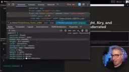
Here's a critical gotcha: if you want to use display: grid or flex to lay out the popover's contents, never write display directly on the popover element itself. Doing so overrides the display: none in the User Agent Styles, making the popover impossible to hide — clicking away or pressing Esc won't close it. Understanding the priority of User Agent Styles is crucial for correctly overriding popover defaults; writing display: grid directly will cause unexpected behavior because it lacks the specificity to interact properly with the browser's internal handling of display: none.
The correct approach is to override the default margin: 0 and inset: auto so the popover is no longer forced to the center. Community CSS Reset solutions for popovers also exist to avoid interference from default styles.
CSS Anchor Positioning: Intelligently Attaching the Popover to Its Trigger
After overriding styles, the popover appears at a fixed position on the page — but typically you want it to hug the trigger button. This is exactly where CSS Anchor Positioning comes in.
CSS Anchor Positioning (CSS Anchor Positioning Level 1) is a new layout mechanism proposed by the CSS Working Group to address a longstanding pain point: how to make a position: fixed or position: absolute element visually "follow" any DOM node, no matter how far apart they are in the document tree. The traditional solution relied on JavaScript reading the target element's getBoundingClientRect() and manually setting coordinates, recalculating on every scroll or window resize — most of the core logic in Floating UI and Popper.js is handling exactly this problem. CSS Anchor Positioning establishes the binding relationship at the CSS level via anchor-name and position-anchor properties, with position synchronization maintained by the browser's layout engine at the compositor thread level. This delivers better performance and natively supports position tracking inside scroll containers. The position-area property uses a nine-cell grid model to concisely describe the position relative to the anchor, replacing tedious manual top/left/right/bottom calculations.
Anchor Positioning has a wonderful feature — the implicit anchor: the button that triggers the popover automatically becomes its anchor. So you only need to set inset to auto and use position-area to specify the direction (e.g., bottom, right, top), and the popover automatically snaps to the correct position relative to the button.
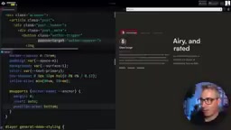
Progressive enhancement is critical here. The core philosophy of progressive enhancement is: ensure basic functionality works in all environments first, then layer on better experiences for environments that support newer features. Although Anchor Positioning has now landed in all major browser engines, it's still marked as "limited availability" with some known bugs. It's recommended to wrap related styles in a feature query:
@supports (anchor-name: --anchor) {
  .popover {
    margin: 0;
    inset: auto;
  }
}
The @supports rule (CSS Feature Queries) has been supported since 2013 and is the standard tool for implementing progressive enhancement. This way, in browsers that support Anchor Positioning the popover attaches to the button, while browsers that don't gracefully fall back to centered display — without breaking functionality. Compared to using JavaScript to detect features and then dynamically loading polyfills, this strategy requires no additional runtime overhead and stays entirely within CSS's declarative paradigm.
Additionally, position-try: flip-block lets the popover automatically flip direction when space is insufficient (e.g., originally pointing upward but auto-switching to downward when there's not enough room at the top). position-area: top span-right lets the popover expand upward while also extending to the right, preventing it from being clipped at the screen edge.
Open and Close Animations with :popover-open and @starting-style
To set the popover's display styles after it opens (such as a grid layout), write them inside the :popover-open pseudo-class:
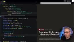
.popover {
  gap: 1rem;
  grid-template-columns: auto 1fr;
}
.popover:popover-open {
  display: grid;
}
Note the gotcha here: gap and grid-template-columns must always exist on the element; only display goes inside :popover-open. Otherwise, the grid layout will abruptly disappear during the closing animation, causing content to jump.
allow-discrete: Enabling Transitions on Discrete Properties
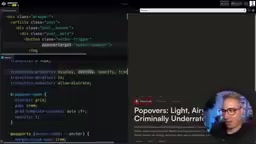
The core challenge of animation here is that traditional CSS cannot transition between display: none and display: grid. The solution is transition-behavior: allow-discrete, which enables discrete properties like display and overlay to participate in transitions — they jump at the very end of the transition process, rather than snapping immediately.
@starting-style became officially available in Chrome 117 and Safari 17.5 in 2023, filling a decade-long gap in CSS animation. Before this, toggling between display: none and a visible state was always a "non-animatable" operation. The traditional developer workaround was setting visibility: hidden + opacity: 0 (leaving the element in the layout but invisible), or simulating hiding with pointer-events: none, then using JavaScript to apply display: none after the transition ended — this pattern is heavily encapsulated in Vue and React transition components, where the underlying logic essentially boils down to listening for the transitionend event before toggling display state. transition-behavior: allow-discrete brings discrete properties like display and overlay into the transition system, defining the semantics of "jump at the end of the transition"; @starting-style solves the problem of an element having no "previous state" to interpolate from when it first enters the render tree. Together, they form a complete enter/exit animation solution without any JavaScript lifecycle hooks.
.popover {
  opacity: 0;
  translate: 0 30px;
  transition: display, overlay, opacity, translate;
  transition-duration: 0.75s;
  transition-behavior: allow-discrete;
}
.popover:popover-open {
  opacity: 1;
  translate: 0 0;
  @starting-style {
    opacity: 0;
    translate: 0 30px;
  }
}
@starting-style: Defining the Element's Initial State on Entry
@starting-style is the key to entry animations. When an element transitions out of display: none, it "appears from nowhere" — the browser has no prior state to transition from. @starting-style (which should be placed at the end of the rule) explicitly defines the element's initial state on entry, giving the transition a clear starting point. From a specification perspective, @starting-style essentially declares a "frame zero" for the element — it only takes effect the first time the element participates in style calculation, and is not triggered by subsequent state changes. This differs semantically from @keyframes 0% in CSS Animations.
Even better, the starting values for the entry animation and the ending values for the exit animation can be different, enabling two distinct animation effects for open and close — for example, sliding in from below and fading in when opening, then fading out upward when closing, creating a richer visual hierarchy.
Summary: The Evolution of Native CSS Interactivity
This example showcases the enormous strides CSS has made in native interactivity in recent years:
popoverattribute: Open/close, light dismiss, focus management, and top layer rendering in a single line of code — no z-index headaches.- CSS Anchor Positioning: Intelligently attaches the popover to its trigger element and automatically flips direction when space is insufficient.
@starting-style+allow-discrete: Bridges the animation gap betweendisplay: noneand visible states, eliminating flashing.
These three capabilities combined allow developers to build interactive components — that previously required JavaScript libraries — with minimal code, better accessibility, and lower performance overhead. While Anchor Positioning's browser compatibility still requires progressive enhancement via @supports, the direction is clear: the browser platform is internalizing complexity, letting web development return to simplicity.
Related articles

Claude Paid Subscription Down for Over a Week with No Response: The Pain Points of AI Service Support
Claude AI paid subscription down for over a week with no support response, exposing systemic gaps in AI service customer support. Analysis of impact, industry shortcomings, and user strategies.

Older Google Home Gets Gemini Live Upgrade: Conditions and Experience Fully Explained
Google is rolling out Gemini Live conversational AI to older Google Home speakers, but subscription or plan requirements may apply. Here's what you need to know.

Older Google Home Gets Gemini Live Upgrade: Complete Breakdown of Requirements and Experience
Google is rolling out Gemini Live conversational AI to older Google Home speakers, but subscription or plan restrictions may apply. Full breakdown of the upgrade details and impact.