Same Prompt, Three AI Models Tested: Astra, Opus 5.5, or Sol 6.1 — Which Wins?

Same OZ recreation prompt, three AI models tested: Astra looks best, Opus has most detail, Sol 6.1 lags behind.
Bilibili creator "Level Up" benchmarked Astra, Opus 5.5, and GPT-6.1 Sol using the same prompt: recreating the OZ virtual world from Summer Wars. Astra took the top spot for overall visual composition and effective use of negative space; Opus 5.5 impressed with richer detail, including tiered arena stands and character customization; Sol 6.1 included all the required elements but lacked cohesive visual identity, falling short of its "near-Astra" billing. The test highlights a key insight: a long feature list doesn't equal a strong final result, and detail density and overall impact need to be weighed separately.
Same Prompt, Three AI Models Tested: Astra, Opus 5.5, or Sol 6.1 — Which Wins?
Recent AI modeling demos all share a common trait — give them one sentence, and they'll generate a fully realized 3D world. From the GPT series to Astra and Opus 5.5, each new release seems more impressive than the last, capable of generating 3D scenes, games, and websites in a single click. It's hard not to want to try them yourself.
To benchmark these models against each other on equal footing, Bilibili creator "Level Up" gave all three the same challenge — recreating the OZ virtual world from the anime film Summer Wars — and ran a head-to-head comparison across Astra, Opus 5.5, and Sol 6.1. The verdict upfront: Astra delivered the best overall visual impression, Opus 5.5 packed in the most detail, and the newly released Sol 6.1 noticeably fell behind.
Why OZ Was Chosen as the Test Case
The OZ virtual world is a perfect benchmark for testing an AI's ability to faithfully recreate a known environment. It features expansive white negative space, floating islands, colorful ring-shaped structures, and crystalline elements drifting through the air. Each individual element seems manageable — spheres, rings, buildings — you could assemble a rough approximation fairly easily.
The real challenge is whether, once those elements are combined, a viewer can immediately recognize it as "the OZ from memory." Good composition isn't about filling every corner — it's about knowing where to leave space and where to concentrate detail. Get the proportional relationship between the central structure and the surrounding islands wrong, and the whole atmosphere collapses.

More critically, the task here was to build a fully functional 3D website that runs in a browser — requiring not just a scene, but characters and interactive elements as well. The longer the task chain, the more likely a model is to fall into the trap of "nailing the composition first, then breaking it when cramming in features later." What this test was really measuring was whether a model could take a complex creative idea and see it through to a coherent, polished final product from start to finish.
Summer Wars (2009), directed by Mamoru Hosoda, features a fictional online virtual world called "OZ" that is instantly recognizable for its visual style: a white background, masses of floating geometric islands, vividly colored ring-shaped architectural clusters, and cartoon avatars representing hundreds of millions of user accounts drifting through the air. Because this world's visual identity is so deeply embedded in viewers' memories, it serves as both a clear reference for a recreation test and a natural litmus test — you can judge whether an AI's output "feels right" based on gut reaction alone, something a randomly generated scene could never offer. Using visually iconic source material with strong collective memory as a benchmark is a common AI evaluation strategy: it sidesteps the problem of "no way to measure a generated result" and anchors judgment to similarity with the original rather than subjective aesthetics.
Astra: The Most Visually Compelling Overall
Astra was the creator's personal favorite. Its biggest strength is the overall visual impression — when you look at a scene, you first register the broad silhouette, then the color distribution, and only then do you start counting individual buildings and decorative elements. Astra's version made you want to stop and take in the whole world before moving on.
For a recreation task, this matters enormously. When there's a clear target in mind and the audience already has a reference, the first thing a result needs to establish is that sense of familiarity — then it can fill in content layer by layer. Astra handled the organization of ring structures and floating zones well: the central subject wasn't overwhelmed by surrounding elements, and the colors didn't compete with each other.
That said, personal preference aside, it's far from a film-accurate recreation. Zoom in and you can see the telltale signs of procedural generation and asset stitching. The intricate yet crisp detail of the movie isn't something a first-pass code model can reproduce. On the engineering side, Astra also implemented character customization, zone switching, a workspace panel, and mini-games — juggling all of that in a long-form task is genuinely harder than generating one beautiful screenshot. The creator's summary: the direction was right, the overall result best matched expectations, but the details still have room to grow.
Opus 5.5: The Most Generous with Detail
Opus 5.5 made a clear impression — more detail, more content. The more you zoomed in and explored different areas, the more it rewarded you.
Take the arena as an example: the implementation included tiered stands, spectator figures, and differentiated sports designs. Each of those is a small thing on its own, but together they transform a location from "there's a circular structure here" into "this actually feels like a sports zone." Beyond that, Opus put considerable effort into the hexagonal character customization portal and combat-related features — you could clearly sense it trying to push the detail further.
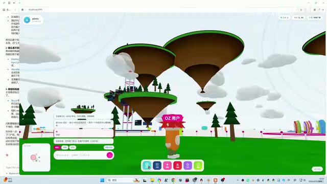
If the only question were which model was more generous with detail, the vote goes to Opus. But the creator still ultimately preferred Astra, for a reason worth unpacking: quantity of detail and overall visual impact are two separate things. OZ itself relies heavily on negative space. Strong local execution is interesting, but when the camera pulls back to the full panorama, everything has to be re-evaluated in relation to the whole world. "Compelling up close" and "moving as a whole" don't always come from the same result — and that tension is precisely what made this comparison so interesting.
Sol 6.1: The Gap Between Official Positioning and Real-World Results
Sol 6.1 (GPT-6.1 Sol) launched on the same day as the test, with an attractive official pitch: near-Astra performance on complex tasks at a lower cost. That made the expectations heading into this project reasonably high.
The result, however, led the creator to declare it a clear disappointment. It's not that nothing was produced — the project did include 3D scenes, characters, and some interactivity, and if you checked off requirements against the brief, you could find corresponding elements. The problem was that when those elements came together on screen, they failed to produce the intended effect.
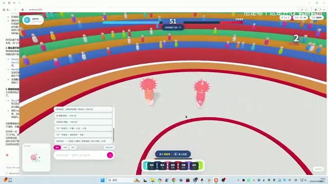
It reads like a "checkbox" submission: all the required nouns are present — goldfish, floating islands, rings — but the overall answer falls short of what the prompt was actually asking for. The task called for a world with visual identity. Scattered elements alone aren't enough; what matters is whether they ultimately come together to form that recognizable image.

It's worth emphasizing: the official claim of "near-Astra performance" refers to the model's general positioning on complex tasks — it doesn't guarantee identical output quality on this specific 3D scene challenge. So this result alone doesn't justify writing Sol off entirely. What can be said with confidence is that in this particular same-prompt recreation test, it fell furthest short of expectations.
GPT-4.1 Sol is one tier in OpenAI's tiered model strategy introduced after the GPT-4 series. "Sol" denotes the cost-performance-optimized version of the lineup, while "Astra" represents the flagship tier. This naming and tiered pricing approach is becoming increasingly common across the AI model industry: under the same underlying architecture, vendors release multiple variants — high, mid, and low — calibrated to different levels of compute consumption and task complexity, allowing developers to choose based on their needs. Sol's official selling point is "covering complex tasks with near-Astra capability at lower API costs," making its intended audience cost-conscious developers who still need to handle demanding tasks, rather than users chasing maximum output quality. In this test, that positioning difference was magnified by the creative recreation scenario, exposing the semantic gap between the official description of "complex tasks" and what creative generative tasks actually demand.
What This Test Reveals: Don't Let Feature Lists Mislead You
The most thought-provoking takeaway from this comparison is this: when evaluating these kinds of projects, the easiest thing to get wrong is letting a long list of implemented features — lots of code, lots of modules — trick you into thinking the job was well done. But the real benchmark remains unchanged: does what it delivered make you feel like it "got it right?"
This is also why there's still value in taking a real project and testing it yourself after a new model launches. Capabilities described in marketing copy only mean something when they translate into visible results on your screen. Swap out the prompt for a different challenge, and the rankings among these three models could flip entirely — so this result is specific to this task, not a permanent label.
For everyday users, the practical takeaway from this test is: don't pick a model based on specs and promotional copy alone. Overall visual impression, detail density, and completion quality often need to be evaluated separately, and different tasks weight those three factors differently.
"Feature list bias" is a common cognitive trap in AI product evaluation: when a model's output contains a large number of visible functional elements — long code, fine-grained module breakdown, clean naming conventions — evaluators tend to overestimate its quality while overlooking whether those features actually serve the core objective. The same phenomenon exists in software engineering project reviews, where it's sometimes called "confusing deliverable quantity with deliverable value." For AI-generated content, this bias is especially pronounced, because language models are naturally good at producing structurally complete, vocabulary-rich text — making it easy to mistake "wrote a lot" for "did it well." Effective evaluation usually requires stepping back and measuring against the task's original goal, not the model's output volume.
Related articles

Why Does the Tesla Roadster Need to Fly? A Deep Dive into Musk's Wild Demo
Tesla's Roadster launch showed wall-climbing, upside-down driving, and flying stunts—but The Vergecast notes the demo car may lack a battery, the Rocket version is invite-only and not street-legal, and the website terms don't guarantee delivery. After nine years of delays, why does this car still need to exist?

AI Is Not a Replacement: Human-AI Collaboration Through the Lens of Factory Root Cause Analysis
Starting from factory root cause analysis, this article explains how AI accelerates evidence chain construction rather than replacing human experts, exploring the pragmatic implementation logic and business value of 'AI supporting people rather than replacing them.'

AI Agent Decision Auditing: Building an Evidence Chain in Regulated Workflows
Starting from a Reddit discussion, this article analyzes three core issues in AI agent decision auditing within regulated workflows: what fields audit records should contain, how to handle feedback latency for erroneous decisions, and how to continuously calibrate LLM judge consistency with human judgment.