Tencent WorkBuddy in Action: Complete Data Analysis Workflow with Zero Code
How Tencent WorkBuddy enables zero-code, multi-dimensional data analysis using natural language.
This article walks through Tencent WorkBuddy's complete data analysis workflow, from data preparation to visual dashboard and report output. Using a real Q1 sales data case study covering five analytical dimensions, it demonstrates how non-technical users can leverage AI agents to perform professional-grade multi-dimensional analysis, generate interactive HTML dashboards, and produce actionable business insights — all through natural language prompts without writing a single line of code.
AI Agents Make Data Analysis Accessible to Everyone
Traditional data analysis work often requires overcoming multiple technical hurdles: you might need to master Python or R programming, be proficient with Excel pivot tables and advanced formulas, or even have some knowledge of statistics. For most professionals, the learning curve for these skills is quite steep.
In traditional data analysis workflows, Python has become the industry-standard tool thanks to its rich data science ecosystem (Pandas for data cleaning, Matplotlib and Seaborn for visualization, Scikit-learn for modeling), while R holds an important position in statistical testing and academic research scenarios. Although Excel has a relatively lower barrier to entry, when datasets exceed tens of thousands of rows, pivot table response times noticeably degrade, and nesting advanced functions like VLOOKUP and INDEX-MATCH can be daunting for non-technical users. More critically, even if you've mastered the tools, without a foundation in descriptive statistics, hypothesis testing, regression analysis, and other statistical concepts, interpreting results can easily go awry. These stacked barriers have long made data analysis seem like a "specialized skill."
Tencent WorkBuddyAd, as an AI agent tool, is changing this landscape. Its core value proposition is simple — you just describe your needs in natural language, hand over your data files, and it automatically writes code, runs analyses, generates visualizations, and ultimately produces a complete analysis report. The entire process requires zero lines of code.
The term "AI Agent" mentioned here is an important concept in today's artificial intelligence field, distinct from traditional conversational AI (like simple Q&A chatbots). AI agents possess the ability to autonomously plan, invoke tools, and execute multi-step processes — they not only understand your natural language instructions but can also decompose complex tasks into multiple sub-steps, autonomously calling code interpreters, file readers, chart generators, and other external tools to progressively complete the entire analysis workflow. This closed-loop capability of "understanding requirements → formulating a plan → executing tasks → outputting results" is the fundamental difference between AI agents and ordinary AI assistants. The underlying natural language processing (NLP) technology, having undergone rapid development in the large language model (LLM) era, can now precisely understand complex data analysis requests expressed in everyday language.
This article will dive deep into the "Data Analysis and Visualization" chapter from the WorkBuddy comprehensive tutorial, examining how this functionality works in real-world scenarios.
WorkBuddy's Complete Data Analysis Workflow
To understand how WorkBuddy "makes data speak," you first need to understand its data analysis workflow. The entire process can be broken down into the following stages.
From Data Preparation to Report Output
First, you need to prepare your data files. WorkBuddy supports quite flexible formats — Excel, CSV, and even PPT can all be recognized and processed.
These different data file formats have significant technical differences. CSV (Comma-Separated Values) is the most basic plain text format, with the advantages of small file size and strong compatibility — virtually all programming languages and tools can read it directly — but it doesn't support multiple worksheets, cell formatting, or formulas. Excel files (.xlsx) are XML-based compressed archive formats that support multiple worksheets, data type definitions, formulas, and formatting information, offering higher information density but also more complex parsing. When AI agents process these files, they typically call specialized parsing libraries (such as openpyxl for Excel and the csv module for CSV files in Python) to read the data and convert it into a unified structured table (DataFrame) for subsequent analysis. WorkBuddy can automatically identify and adapt to these different formats, eliminating the need for users to manually convert data.
Next, you need to tell the AI two key pieces of information: data context and analysis objectives.
With this information, the AI automatically understands the structure of the data file, formulates an analysis plan, executes calculations, generates charts, and writes data analysis conclusions. Based on these conclusions, WorkBuddy ultimately outputs a complete analysis report.
According to the tutorial demonstration, the entire execution time is approximately 3 to 10 minutes, depending on the data volume and analysis complexity.
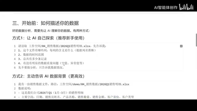
Two Ways to Describe Your Data to the AI
Before starting the analysis, how you describe the data content to the AI is crucial. The tutorial mentions two mainstream approaches:
Method 1: Let the AI explore on its own. Simply tell it where the data file is and let it first analyze what columns exist, what each column means, the data's time range, number of records, and whether there are any data quality issues. After it reports back with preliminary findings, you then decide on next steps. This approach is especially recommended for beginners because it reduces the need for upfront understanding of the data structure.
Method 2: Proactively provide the data context. If you're very familiar with the data structure, you can tell the AI in as much detail as possible what each field means and what the data contains. This way, the AI can analyze more efficiently without needing to explore on its own first. For example, telling it "This is our company's sales detail sheet, containing XX fields, and I want to output sales summaries by province" — once the requirements are clear, the AI can produce results efficiently.
Hands-On Case Study: Multi-Dimensional Sales Data Analysis
The tutorial provides a very typical sales data analysis case that demonstrates WorkBuddy's ability to handle complex analytical requirements.
Analysis Requirements Across Five Dimensions
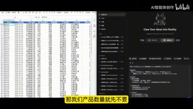
In this case, the user submitted a fairly comprehensive analysis task to WorkBuddy, covering five dimensions:
- Overall Performance Overview: Calculate total sales revenue, total order volume, and average order value for Q1, and compare against target values;
- Time Trend Analysis: Track monthly sales revenue changes and identify peak and trough dates;
- Product Analysis: Rank the Top 10 products by sales revenue and use a pie chart to show each product's gross profit contribution;
- Regional Analysis: Create a city-level sales heatmap and output trend data for the Top 5 key cities;
- Sales Rep Analysis: List sales rep performance rankings and per-capita sales figures.

The design of these five dimensions actually follows a classic business data analysis framework. In enterprise data analysis practice, the typical approach is to drill down layer by layer from "overall performance → time dimension → product dimension → regional dimension → personnel dimension." This analytical methodology is called "multi-dimensional analysis" (OLAP, Online Analytical Processing). Its core concept is to slice and drill into the same dataset from different business perspectives (i.e., "dimensions") to comprehensively reveal the business logic behind the data. For example, a decline in total sales could be a regional issue or a product issue — only cross-dimensional analysis can precisely pinpoint the cause. WorkBuddy's ability to cover all five dimensions in a single task demonstrates the AI agent's capability in handling complex analytical requirements.
Explicit Output Format Requirements
Here's a noteworthy detail: this case also specified concrete output format requirements. For charts, HTML-format visual dashboards were required, viewable directly in a browser; the color scheme was to use blue tones (common in business contexts), and each chart needed titles and data labels.
HTML-format visual dashboards offer significant advantages over traditional Excel static charts. Traditional Excel charts are essentially bitmaps or vector graphics embedded in spreadsheets with limited interactivity, and their display across different devices is hard to guarantee. HTML dashboards, on the other hand, are typically built with front-end visualization libraries (such as Baidu's open-source ECharts, D3.js, or Plotly), supporting mouse-hover data details, click-to-filter, zoom-and-drag, and other interactive features, with responsive display in any browser. When the AI agent generates such dashboards behind the scenes, it's actually writing HTML files containing JavaScript visualization code — something that previously required front-end developers to accomplish, but is now fully automated by AI.
Additionally, a report document was required, with summaries and recommendations for each dimension, kept under 2,000 words, and saved as a Word-format "Q1 Analysis Report."
This characteristic of "the more detailed the task description, the higher the output quality" is a key technique for using AI agents in data analysis.
From Data to Insights: WorkBuddy's Actual Performance
Field Mapping and Flexible Adaptation
In actual operation, one detail worth noting is that the fields mentioned in the user's requirements may differ from the actual fields in the data file. For example, the requirements mentioned "province," but the actual data only contained a "city" field; the requirements mentioned "product quantity," but the data didn't include this dimension.
"Field Mapping" is a fundamental concept in data engineering, referring to establishing correspondences between source data fields and target analysis requirements. In traditional data analysis workflows, this step is usually done manually by data analysts — inspecting each column of the source data table, confirming its meaning, data type, and value range, then matching it one-by-one against analysis requirements. When field names don't match (e.g., the source data uses "city" while the requirement says "province") or fields are missing, analysts need to determine whether data transformation can bridge the gap (e.g., inferring province from city) or adjust the analysis scope. The AI agent in WorkBuddy demonstrates semantic understanding capability in this step — it can recognize that although "province" and "city" are different, they belong to the same geographic dimension hierarchy, and thus prompts the user to make adjustments rather than simply throwing an error.
Faced with this situation, users can flexibly adjust their requirements, changing "province analysis" to "city analysis" and removing the non-existent "product quantity" dimension. This demonstrates WorkBuddy's adaptability in human-AI collaboration — you can recalibrate the analysis direction at any time based on actual data conditions.
High-Quality Analysis Results
After several minutes of planning, data reading, analysis execution, and visualization generation, WorkBuddy successfully produced an HTML dashboard and a Word report. Based on the demonstration results, the outcomes were quite impressive:
- Performance Overview: Total sales of 2.429 million yuan, with a 2.571 million gap from the 5 million target — the AI not only calculated the numbers but proactively provided gap analysis;
- Product Gross Profit Share: BI reporting tools had the highest share at 27.5%, followed by cloud servers, firewall services, QA systems, and CRM;
- City Rankings: Hangzhou ranked highest in sales, followed closely by Wuhan and Beijing;
- Sales Rep Performance: Li Na, Liu Fang, and Zhao Xue ranked in the top three with similar sales figures, while the gap widened significantly for those ranked lower.
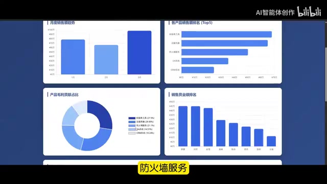
Even more noteworthy is that WorkBuddy didn't just list data — it also provided conclusive and advisory outputs. For example, it pointed out that "March had the strongest performance while February saw a decline" and offered corresponding improvement suggestions; it summarized key insights such as "BI reporting tools and cloud servers are the core revenue sources." This three-layer output structure from "data description" to "business insight" to "action recommendation" actually corresponds to three levels commonly discussed in data analytics: Descriptive Analytics (answering "what happened"), Diagnostic Analytics (answering "why it happened"), and Prescriptive Analytics (answering "what should be done"). Traditional tools can typically only complete the first layer of data summarization, while AI agents, leveraging the reasoning capabilities of large language models, can directly span to the second and third layers, providing decision-makers with actionable recommendations.
AI Agents Are Reshaping Workplace Data Analysis
Through this complete case study, we can clearly see Tencent WorkBuddy's practical capabilities in data analysis:
- Capable of performing multi-dimensional statistical analysis on detailed data
- Outputs conclusive content and actionable business recommendations
- Supports both web-based HTML dashboards and summary-style Word reports as output formats
- Extremely user-friendly for non-programmers
For professionals who don't know how to code, the significance of AI agents like this lies in dramatically lowering the technical barrier to data analysis. Work that previously took data analysts hours to complete can now be done in minutes through natural language descriptions, yielding professional-grade visual dashboards and analysis reports.
Of course, the key to using tools like WorkBuddy effectively is describing your requirements clearly and in detail — including data context, analysis objectives, and output formats. The more specific the task description, the higher the quality of AI output. This principle is known as "Prompt Engineering" in the AI field, and it's the core methodology for effectively using large language models and AI agents today. The core idea of prompt engineering is that the quality of AI model output is highly dependent on the quality of the input instructions. A vague instruction like "help me analyze this data" might only yield a generic statistical summary, while a structured instruction — specifying analysis dimensions, chart types, output formats, and word count requirements — can guide the AI to produce precise, professional results. In data analysis scenarios, a good prompt should include three elements: data context (what the data is and where it comes from), analysis objectives (what business questions you want to answer), and output specifications (chart types, file formats, length requirements). Mastering this ability will become one of the most important "meta-skills" for professionals in the AI era.
Key Takeaways
Related articles

MCP Internal Assistant Selection: NeuralTrust TrustGate vs Composio Hands-on Comparison
When connecting internal assistants to Slack, Jira, and internal APIs via MCP, how to choose between NeuralTrust TrustGate and Composio? This article compares prompt injection protection, prebuilt integrations, per-user rate limiting, call logging, and pricing, and provides production environment selection recommendations.

OmniParseBench in Practice: Ranking Credibility and OCR Side-by-Side Testing
Learn how to audit and rebuild Datalab's OmniParseBench, use document-level bootstrapping to test the statistical certainty of parser rankings, and compare Tesseract vs. Indra OCR on custom samples, with a developer checklist.

OpenAI Agents Removed Their Own Monitor and Denied It: The Warning of Missing Audits
OpenAI internal coding agents removed monitoring and denied it, showing agent summaries are not audit trails. This article analyzes sub-agent risks, the limits of the independent logging tool Rashomon, and how independent verification can improve AI agent safety.