The Most-Used CSS Units in Production Websites — Ranked

Real production CSS rankings show em beats rem, while animation units deg and s crack the top three.
A frontend quiz show episode revealed the actual frequency of CSS unit usage across real production websites — and it upended developer intuitions. px led unchallenged at number one, but the "foot-gunny" em came in second at 91.3% coverage, outranking the widely recommended rem (which landed fifth at 80.3%) largely because Bootstrap and legacy frameworks embed em throughout their internals. Most surprising of all: third and fourth place went to seconds (s) and degrees (deg), driven by the near-universal use of CSS animations and transitions. Percentages, viewport units, and character units all missed the top five entirely.
A Fun CSS Unit Guessing Game
In a YouTube episode presented in a "frontend family feud" format, the host posed a deceptively simple question: What CSS units do developers use most frequently on real, production websites?
These aren't cutting-edge projects chasing the latest tech stack — they're the actual sites scattered across the internet: heavy WordPress deployments, table-based layouts, Bootstrap-powered pages. The technology choices on these sites tend to lag behind, which is precisely what makes them a more honest reflection of how CSS units are actually used in the wild.
Participant Alex confidently opened with pixels (px) as his first answer. That's the gut instinct of virtually every frontend developer, and the data confirmed it — px is indeed ranked number one.
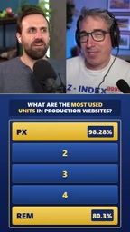
The Surprising Order of the Top Five
The really interesting part isn't the top spot — it's everything that comes after it, which defies quite a few developer assumptions.
px and em Dominate
Coming in at number two is em, with a remarkable coverage rate of 91.3%. That number genuinely surprised the participants. em has a complicated reputation in the developer community — it calculates relative to the parent element's font size, and nesting it creates compounding complexity (what some call being "foot-gunny"). Many developers consciously avoid it.
And yet, em's real-world usage rate actually exceeds the widely recommended rem. The reason isn't hard to figure out: a huge number of legacy sites and frameworks — Bootstrap chief among them — rely heavily on em internally. Even if a developer never writes a single em themselves, they "inherit" the unit from their dependencies. This is the gap between "production reality" and "best practices" in plain sight.
em's calculation logic is worth a brief explanation: it uses the parent element's font size as its reference point. If the parent is 16px, then 1.5em equals 24px. This is intuitive in a flat structure, but in nested elements, each child's em compounds relative to its parent (not the root), causing font sizes to snowball at deeper nesting levels — that's the "foot-gun" developers warn about. Bootstrap 3 and 4 rely extensively on em for internal spacing and font sizing in core components like buttons, forms, and typography. Any project that includes Bootstrap will have em units baked into the build output, whether the developer wrote any or not. This explains why em's coverage rate ends up higher than the "safer, more modern" rem.
rem Lands at Number Five
As the unit recommended by modern CSS best practices, rem surprisingly falls to fifth place, with a coverage rate of 80.3%. rem's appeal for new projects is clear — it calculates relative to the root element, so nesting has no effect. But the sheer volume of legacy sites in production pulls its overall penetration rate below em's.
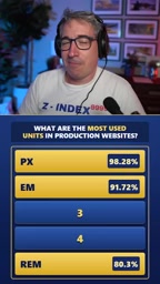
Third and Fourth Place Break Intuition Entirely
When asked to guess numbers three and four, participants hit a clear mental wall. They cycled through several "obviously reasonable" options — all of them wrong:
- Viewport units (vw/vh): Considered "not a bad guess," but didn't come close;
- Character units (ch) and line-height-related units: Also absent from the top five;
- Print units like inches (in): Possibly somewhere in the full list, but nowhere near the top five;
- Percentages (%): Praised as "a great guess" — still wrong.

Participants kept thinking in terms of length and size — the dimension most developers instinctively reach for when the word "unit" comes up.
The Answer: degrees and seconds
The reveal landed like a lightbulb moment:
- 4th place: degrees (deg) — used in rotations, gradient angles,
transformoperations, and more; - 3rd place: seconds (s) — used in
transitionandanimationtiming.
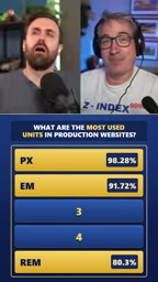
Neither of these describes spatial dimensions. They serve angle and time respectively. Their high rankings make perfect sense when you consider that animations, transitions, and visual transforms are now ubiquitous on the modern web — virtually every site with any level of interactivity uses them.
deg and s belong to CSS's non-length typed value categories. deg appears in contexts like rotate(45deg), linear-gradient(90deg, ...), and hue-rotate(180deg). s (and its sibling ms) is essential in patterns like transition: all 0.3s ease and animation-duration: 1.2s. Modern browsers' GPU compositing optimizations make transform and opacity animations nearly zero-cost in terms of performance, which has pushed developers to adopt transitions and keyframe animations broadly — for hover states, expanding panels, fade-ins, and more. When nearly every nav menu, card hover, and modal entrance carries a transition, s naturally racks up enough appearances to leave percentages and viewport units far behind.
What This Ranking Tells Frontend Developers
This episode was presented as lighthearted entertainment, but it reflects a few realities worth thinking about.
Best practices ≠ actual adoption. rem is universally recommended, yet it ranks below em because of the historical weight of legacy codebases. When assessing a technology's real-world impact, community endorsement only tells part of the story.
"Units" means more than dimensions. The participants' blind spot is entirely typical — the brain defaults to equating "unit" with length. The appearance of degrees and seconds in the top four shows that animation and transforms are now standard fare, and that time and angle units see more use than percentages or viewport units.
Frameworks shape real-world data. em's high coverage rate is largely driven by its presence inside Bootstrap and similar frameworks. Developers' technical choices are often quietly decided by the tools they depend on.
For anyone who writes CSS day-to-day, this ranking is a useful reality check: the units you think you use most may not be the ones dominating the broader internet.
Related articles

AI New Grad Resume Diagnosis: How to Stand Out for ML/CV Roles?
How can AI/ML new grads optimize their resumes to get interviews? Based on a real Reddit case, this article analyzes project selection, depth display, and structure for ML/CV roles, with actionable revision advice.

OpenAI Opens Up Decision Models as Competition with Jev Heats Up
OpenAI makes its decision model widely available, directly challenging first mover Jev. We analyze the impact on the decision model competitive landscape and key considerations for developers and enterprises.

Startup Growth Secrets: Early Sales Are Not the Key
At Disrupt, experts from Lovable, Polska, and Theory Ventures said early startup growth depends not on early sales but on a repeatable sales process, a clear ICP, team development, and data-driven iteration.