Why Can't AI Draw Charts Properly? The Cognitive Blind Spots in LLM Visualization Capabilities

Exploring why advanced AI models consistently fail at generating accurate charts despite excelling at other tasks.
Despite being able to write complex code and pass professional exams, top AI models frequently fail at generating accurate charts. This article analyzes the root causes—from the probabilistic nature of language models and pixel-level image generation to cognitive biases that make polished but incorrect outputs dangerously convincing—and offers practical guidance for human-AI collaboration in data visualization.
A Tweet That Sparked Reflection
Recently, a rather ironic tweet went viral in tech circles: "A company worth billions of dollars, claiming to have the world's smartest AI, can't even produce a single effective chart."
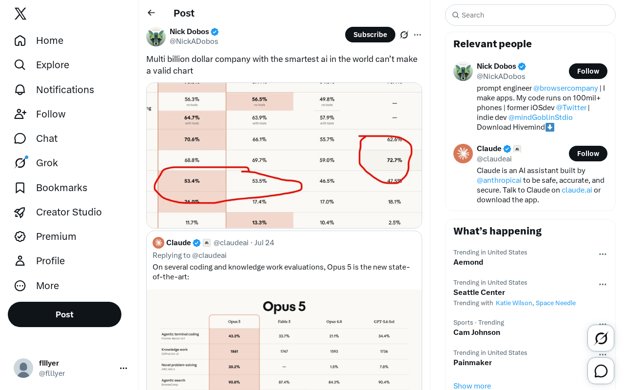
This seemingly tongue-in-cheek comment actually hits a critical pain point at the capability boundary of current large language models (LLMs): The most advanced AI still makes errors that humans would consider remarkably "basic" when generating structured, high-precision visualizations. This contrast—top-tier models can write complex code and pass professional exams, yet stumble on a simple chart—deserves deeper analysis.
Why Can't AI Draw Charts Well?
The Fundamental Limitations of Language Models
The core mechanism of large language models is probabilistic prediction: predicting the next most likely token based on massive text data. This mechanism excels at natural language processing and logical reasoning, but has inherent shortcomings when it comes to visualization tasks requiring spatial geometric precision and numerical consistency.
To understand this limitation, we need to look at the underlying architecture. Current mainstream LLMs (such as the GPT series and Claude series) are all based on the Transformer architecture, whose core is the Self-Attention mechanism—the model understands context by calculating the association weights between each token and every other token in the input sequence. In Autoregressive Generation mode, the model generates only one token at a time, then adds it to the existing sequence to predict the next one. This means that when generating chart descriptions or code, the model doesn't possess an internal representation of a "global canvas"—it cannot simultaneously "see" the entire chart in its mind and check the spatial relationships between elements, the way humans can. Furthermore, the Tokenization process itself introduces precision loss: the number "3.1415926" might be split into multiple tokens, and the model's "understanding" of numerical values is essentially statistical associations between these subword fragments, not actual mathematical computation. This is why models sometimes generate charts that "look reasonable" but are completely wrong in numerical precision—they choose the output that probabilistically "resembles" the correct answer most, rather than arriving at the correct answer through calculation.
Chart generation is essentially a multi-dimensional constraint problem: the scale of axes, the position of data points, the correspondence between legends and data, color differentiation... All these elements require strict internal consistency. Language models tend to "generatively" piece together something that "looks like a chart" without necessarily ensuring that every data point lands in the correct position.
The Gap Between Data and Visuals
When AI is asked to generate charts, there are typically two paths: directly generating images (through image generation models), or generating plotting code (such as Python's matplotlib, frontend charting libraries, etc.).
The direct image generation approach is most prone to errors—the model might produce "pseudo-charts" with jumbled axis numbers, bar heights inconsistent with the data, or pie chart segments that don't add up to 100%. The reason is that image generation models focus on "visual plausibility" at the pixel level, not "logical correctness" at the data level.
Here we need to understand how current mainstream image generation models work. Take Diffusion Models as an example—the technical foundation behind DALL-E, Stable Diffusion, Midjourney, and similar systems—they work by starting from a pure noise image and progressively "recovering" the target image through iterative denoising. During training, the model learns visual patterns from massive image datasets, so it knows "what charts look like": they have axes, bar graphs, and numerical labels. But what it learns are the statistical patterns of pixel distributions, not the mapping logic from data to visual elements. In other words, when a diffusion model generates a bar chart, it's "painting a picture that looks like a bar chart," not "constructing an accurate visualization based on a dataset." It's like a painter who can draw a realistic clock, but the hands don't point to the correct time. This problem is equally prominent in text rendering—early image generation models couldn't even correctly spell words in images. Although recent models have improved significantly in this regard, numerical precision remains a structural challenge.
Even with the code generation approach, misreading data or computational errors can produce a chart that "technically runs but is factually incorrect."
What Truths About AI Capabilities Do Chart Failures Reveal?
AI Intelligence Is Uneven
The most important insight from this case is that AI intelligence is not uniformly balanced. We're accustomed to measuring AI's "intelligence" along a single dimension (such as exam scores or coding ability), but in reality, model performance varies enormously across different tasks.
A model capable of writing papers and solving advanced mathematics problems might perform like a beginner on tasks requiring precise spatial layout. This "jagged capabilities" pattern is a universal characteristic of current AI—exceeding human experts in some dimensions while falling short of ordinary people in others.
The concept of a "jagged frontier" was first systematically proposed and widely discussed in a 2023 study by Harvard Business School. The study had hundreds of Boston Consulting Group (BCG) consultants use GPT-4 to complete different types of tasks. The results showed that on tasks "inside" the capability frontier, consultants using AI outperformed their non-AI-using colleagues by over 40%; but on tasks "outside" the frontier, consultants using AI actually performed worse than those who didn't—because they over-trusted AI's incorrect outputs. This finding has also been confirmed in AI benchmarking: the same model might achieve over 90% on the MMLU (Massive Multitask Language Understanding) test while performing mediocrely on the ARC test, which requires spatial reasoning. This extremely uneven capability distribution requires users to develop independent capability assessments for each specific task category, rather than making blanket judgments about whether a model is "smart or not."
Surface Fluency Masks Deep Flaws
Even more concerning is that AI-generated incorrect charts often look extremely professional. Polished color schemes, standardized layouts, and carefully chosen fonts all cause people to instinctively trust the accuracy of the content. This "fluency bias" is a major hidden danger in AI applications—users are easily deceived by the surface-level professionalism and neglect to verify the underlying data.
This phenomenon has deep theoretical roots in cognitive psychology. Psychologists call it the "Processing Fluency" effect: the human brain uses the ease of information processing as a heuristic cue for judging credibility. In other words, text with beautiful formatting and smooth phrasing is unconsciously judged as "more credible" and "more accurate"—even if its content is completely wrong. This cognitive bias existed before AI (for example, professionally printed materials are more easily trusted than handwritten notes), but AI has dramatically amplified its harm. In the past, creating a professional-looking but erroneous report required significant human effort and deliberate intent; now, AI can generate content with impeccable appearance but riddled with errors in seconds. More importantly, AI's error patterns differ from humans'—when humans make mistakes, they typically show hesitation and lack of confidence, but AI maintains the same fluency and confident tone even when completely "hallucinating," making it harder for recipients to identify errors through conventional social signals. Research shows that even domain experts' error detection rates drop significantly when facing AI-generated content.
In business reports, academic research, news media, and other contexts, a chart that appears authoritative but is actually incorrect can cause serious misdirection.
Practical Implications for AI Applications
Establish Human-AI Collaborative Verification Mechanisms
For any workflow that relies on AI-generated visualizations, human verification is indispensable. Especially for data presentations that inform critical decisions, humans must confirm the accuracy of every data point and every trend line.
The correct positioning is: don't view AI as a "chart maker" to whom you can fully delegate, but rather as an "assistant" that boosts efficiency—it can quickly scaffold chart frameworks and provide multiple visualization options to choose from, but ultimate responsibility for accuracy remains with humans.
Prioritize the Code Generation Path
In practice, having AI generate plotting code (rather than directly generating images) is typically more reliable. Code is verifiable, modifiable, and reproducible—you can check line by line whether the data source is correct, flexibly adjust parameters, and precisely locate problems when errors occur. This "transparent" generation approach is more suitable for serious scenarios with accuracy requirements than black-box image generation.
In the data visualization field, there's a mature open-source tool ecosystem that can work alongside AI. In the Python camp, matplotlib is the most fundamental and flexible bindling library, capable of customizing virtually every visual element of a chart, though its syntax is relatively verbose; seaborn provides a higher-level statistical charting interface on top of matplotlib, particularly suited for exploratory data analysis; Plotly focuses on interactive visualization, producing charts that can be zoomed, hovered over to view data points, and are ideal for dashboards and web application scenarios. In the frontend realm, D3.js is the de facto standard for data-driven documents, binding data directly to DOM elements with extremely high customization freedom, though it has the steepest learning curve; ECharts (open-sourced by Baidu) and Chart.js offer more out-of-the-box experiences. In practice, the best strategy is to have AI generate code for these libraries, then run and iteratively debug it in a local environment. Because these libraries all have comprehensive documentation and large communities, AI's accuracy rate when generating related code is significantly higher than when directly generating images—since the training data contains abundant high-quality plotting code examples. Some emerging tools like Vega-Lite also adopt a declarative JSON specification for describing charts, and this structured intermediate representation format is particularly well-suited for collaborative workflows involving AI generation and human verification.
Maintain a Rational View of AI Capability Claims
Marketing rhetoric like "the world's smartest AI" easily leads the public to have excessively high expectations of AI capabilities. This chart failure case serves as a timely reminder: even the most powerful models have clear capability boundaries. As users, maintaining clear-headed awareness and understanding what models excel at and what they don't is the key to truly leveraging AI's value while mitigating potential risks.
Conclusion
A poorly drawn chart may seem like a minor incident, but it's actually a window into AI's true capabilities. It reminds us: intelligence does not equal omnipotence, and fluency does not equal correctness. In embracing the wave of AI technology, maintaining critical thinking and necessary human verification is the path of responsible application.
As model capabilities continue to evolve, these visualization shortcomings will gradually improve. But the principle of "verify rather than blindly trust" will remain the golden rule of AI applications for the foreseeable future.
Related articles

Poison-Resistant Concept Anchoring: A New Approach to Defending Against AI Data Poisoning
Deep dive into Poison-Resistant Concept Anchoring, defending against data poisoning via signed anchors and bounded updates. Experiments show 62% poison isolation with 0% false rejection rate.

Hungarian Algorithm Explained: Principles, Complexity, and Engineering Implementation Guide
In-depth explanation of the Hungarian Algorithm: core principles, O(N³) time complexity advantages, and engineering implementation. Covers assignment problem definition, step-by-step algorithm walkthrough, Python/C++ libraries, and applications in multi-object tracking and resource scheduling.
OpenAI's First Enterprise AI Report: H…
OpenAI's First Enterprise AI Report: How ChatGPT Is Changing the Way Organizations Work
OpenAI's first enterprise AI report reveals three key traits of ChatGPT Enterprise adoption: the shift from novelty to necessity, writing and coding as top use cases, and data governance as a core prerequisite.