Charts Built for Conversation: A New Data Visualization Paradigm in the Age of AI
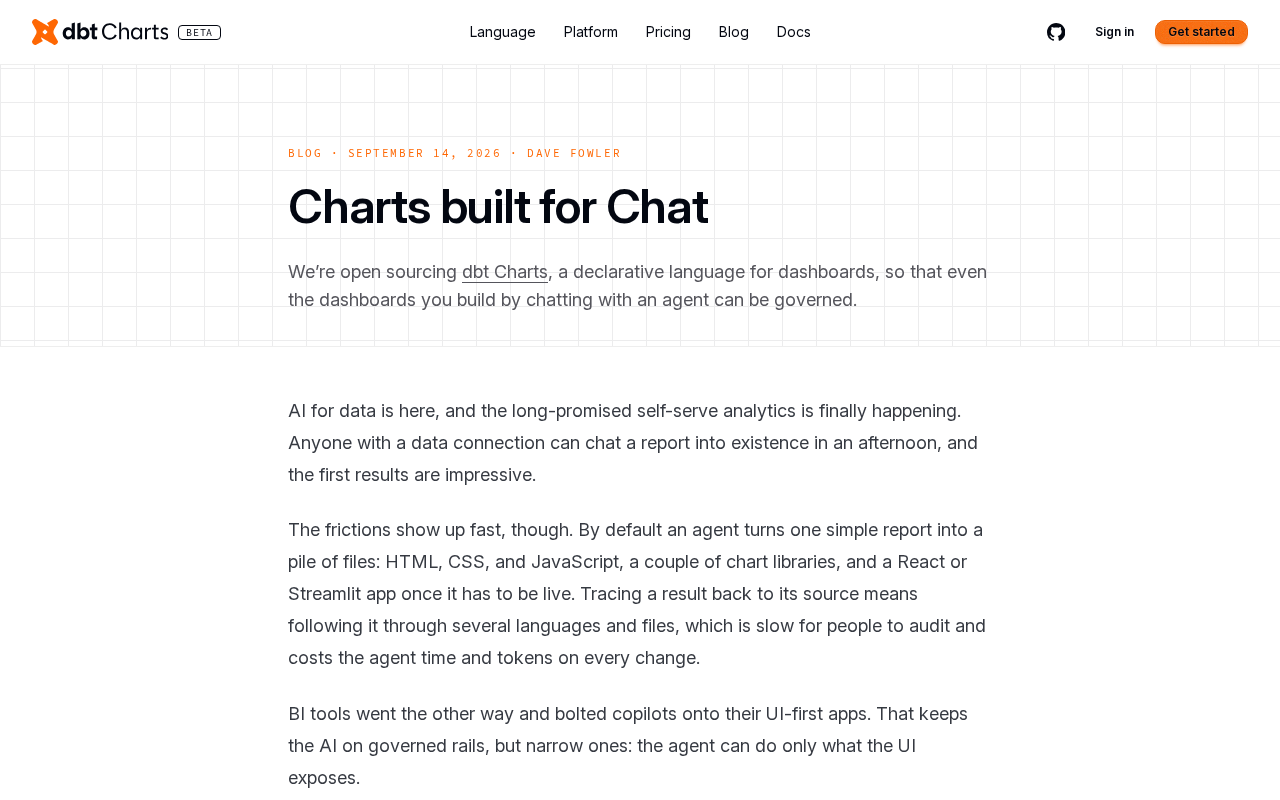
dbtcharts argues AI chat needs charts redesigned for conversation, not just responsive BI embeds.
Traditional BI charts are built for exploratory desktop workflows, but AI chat interfaces demand visualizations that communicate a conclusion at a glance and stay semantically aligned with natural language responses. dbtcharts' 'Charts built for Chat' concept focuses on three shifts: restrained information density, narrow-screen rendering, and alignment between charts and AI-generated text. The idea sparked debate on Hacker News — supporters see it filling a real toolchain gap, while skeptics view it as repackaged responsive design and warn about AI-driven information gatekeeping. At a deeper level, it reflects a paradigm shift from active dashboard exploration to AI-driven conversational analysis.
As AI chat assistants increasingly take over data analysis workflows, a long-overlooked question has come to the surface: who were traditional charts actually designed for? The "Charts built for Chat" concept proposed by dbtcharts attempts to redefine the role of data visualization in AI-powered conversational interfaces. The post garnered 225 points and 70 comments on Hacker News, reflecting strong interest from the developer community.
Why Traditional Charts Don't Work in Chat
For decades, data visualization tools have been designed almost entirely around the desktop workflows of human analysts — large screens, hover interactions, zoomable axes, and dense legend information. These design assumptions presuppose that users will spend time studying a chart, repeatedly dragging, filtering, and drilling into details.
But when charts appear inside a chat window, nearly all of these assumptions break down. Conversational interfaces have limited space, user attention is fleeting, and the interaction mode shifts from "exploration" to "understand at a glance." A complex line chart packed with data points and legends often becomes noise rather than signal inside a chat bubble.
More critically, charts in a chat context are typically part of an AI-generated response. A user asks a natural language question, and the AI needs to quickly communicate a core finding through a single visualization. This means the chart must serve the goal of answering a question, not providing an open canvas for free exploration.
Traditional BI tools like Tableau, Power BI, and Looker are deeply built around the "dashboard" paradigm — users arrange multiple charts on a fixed canvas and explore data through filters, drill-downs, and cross-filtering. These tools assume a degree of data literacy and a willingness to invest time in active analysis. By contrast, users of conversational AI data products (such as analytics assistants built on GPT or Claude) tend to expect "ask once, get an answer" — a fundamentally different cognitive load than browsing a dashboard. The two scenarios have structurally conflicting requirements for visualization: information density, interaction depth, and the degree of self-directed exploration. This is the root reason why simply embedding existing charting libraries into a chat interface so often produces a poor experience.
What "Optimized for Conversation" Actually Means
dbtcharts' central argument is that in AI conversational environments, charts should be redesigned to match the pace and constraints of dialogue. This involves shifts on several levels.
Tighter Information Density Control
Charts in a chat context need restraint. Rather than displaying every possible data dimension, the focus should be on the minimum information needed to answer the question at hand. This requires a charting engine capable of determining "what to show and what to omit" — which is precisely where AI excels. Because it understands the intent behind a user's question, it can tailor the chart's content accordingly.
Rendering for Narrow Screens and Mobile
Conversational interfaces naturally skew toward mobile form factors. Charts need to remain legible at small sizes and avoid relying on desktop interactions like hover. Labels, values, and trends should be rendered directly on the chart rather than hidden behind interactive gestures.
Alignment with Natural Language Responses
When an AI delivers a conclusion in text, the accompanying chart should reinforce — not distract from — that conclusion. The chart and the textual explanation need to point to the same insight, forming a complement rather than a redundancy. This kind of alignment is a dimension that traditional BI tools rarely consider.
Divisions in the Community Discussion
In the Hacker News comment thread, the concept sparked debate from multiple angles. Supporters argue that as more data interaction migrates from dashboards to conversational interfaces, charts purpose-built for chat do fill a genuine gap in the toolchain.
Some developers were more skeptical, questioning whether "charts designed for chat" is anything more than conventional responsive visualization dressed up in marketing language. They argue that good chart design principles should naturally adapt to multiple media, and that chat may not require an entirely new system.
Deeper questions also emerged: when AI decides what charts to show and which details to hide, do users lose complete control over their data? The model of "AI decides what you see" may improve convenience, but it also introduces risks of bias and missing information.
"Responsive Visualization" is a research direction with an existing body of academic work — it refers to charts that dynamically adjust layout and content density based on screen size and device type, predating the AI chat boom by some years. The skeptics' logic is this: if a charting library that rigorously follows responsive design principles can already render correctly on mobile and narrow screens, the incremental value of "designed for chat" needs to be more precisely defined. Is it an engineering-level adaptation to a medium, or does it involve a cognitive-layer decision where AI actively trims information after understanding intent? Conflating the two risks blurring the product's positioning. Supporters counter that the latter — AI-driven information pruning — is the genuine innovation, fundamentally distinct from traditional responsive design, because it introduces the ability to "understand semantics" rather than merely "fit a screen."
The Bigger Picture Behind This Trend
Setting aside the specific product, "Charts built for Chat" reflects a deeper shift in the data interaction paradigm. In the past, users actively opened BI tools, constructed queries, and interpreted charts themselves. Today, users increasingly prefer to ask questions in natural language and let AI handle the entire pipeline from querying to visualization.
In this new flow, visualization is no longer a standalone analytical tool — it becomes an "expression component" of the AI's response. Its value lies not in offering unlimited exploratory freedom, but in conveying a conclusion precisely and quickly. This places entirely new demands on visualization designers: how do you make a chart "speak in concert" with AI, rather than requiring users to "operate" the chart themselves?
For teams building AI-native data products, this means you can't simply drop existing BI chart libraries into a chat interface. You need to rethink what a chart's role is within a conversational context. Whoever can nail this logic first stands to claim an early lead in the AI-native data analytics space.
dbt (data build tool) is an open-source transformation framework aimed at data engineers, focused on building testable, version-controlled data models in data warehouses using SQL. It's one of the core components of the Modern Data Stack. dbtcharts, as a derived product, sits within the dbt ecosystem that is already deeply embedded in data engineering team workflows, giving it a natural advantage in bridging the data transformation layer with the visualization layer. Understanding this context helps clarify the go-to-market path for its "charts designed for conversation" concept: it isn't building an independent BI tool from scratch, but rather extending beyond already-modeled dbt data to cover the AI conversational presentation layer — spanning the complete chain from data modeling to final visual answers.
Closing Thoughts
"Charts built for conversation" is a proposition that appears niche but actually points toward a broader trend. It reminds us that when the interaction surface shifts from dashboards to chat windows, the rules of visual communication need to change with it. Whether or not dbtcharts' specific implementation becomes the standard, this debate over "who charts should serve" is one that everyone building data products deserves to take seriously.
Related articles
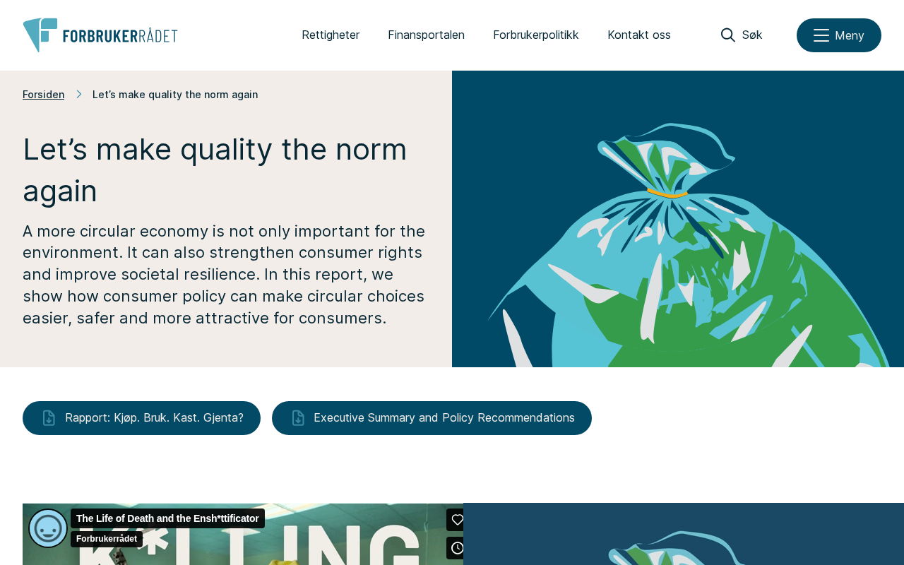
Bringing Software Quality Back to the Mainstream: A Reflection on Speed-First Culture
Why has software quality gone from default to luxury? Exploring technical debt, software bloat, and how to make quality the norm again in a speed-obsessed industry.
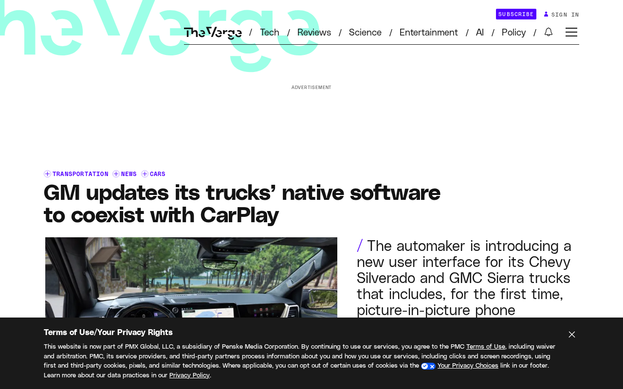
General Motors Updates Native Infotainment Software, Makes Peace with CarPlay
GM updates its best-selling pickup trucks' native infotainment software with safer UI and a new picture-in-picture mode for Apple CarPlay and Android Auto, marking a shift toward coexistence.
How Much of F-Droid's Code Is LLM-Generated? A New Open Source Controversy
Hacker News sparks debate on LLM-generated code in F-Droid. We examine risks to license purity, security auditing, and contribution transparency in the AI era.