Code Visualization Tool Optimization Guide: Key Design Principles for Lowering the Comprehension Barrier

How effective code visualization design lowers comprehension barriers and drives developer tool adoption.
This article explores the growing importance of visualization in developer tools, examining how thoughtful design reduces cognitive load and learning curves. Drawing on cognitive science principles and community feedback patterns, it highlights the industry shift from functionality-first to experience-first development, and offers practical insights for teams building technical tools.
A Noteworthy Visualization Update
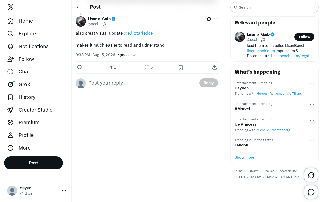
In the iteration of technical tools, improvements to the visualization experience are often underestimated, yet their real-world impact on developers should not be overlooked. Recently, developer Elliot Arledge released a visualization update that garnered considerable positive feedback in the tech community. One user commented directly on Twitter: "This visualization update is great—it makes the content much easier to read and understand."
Though brief, this feedback highlights a core issue: excellent visualization design can significantly lower the comprehension barrier. As AI and programming tools become increasingly complex, presenting abstract logic, data flows, or model architectures in intuitive ways is becoming a critical measure of tool quality.
The importance of visualization design in technical tools can be traced back to the birth of Graphical User Interfaces (GUIs) in the 1980s. From early command-line interfaces to today's interactive visualization panels, the presentation of technical tools has undergone tremendous transformation. In the AI domain, TensorBoard (a visualization tool released by Google in 2015) pioneered letting developers intuitively observe loss curves, network architectures, and parameter distributions during model training. Since then, tools like Jupyter Notebook's rich text output and VS Code's inline visualization plugins have continuously pushed the boundaries of code visualization. This evolutionary trend shows that the tech community's demand for information visualization has never stopped growing.
Why Code Visualization Matters So Much
The Leap from "Functional" to "Understandable"
For many technical tools, implementing functionality is only the first step. What truly determines whether a tool will be widely adopted is often the cognitive burden placed on its users. When a piece of code, an algorithm flow, or a dataset is presented in pure text, even if the information is complete, readers still need to invest significant effort to parse and reconstruct its internal structure.
Good visualization design essentially "pre-processes" information for users. Through thoughtful layout, color differentiation, hierarchical organization, and graphical representation, tools can transform content that would otherwise require line-by-line reading into an overall picture that can be grasped at a glance. This is exactly why this update received praise—"easier to read and understand."
From a cognitive science perspective, this phenomenon has a solid theoretical foundation. Cognitive Load Theory, proposed by educational psychologist John Sweller in 1988, posits that human working memory capacity is limited, typically handling only 4-7 chunks of information simultaneously. When developers face plain-text code or complex technical documentation, the sheer volume of information overwhelms working memory, causing comprehension efficiency to plummet. Effective visualization design significantly reduces extraneous cognitive load through chunking information, using spatial positioning to encode relationships, and employing color for semantic marking—allowing users to devote more cognitive resources to genuine learning and understanding.
Effectively Reducing the Learning Curve
In AI programming and technical education, the value of visualization is particularly pronounced. Whether it's neural network architectures, data flow paths, or component relationships in complex systems, graphical representation can dramatically shorten the onboarding time for newcomers. When abstract concepts are transformed into visual diagrams, learners can build mental models more quickly and master the core usage of tools more efficiently.
Mental Models are a core concept in cognitive science, referring to the internal representations people construct in their minds about how the external world operates. In technical learning, building accurate mental models is a crucial step toward mastering complex systems. Research shows that graphical representation leverages the parallel processing capabilities of the human visual system—the human eye can identify overall image patterns within 200 milliseconds, while understanding equivalent information in text requires seconds or even minutes. Neural network visualization tools like Netron and NN-SVG, as well as data flow visualization tools like D3.js, are all designed based on this cognitive principle, helping learners quickly build spatialized understanding of system structure and data flow.
The Positive Feedback Loop in the Developer Community
Interestingly, this type of feedback often comes from firsthand experience of real users. In the tech community, mutual recognition and suggestions among developers form a healthy iteration loop: creators release updates, the community provides feedback, and creators continuously optimize based on that input.
As an active technical content creator, Elliot Arledge's investment in visualization exemplifies this loop. When users clearly state that "the update makes content more readable," this not only validates the current version but also provides a clear signal for future improvement directions.
This Feedback-Driven Development model in open-source communities has become an increasingly mature collaborative approach. Unlike traditional waterfall development, this model emphasizes rapid release, collection of real user feedback, and then iterative improvement. GitHub's Issue system, technical discussions on Twitter/X, Discord communities, and other platforms form a multi-layered feedback network. Data shows that open-source projects that actively collect and respond to community feedback typically see 2-3x higher user retention rates and contributor growth rates compared to projects developed in isolation. The core value of this model lies in letting real use cases drive product improvement directions, rather than relying solely on developers' subjective judgment.
Implications for Developer Tool Design
This seemingly minor update actually reflects a larger industry trend: developer tools are shifting from "functionality-first" to "experience-first."
In an era of increasing feature homogenization, whoever provides a clearer, more user-friendly experience wins user preference more easily. While visualization improvements don't directly add new features, they indirectly amplify a tool's actual value by enhancing information delivery efficiency.
Developer Experience (DX) has become a key battleground for technical product competition in recent years. Similar to User Experience (UX) for consumer products, DX focuses on the overall feelings developers have when using tools, APIs, documentation, and platforms. According to SlashData's 2023 developer survey report, over 70% of developers stated that documentation quality and tool usability are their top considerations when choosing a tech stack—even taking priority over feature completeness. The success of companies like Stripe, Vercel, and Supabase is largely attributable to their relentless pursuit of DX. In the AI tool space, this trend is even more pronounced—when underlying model capabilities gradually converge, interface design, information organization, and visualization quality become the core differentiators.
For teams currently developing technical tools, this is an important reminder: don't neglect the optimization of interface presentation and information organization. Sometimes, a single visual update that makes code "easier to read and understand" resonates with users more than a pile of new features.
Conclusion
From this brief piece of community feedback, we can see a real microcosm of technical product iteration. Excellent visualization isn't just icing on the cake—it's one of the core means of enhancing tool usability. As AI and programming tools continue to grow in complexity, presenting complex information in intuitive ways will remain a direction well worth developers' sustained investment.
Key Takeaways
Related articles

Black Forager Alexis Nelson: From Foraging to Publishing, Happy Snacking, Don't Die
Black Forager Alexis Nikole Nelson visits Talks at Google, sharing her journey from childhood plant walks with her mother to publishing the cookbook Happy Snacking, Don't Die!, revealing the racial and land history behind foraging's rise and fall in America.

How to Present Your Ideas Effectively: Three Types of Revelation Talks
Revelation talks are the most direct way to convey ideas. This article breaks down three types — Wonder Walk, Dynamic Demo, and DreamScape — with classic examples from David Gayo, Michael Pritchard, and Sylvia Earle.

Modern Web Guidance: Letting AI Write Native Declarative Dialog Popovers
Google's Modern Web Guidance makes AI coding assistants prefer native declarative dialog capabilities over repetitive JavaScript event listeners, measurably cutting boilerplate code.