CSS transition-behavior and @starting-style: Elegant Transitions for display:none

Use transition-behavior and @starting-style to smoothly animate display:none with pure CSS.
CSS has long struggled with animating display:none transitions. Two new features solve this: transition-behavior: allow-discrete enables exit animations by keeping display active during transitions, while @starting-style defines entrance starting points. Combined with translate and opacity, developers can create directional enter/exit animations in pure CSS without JavaScript workarounds.
A Long-Standing Pain Point for Frontend Developers
Implementing show/hide animations for elements in CSS has always been both simple and tricky. The simple part is that we can easily transition properties like opacity and transform; the tricky part is that once you involve switching from display: none to display: grid (or any other value), traditional CSS transitions completely break down.
The reason is that the display property is a discrete animation — it has no intermediate states and can only jump instantaneously between two values. This means when you switch an element from display: none to display: grid, the browser completes the change immediately, and any transition effects attached to it have no chance to run.
The Fundamental Difference Between Discrete and Continuous Animations
CSS properties fall into two major categories in terms of animation behavior: continuous animation properties (like opacity going from 0 to 1, or various transform operations) have computable intermediate values, allowing browsers to generate smooth transition frames through interpolation algorithms; discrete animation properties (like display, visibility, content-visibility) have only finite discrete states with no mathematically meaningful intermediate values. display: none essentially removes the element entirely from the rendering tree — the element occupies no layout space, doesn't respond to events, and doesn't participate in the accessibility tree. This is fundamentally different from opacity: 0 — where the element still exists in the layout but is just visually invisible. Because the "removal" semantics of display: none are so thorough, browsers have long treated it as a non-animatable property.
In the past, developers had to resort to JavaScript's setTimeout, multiple nested containers, or complex class-toggling logic as workarounds. Now, thanks to two brand-new CSS features — transition-behavior and @starting-style — this problem can finally be elegantly solved with pure CSS.
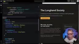
transition-behavior: allow-discrete Solves Exit Animations
The first piece of the puzzle is the transition-behavior property. Setting it to allow-discrete essentially tells the browser: "I'm allowing you to handle transitions for discrete properties (like display)."
transition-behavior: allow-discrete;
Adding this line produces an interesting phenomenon: the closing animation works, but the opening animation doesn't respond.
The logic behind this is worth understanding deeply. When an element changes from display: none to display: grid, it enters this state instantaneously — the browser doesn't know what "before" looked like, so there's no starting point for a transition. However, when the element closes, allow-discrete keeps the display property temporarily at grid until other transitions (like opacity) finish running, allowing the fade-out animation to play smoothly.
In other words, transition-behavior: allow-discrete only solves the "exit" problem — it still lacks an "entrance" starting point.
The @starting-style Rule Completes the Entrance Animation
What completes the entrance animation is the brand-new @starting-style rule. Its purpose is to define a "starting style" for an element — the state from which the element should begin transitioning when it first appears.
.dialog {
  opacity: 1;
  transition: opacity 0.5s, display 0.5s allow-discrete;
}

@starting-style {
  .dialog[open] {
    opacity: 0;
  }
}
With this in place, the element starts from opacity: 0 when it appears and smoothly transitions to opacity: 1, achieving the entrance fade-in animation.

CSS Rule Order Is Crucial
There's an easy-to-miss detail here: the order of rules must be correct. The correct order is — first write the closed state, then the open state, and finally the @starting-style transition starting point.
If you place @starting-style earlier in your stylesheet, it won't work. This is because CSS's cascade mechanism follows a "last one wins" principle — just like media queries, the last declared rule overrides previous ones. Understanding this can save you a tremendous amount of debugging time.
CSS Cascade Mechanism and Rule Priority
The CSS Cascade mechanism determines which rule ultimately takes effect when multiple rules apply to the same element simultaneously. Given equal selector specificity, rules appearing later in the source code override those appearing earlier — this is the "last one wins" principle. The @starting-style rule essentially provides style declarations for an element's "pre-change state," and it participates in cascade calculations similarly to regular rules. If declarations within @starting-style are overridden by subsequent rules of the same specificity, the browser cannot obtain the correct transition starting point, causing the entrance animation to fail. This shares the same principle as the position-sensitivity of @media queries — both are concrete manifestations of the cascade mechanism.

Practical Example: Creating Directional Enter/Exit Animations with translate
Simple fade-in/fade-out isn't cool enough. The real value of @starting-style is that it allows us to design different animation paths for entrance and exit.
The following example combines the translate property to achieve a "slide in from above, slide out below" effect:
.dialog {
  translate: 0 0;
  transition: opacity 0.5s, translate 0.5s, display 0.5s allow-discrete;
}

/* Exit state */
.dialog {
  opacity: 0;
  translate: 0 50px;
}

/* Entrance starting point */
@starting-style {
  .dialog[open] {
    translate: 0 -50px;
  }
}
By setting the entrance starting point to -50px (entering from above) and the exit endpoint to 50px (leaving downward), the element's entrance and exit have distinctly different directional feel, creating a more three-dimensional and natural visual experience.

Don't Forget to Add Transitions to the Backdrop
For <dialog> elements or popovers, there's also the top layer's ::backdrop overlay to consider. The backdrop itself doesn't automatically participate in transitions in some cases. The simplest and most reliable approach is to directly set opacity on ::backdrop and add a transition:
.dialog::backdrop {
  opacity: 0;
  transition: opacity 0.5s, display 0.5s allow-discrete;
}

.dialog[open]::backdrop {
  opacity: 1;
}
The Top Layer Mechanism and the dialog Element
When the HTML <dialog> element's showModal() method is called, it gets promoted to the browser's "Top Layer" — a special rendering layer independent of and above the normal document flow. Elements in the top layer are unaffected by parent elements' z-index, overflow: hidden, transform, and other properties, naturally overlaying all page content. The ::backdrop pseudo-element is a companion feature of the top layer mechanism — it automatically generates a viewport-covering overlay positioned below the dialog but above the page content. Since the lifecycle of top-layer elements is managed by the browser (entering and leaving the top layer is instantaneous), this makes their transition animations more complex than regular elements, which is why the backdrop needs its own separate transition rules.
This way, the overlay can fade in and out in sync with the modal, making the overall transition more cohesive.
Browser Compatibility and Use Cases
It's worth noting that the demos use the newer Invoker Commands (such as command="show-modal") to control the <dialog> toggle. While this feature has landed in major browsers, it's still relatively new. If you want more robust compatibility, you can easily substitute a small amount of JavaScript — the effect is identical with no compatibility issues.
Introduction to the Invoker Commands API
Invoker Commands is a new declarative interaction API in HTML that allows developers to establish behavioral associations between buttons and target elements directly through HTML attributes (like commandfor and command), without writing JavaScript. For example, command="show-modal" makes a button automatically call the target dialog's showModal() method when clicked. The design philosophy of this API is consistent with built-in interactive elements like <details> and <dialog> — building common UI patterns into the platform to reduce JavaScript dependency. As of late 2024, Chrome and Edge have implemented support, with Firefox and Safari following. In production environments, developers can use a progressive enhancement strategy: prefer Invoker Commands while providing a JavaScript fallback.
This transition approach isn't limited to <dialog> elements. Any scenario requiring a switch from display: none to another display value — dropdown menus, toast notifications, sidebar drawers, modal dialogs — can all use this pattern.
Summary: Two Lines of CSS Solve the display Transition Problem
The arrival of this capability marks another important advancement in CSS's animation expressiveness. You only need to remember two key points:
transition-behavior: allow-discrete— Makes discrete properties (likedisplay) transitionable, solving exit animations@starting-style— Defines the starting style when an element first appears, solving entrance animations
Combined with properties like translate and opacity, along with the correct rule ordering, we can write entrance/exit animations in pure CSS that rival JavaScript animation libraries. For frontend developers pursuing lightweight, clean code, this is undoubtedly a new tool worth adopting immediately.
Key Takeaways
Related articles

Chain of Thought Isn't Just for AI: How Humans Can Use CoT to Improve Thinking Quality
Chain of Thought isn't just a prompt trick for large models. Starting from a Hacker News discussion, this article analyzes why CoT works for human thinking too, breaks down actionable ways to transfer it, and highlights the key differences between human CoT and machine CoT.
Cloudflare Teams Up with OpenAI: Closi…
Cloudflare Teams Up with OpenAI: Closing the Loop from Vulnerability Discovery to Defense with AI
Cloudflare uses OpenAI Daybreak to investigate security vulnerabilities and generate reviewable remediation plans, while developers use Codex to boost coding efficiency and quality.

Orca Multi-Agent Orchestration in Practice: A Guide to Parallel Collaboration with Claude and Codex
Orca is Stable AI's free open-source agent workbench supporting 34 agents like Claude Code and Codex in parallel. Learn its Git worktree isolation, multi-model orchestration, and mobile management.