Fledge Alpha Real-World Test: Six Hardcore Tasks Reveal Its True Capabilities

Fledge Alpha runs solid logic but struggles badly with visual polish and interaction detail.
Fledge Alpha, the mysterious model on OpenCode, was stress-tested across six progressively harder tasks. It shows a clear split: core logic and functional implementation are reliable, with basic SVG animation and game controls working correctly. However, it falls short on strict instruction following, visual aesthetics, and interaction details — the Kanban app alone exposed multiple counterintuitive design choices. Complex multi-component SVG scenes also revealed spatial reasoning breakdowns. The overall profile is strong engineering thinking, weak product/design thinking: good enough for rapid prototyping, but not ready for polished deliverables without heavy human intervention.
A mysterious model called Fledge Alpha has appeared on OpenCode, sparking widespread debate in the community about its actual capabilities. One content creator cranked the thinking mode to its highest setting and ran six progressively harder tasks as a stress test, covering instruction following, SVG generation, complex front-end applications, and game implementation. The results showed both strengths and weaknesses — here's a task-by-task breakdown.
Instruction Following: Complete Failure on Sentence Generation
The first task tested strict instruction following — generate a set of sentences where each one ends with the numbers 1 through 10, while keeping the sentences grammatically natural.
The results were disappointing. After checking each sentence, the tester found that not a single one read naturally. The model essentially forced a number onto the end of each sentence, in some cases even omitting necessary measure words or units. This exposed a core coordination weakness: under the dual constraint of strict formatting and natural language fluency, the model can satisfy the hard requirement (ending with a number) but sacrifices the soft one (semantic coherence). For any scenario requiring both precise format compliance and expressive quality, this is a red flag.
SVG Generation: Impressive Then Impressive Fail
The second task asked the model to draw an animated SVG scene of Tigger riding a bicycle past Saturn's rings. Completion was quite high — the turning motion was smooth and continuous, with no obvious glitches or breaks. The only flaw was that Tigger's hands weren't actually resting on the handlebars, a minor detail-level issue.

The third task was also SVG, this time depicting a compound bow archer, and the difficulty spike caused a clear breakdown. The tester quipped that the archer looked awkward with "no neck," and more absurdly, the drawing physics were completely wrong — the archer's hands never touched the arrow yet somehow drew the bow. Comparing the two SVG tasks reveals a pattern: the model handles scenes with simpler structure and single actions reasonably well, but once multiple components need to interact spatially (the relationship between person, bow, and arrow), logical coherence collapses.
SVG (Scalable Vector Graphics) is an XML-based vector format that describes shapes, paths, and animations through mathematical coordinates rather than pixel grids. Generating complex SVG scenes is a uniquely challenging task for language models: they must precisely calculate coordinates, dimensions, and spatial relationships for every element purely at the text level, while ensuring the output XML is syntactically valid and renderable. When a scene involves multiple interdependent components — like body joints, grip relationships, or bowstring tension direction — the model must simultaneously maintain geometric consistency across multiple coordinate sets, which demands extremely high spatial reasoning ability. Most current language models tend to fall into the error pattern of "each element looks reasonable in isolation, but the overall relationships are inconsistent" — the archer drawing a bow without touching the arrow is a textbook example of this failure mode.
Browser OS: Functional but Visually Bare
The fourth task asked the model to implement a "beautifully designed browser operating system." In practice, the overall UI was mediocre at best — the desktop background was plain, and the notification system in the top-right corner was thin: only a WiFi-related popup appeared, clicking the date triggered no response, and the one popup that did exist was bare-bones.
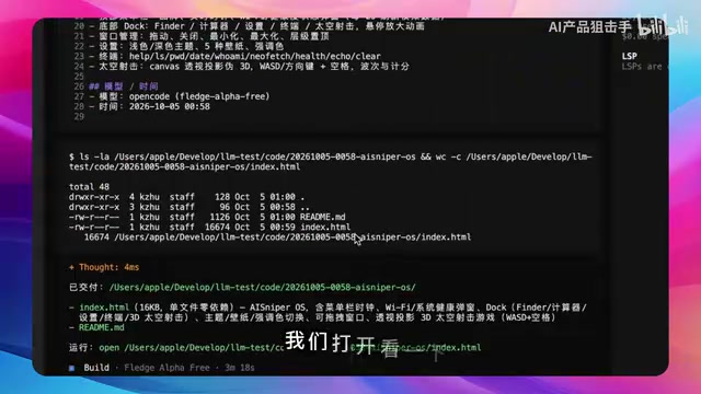
The Dock bar apps worked without major functional issues, but the visual presentation held things back. This task reflects a consistent pattern: the functional logic runs, but aesthetics and polish are severely lacking — nowhere near the "beautiful" standard the prompt called for.
Game Implementation: Playable but Barebones
Rounding out the fourth task was a space shooter game. The directional controls worked fine, but the tester bluntly said the game was "padding things out with a few triangles" — the visual presentation was extremely rough.
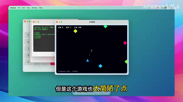
The fifth task's 3D racing game was similar. Both the car and obstacle models looked cheap, and lane changes felt abrupt with exaggerated sideways movement — though the core gameplay logic functioned correctly. Both games reinforced the same conclusion: the model can produce a "working demo," but clearly struggles with visual polish and interaction feel.
Kanban App: Interaction Details Are the Real Problem
The final task was to implement a visually polished Kanban board without any third-party libraries. The UI itself was passable, but the real issues showed up in interaction details — which happen to be the heart of front-end product experience.

Testing revealed multiple interaction flaws:
- Creating a new list doesn't automatically enter edit mode — you have to manually click again to select it, and there's no auto-focus;
- Pressing Enter after typing a to-do title does nothing — you must manually click the "Add" button;
- Selecting a tag displays a hex color picker — an implementation detail that ordinary users have no reason to care about;
- The "Add Task" label is displayed vertically, which looks terrible;
- The delete button is styled in a grayed-out state, giving the visual impression that it's disabled and unclickable.
None of these issues are fatal in isolation, but stacked together they seriously drag down the experience. It suggests the model lacks an understanding of "human-intuitive interaction expectations" — it knows what features need to exist, but doesn't understand how those features should naturally connect.
Kanban originated in Toyota's production management system and was later widely adopted in software engineering. Its core concept is visualizing task flow through card lists (e.g., "To Do → In Progress → Done"). From a front-end implementation standpoint, a "beautiful" Kanban requires not just polished visual styling, but interaction design that matches users' mental models — such as auto-focusing the input field after creating a new item, submitting on Enter, drag-to-reorder, and so on. These details have been refined to industry-standard defaults in mature products like Trello and Linear, and users expect them almost subconsciously. When a model hasn't internalized this "unspoken interaction contract," an implementation that looks functionally complete on paper will create constant friction in actual use — every flaw exposed in this test falls into exactly this category.
Overall Assessment
Across all six tasks, Fledge Alpha presents a clear capability profile:
- Logic and functional implementation are strengths: from SVG animation to game controls, core logic mostly runs correctly;
- Precise instruction following is a weakness: sentence generation under strict constraints failed completely;
- Visual aesthetics and interaction details are the biggest liability: bare-bones UIs, rough game graphics, and counterintuitive Kanban interactions.
In short, this is a model where "engineer thinking" clearly outweighs "product/design thinking." It's adequate for quickly scaffolding functional prototypes, but delivering a genuinely polished end product would require significant human intervention. Whether this model is worth using depends heavily on your use case — if getting the logic to run is enough, it works; if you're aiming for something refined, it falls short.
Related articles

Felix Rieseberg Personal Homepage
Felix Rieseberg's personal homepage sparks attention on Hacker News. This article covers the Slack engineer's technical background, the rise and fall of nativefier, and the value of a developer homepage as a tech calling card.

@ai-sdk/vue 3.0.306 Patch Release Syncs with [email protected] Update
@ai-sdk/vue 3.0.306 released, synced with [email protected]. A routine patch release for the Vercel AI SDK ecosystem with no public API changes; the Vue adapter layer stays version-aligned with the core package.

Gemini 4 Argon API Launches: The Era of Million-Token Output Begins
Google launches Gemini 4 Argon with sparse MoE architecture, up to 1M output tokens, and a 68.90% Vals Index score, available across API, AI Studio, and the Gemini app.