Gemini Flash vs Pro Real-World Test: Can Being 3x Faster Really Replace It?

Gemini Flash is 3x faster and cheaper, but Pro's reliability still wins in production.
Three real-world tests compare Gemini Flash and Pro: a racing game prototype, a subscription management app, and a luxury brand website replica. While Flash impresses with 3x speed, lower cost, and creative flair, it suffers from instruction-following failures, numerical hallucinations, and responsive layout breakdowns. Pro delivers disciplined, accurate results that production environments demand.
After Google launched its next-generation Gemini Flash, the community erupted almost instantly. Someone ran a head-to-head comparison against the previous-generation Pro: given the exact same prompt, Pro's racing game looked like a crude black-and-white sketch from a decade ago, while Flash delivered road textures, weaving traffic, checkpoints along the route, and crash sound effects — visually crushing its big brother from the same family.
So many people jumped to an immediate conclusion: a new model that's three times cheaper and three times faster can fully take over — Pro can be "laid to rest." But veterans who've been burned by Flash in real projects know better: the "small size overtakes the large" drama from big tech companies is never that simple. This article is based on three rounds of real-world testing by a Bilibili creator, helping you settle the score once and for all.
Gemini Flash vs Pro on Paper: Flash Dominates Across the Board
Looking at specs alone, Pro does seem pushed to the brink of retirement. The test data speaks for itself:
- Composite intelligence score: 56 vs 48 — Flash scores higher
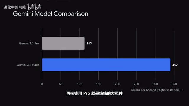
- Output speed: 340 vs 113 tokens per second — a full 3x faster
- API cost: Just $0.75 vs $2.00 per million tokens — not even half of Pro's price
It's worth explaining the billing unit "Token" here. In large language models, a token is the smallest unit of text processing — it doesn't exactly equal a character or a word, but rather a semantic fragment produced by the model's tokenizer. For English, one token corresponds to roughly 4 characters or 0.75 words; for Chinese, a single character is typically encoded as 1–2 tokens. LLM APIs charge separately for input and output tokens, so the price per million tokens directly determines the cost ceiling for large-scale usage. Output speed (tokens/s) determines how long users wait, which is especially critical for streaming applications like chatbots and code completion.
Maxed-out speed, rock-bottom pricing, and higher benchmark scores — anyone looking at this would think continuing to pay for Pro is pure foolishness.
But here's exactly the question: why won't veterans dare to hand all the work over to Flash in real production environments?
To understand this, you need to look at Google's product tiering strategy for the Gemini model family. Google uses a layered approach similar to consumer goods: Ultra (the largest size) targets maximum reasoning capability, Pro (the medium) balances overall performance with cost, and Flash (the smallest) pursues extreme speed and minimal price. This tiering isn't unique to Google — OpenAI's GPT-4o vs GPT-4o mini and Anthropic's Claude Opus vs Claude Haiku follow similar paths. The core differences between tiers typically stem from model parameter count, training data scale, and compute resource allocation during inference. Models with fewer parameters are faster and cheaper to deploy, but they often show measurable gaps in complex logical reasoning, long-context retention, and instruction-following precision.
The answer lies in the three battle-tested rounds below.
Round 1: Paris Racing Game — Flash's Charming "Creative Embellishments"
The first test examined each model's creative instinct. Given the same prompt — "build a Paris racing game" — Flash was like a fast-moving creative whiz with a mind of its own. It didn't just build a car and a finish line; it took the initiative to bundle Parisian landmark names along the route, crash sound effects, and a coin scoreboard — all packed together. The result was playable right out of the box, with noticeably stronger game feel.
Pro, on the other hand, had all the underlying rules in place — obstacle dodging, life deduction, and so on — but the visuals were painfully bare-bones.
Takeaway: On the "rapid visual prototyping" track, Flash's self-starter personality that proactively adds features is genuinely appealing. But if you're counting on it for serious, production-grade engineering work, this habit of "improvising without permission" will instantly become a minefield in the next round.
Round 2: Subscription Management App — Flash's Core Feature Failure
The second test was very practical: build an app for managing personal subscription expenses. The requirements list was crystal clear with just three items — view a list, manually add/delete entries, and support OCR import of billing screenshots.
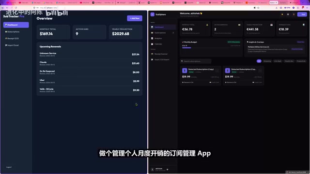
Flash once again went overboard, unilaterally stuffing in a calendar view, spending trend bar charts, and edit/pause/renew buttons for every record. At first glance, it looked like you'd received a full luxury admin dashboard for free.
Flash: Fatal Bugs Beneath the Flashy Shell
But the moment you ran it, the foundation crumbled. All those seemingly premium buttons produced zero response when clicked — the functionality was broken. Even more absurdly, some of the subscription totals it calculated were flat-out wrong — the individual billing numbers didn't add up to the total displayed on screen.
The problems Flash exposed here involve two core technical concepts: Instruction Following and Hallucination. Instruction following measures a model's ability to strictly execute tasks within user-defined constraints rather than freestyle. Lighter models, limited by parameter capacity, tend to perform weaker on constraint adherence and are prone to "over-generation" — adding extra content where the user didn't ask for it. This is closely related to hallucination: the model generates content that appears plausible but is actually nonexistent or incorrect, based on statistical probability. Flash miscalculating subscription totals is a classic case of numerical hallucination, while the unsolicited calendar view and trend charts represent instruction-following failures. In production environments, the harm from these two types of issues far exceeds being slow or looking ugly.

A financial management app that can't even get addition right — that core functionality is essentially dead on arrival.
Pro: Restrained and Reliable Veteran
This is where the previously criticized "rigid" Pro showed its steadiness. It was extremely disciplined: no calendar, no charts — nothing the requirements didn't mention. But every add, delete, update, and query button worked flawlessly end-to-end, and the billing amounts were accurate to the penny.

For the receipt OCR image recognition phase, both models successfully extracted spending details from screenshots and imported them into the system — a tie on that front. Worth noting: the OCR here is no longer traditional optical character recognition. Traditional OCR relies on a pipeline of image preprocessing, character segmentation, and template matching. Multimodal large models like Gemini internalize OCR as part of visual understanding: the model directly receives image pixels as input, extracts features through a vision encoder, then jointly reasons with the language model. This means it doesn't just recognize text character by character but understands layout, table structure, and semantic context — identifying which number is the amount, which is the date, and which is the subscription service name — enabling automatic structured data entry.
The dividing line is crystal clear: Flash is like an eager new hire trying to impress the boss, unilaterally expanding three requirements into six, then crashing on the most critical item — the financials. Pro is like a veteran contractor who builds exactly to spec — does what needs doing, leaves untouched what shouldn't be touched. In real commercial projects, an ugly interface just needs a new skin, but one billing error and the client is calling the authorities.
Round 3: Luxury Brand Website Replica — Where Stability Shows Its True Colors
The final round was frontend replication: both models received the same screenshot of a luxury brand's official website and were asked to produce a pixel-accurate static page. Objectively, neither achieved 100% fidelity on the fine vector icons and micro-interactions, but their critical flaws were on completely different levels.
Flash: Beautiful, but Collapses When Stretched
Flash's page oozed high-end aesthetics at first glance — the color palette and modules screamed luxury. But the moment you stretched the browser window, the responsive header navigation immediately broke and misaligned. And once again it "couldn't keep its hands to itself," forcibly inserting an email subscription box in the page corner that didn't exist anywhere in the original.
The responsive layout breakdown here is a very typical issue in frontend engineering. Responsive Design is a fundamental requirement of modern frontend development — web pages must automatically adjust their layout based on browser window width to display properly across desktops, tablets, and phones. Implementation typically relies on CSS Media Queries, Flexbox, and CSS Grid. When AI generates frontend code focusing only on visual appearance at a fixed width while ignoring layout switching logic at breakpoints, you get the "looks great at first glance, collapses when resized" phenomenon. In real projects, fixing responsive layout misalignment is often more time-consuming than writing from scratch, because you need to trace through nested structures layer by layer to find style conflicts and positioning issues.
Pro: Plain, but Proper
Pro's page was visually more modest, but it dutifully preserved all the design constraints from the original page corners. In real projects, misaligned responsive layouts and fabricated components often require frontend developers to spend twice the debugging time — Pro's "rigidity" actually saves you massive maintenance hours.
Conclusion: Being Fast Is Just the Entry Ticket — Not Causing Problems Is True Productivity
After reviewing all three rounds of battle, the answer to whether you still need Pro is already on the table.
Flash's sweet spot: With its nearly two-thirds cheaper price and 3x speed, it's an unbeatable weapon for creative brainstorming, first-impression visual prototyping, and low-cost rapid experimentation.
Where Pro remains irreplaceable: The moment you enter a real production environment — facing a concrete requirements document, where amounts and data absolutely cannot be miscalculated, and design constraints must be strictly followed — Pro's disciplined reliability of "no unauthorized additions, no calculation errors" remains an irreplaceable ace in the hole.
In the world of large language models, being fast is just a marketing hook. Not causing disasters at critical moments — that's what makes a real productivity tool. When making your choice, rather than blindly chasing the latest thing, ask yourself first: do you want a flashy speedster, or a dependable veteran?
Related articles

JobRunner MCP Server: AI Agents Can Now Fix Failed Java Jobs
JobRunner launches an open-source MCP server enabling AI agents to view cluster status, diagnose failures, and recover Java jobs—incident response from any cloud coding environment or existing agent.

MLAI Digital Launches 9 Security Agents: MCP Server Safeguards the Full Lifecycle of Agentic AI
MLAI Digital launches Security MCP Server with nine built-in specialized security agents covering vulnerability discovery, attack simulation, prompt injection detection, API and infrastructure assessment, and accelerated remediation—embedding security validation across the full Agentic AI lifecycle from development to production.

Running Isaac Lab on H100 GPUs: Exploring Better Approaches
Exploring optimization methods for running Isaac Lab on NVIDIA H100 GPUs, including MIG configuration, mixed precision, TensorRT acceleration, and community experience to improve robotics simulation and reinforcement learning efficiency.