Geographical Fun (1868): Reading Nations Through Humorous Outlines

Geographical Fun (1868) used anthropomorphic outlines to popularize geography and pioneered information design.
The article introduces Geographical Fun: Being Humourous Outlines of Various Countries (1868), which turned national outlines into human or animal figures with rhyming verses to teach geography to young people. It argues that this image-and-rhythm associative memory strategy aligns with cognitive psychology, lowering cognitive barriers and improving retention. As an early precursor to infographics, its "familiar explains unfamiliar" approach continues in modern data visualization, science illustration, and memes. In an age of AI-generated content, its manual creativity and imaginative reconstruction of information remain inspiring for content creators.
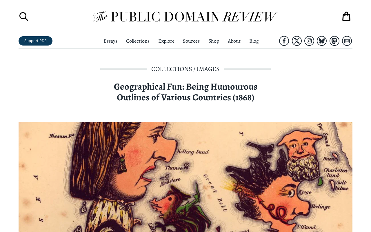
On Hacker News, a post about Geographical Fun: Being Humourous Outlines of Various Countries (1868) sparked a small discussion. Published in 1868, this book depicts different countries through anthropomorphic cartoon outlines, turning geographical knowledge into visual humor. Although the original post had only 6 points and no comments, the content itself is a worthwhile early case study in information design.
An 1868 "Geographic Meme"
The full title of Geographical Fun is "Geographical Fun: Being Humourous Outlines of Various Countries." It is not a traditional atlas, but rather transforms national borders into figures of people or animals, accompanied by rhyming verses. For example, Britain might be drawn as a lion, while France appears as an elegant lady. This approach looks like an early attempt at "national personification" today, but in the 19th century it served the task of teaching geography to young people.
The Educational Intent Behind Visual Humor
In 1868, geography education often relied on dry map memorization. This book lowered the cognitive barrier through exaggerated outlines and rhyming text. The author leveraged people's existing awareness of country shapes, associating them with familiar images to deepen memory. This "associative memory technique" has been proven effective in cognitive psychology: combining images with rhythm improves information retention. Although today we have interactive maps and animations, the core idea remains the same—using fun to stimulate learning motivation.
The more formal terms in cognitive psychology for the "associative memory technique" are "imagery encoding" and "elaborative rehearsal." Dual Coding Theory (proposed by Paivio) holds that if information is encoded through both verbal and visual channels, two mutually retrievable memory traces are formed, thereby improving recall. Rhythm and rhyme, meanwhile, enhance short-term retention via the phonological loop and make material easier to verbally rehearse and transmit across generations—which is also why nursery rhymes and mnemonic verses are widely used in traditional education.
However, such memory advantages have limits: image association is good at helping remember "what it is," but may not convey precise boundaries, proportions, or hierarchical relationships. Therefore, when evaluating the educational value of Geographical Fun, it can be positioned as an "entry-level motivation stimulator" rather than a "knowledge carrier"—it is responsible for making learners willing to look and able to remember the approximate shapes of countries, while precise geographical knowledge still requires specialized maps and measurement tools. This division of labor still applies in educational product design today.
From Geographic Comics to Modern Infographics
Transforming complex information into accessible graphics is the core of information design. This 1868 book can be seen as a precursor to infographics: it translated abstract political boundaries into concrete visual symbols. Modern data visualization, popular science illustration, and even memes all continue this strategy of "explaining the unfamiliar through the familiar." Hacker News readers are interested in such historical materials often because they can inspire current product design—for example, how to make educational app interfaces more engaging.
Infographic, as a professional term and mature design category, is generally considered to have taken shape in the late 20th century, but when academia traces its lineage, earlier precedents are often mentioned: William Playfair's invention of bar and line charts in 1786, Nightingale's rose diagram in 1857, and the statistical graphics used by Florence Nightingale and others in mid-19th-century public health reform. These works share the same design logic as Geographical Fun—translating abstract data or spatial relationships that are difficult to grasp intuitively into shapes and images that the human visual system is good at processing quickly.
Strictly speaking, Geographical Fun is closer to "anthropomorphic cartographic caricature" than to modern data visualization, because it does not encode quantitative information but instead creates associations through outline similarity. Yet the two share the same communication mechanism: both improve memorability by reducing cognitive load and engaging emotional responses. Understanding this distinction helps assess what is transferable from historical cases in contemporary design—what can be borrowed is the translation approach and humorous strategy, not the specific graphic techniques.
Why It Still Matters Today
Although technological means are now vastly different, Geographical Fun reminds us that humor and creativity are communication tools that transcend eras. In an age of proliferating AI-generated content, hand-drawn anthropomorphic outlines seem all the more precious. It demonstrates how humans reconstruct information through imagination—a capability that AI cannot fully replicate. For content creators, finding inspiration from history may be more valuable than chasing the latest tools.
(Note: Since the original material contains only the title and minimal metadata, this article interprets the book based on its known background and does not cite specific page content.)
Background Supplement
Extended Context: The Tradition of National Personification
Geographical Fun is not an isolated phenomenon but part of a visual tradition prevalent in 19th-century Europe. National personification has even older roots: Britain's John Bull dates back to the early 18th century, France's Marianne became a symbol of the republic after the French Revolution, and the United States has Uncle Sam and Columbia. Unlike these political symbols, the personification in Geographical Fun is built directly on the geometric feature of "national border outlines," thus serving both map recognition and image association.
This tradition continues today in forms such as "Countryballs" and has been extensively remixed in internet culture. Understanding this lineage helps readers see clearly that personification is never merely decorative; it also carries identity, stereotypes, and political metaphor—some images in the book may appear to carry obvious period prejudices today, which is also a critical perspective to maintain when studying such historical materials.
One-line Summary
Geographical Fun (1868) popularized geography through anthropomorphic outlines and was a pioneer of information design.
Paragraph Summary
The article introduces Geographical Fun: Being Humourous Outlines of Various Countries, published in 1868, which transformed national outlines into human or animal figures accompanied by rhyming verses to teach geography to young people. It notes that this associative memory strategy combining images and rhythm aligns with cognitive psychology principles, lowering cognitive barriers and improving retention. From a design history perspective, the book can be seen as an early precursor to infographics, and its strategy of "explaining the unfamiliar through the familiar" continues in modern data visualization, popular science illustration, and even memes. The article concludes that in an age of proliferating AI-generated content, this manual creativity and ability to reconstruct information through imagination still offer inspiration, and content creators can find ideas in historical materials.
Related articles

Chain of Thought Isn't Just for AI: How Humans Can Use CoT to Improve Thinking Quality
Chain of Thought isn't just a prompt trick for large models. Starting from a Hacker News discussion, this article analyzes why CoT works for human thinking too, breaks down actionable ways to transfer it, and highlights the key differences between human CoT and machine CoT.
Cloudflare Teams Up with OpenAI: Closi…
Cloudflare Teams Up with OpenAI: Closing the Loop from Vulnerability Discovery to Defense with AI
Cloudflare uses OpenAI Daybreak to investigate security vulnerabilities and generate reviewable remediation plans, while developers use Codex to boost coding efficiency and quality.

Orca Multi-Agent Orchestration in Practice: A Guide to Parallel Collaboration with Claude and Codex
Orca is Stable AI's free open-source agent workbench supporting 34 agents like Claude Code and Codex in parallel. Learn its Git worktree isolation, multi-model orchestration, and mobile management.