Google Timeline Visualizer: Turn Your Google Location History into Annual Travel Maps

An open-source tool that turns Google Location History into stunning annual travel maps.
google-timeline-visualizer is a trending open-source project that converts Google Location History data into beautiful annual travel maps. Built in Kotlin, it parses exported JSON data, cleans GPS drift, and renders year-long trajectories on maps. Its popularity stems from strong social sharing appeal, local-first privacy control, and timely relevance as Google migrates Timeline data to device-only storage.
Project Overview
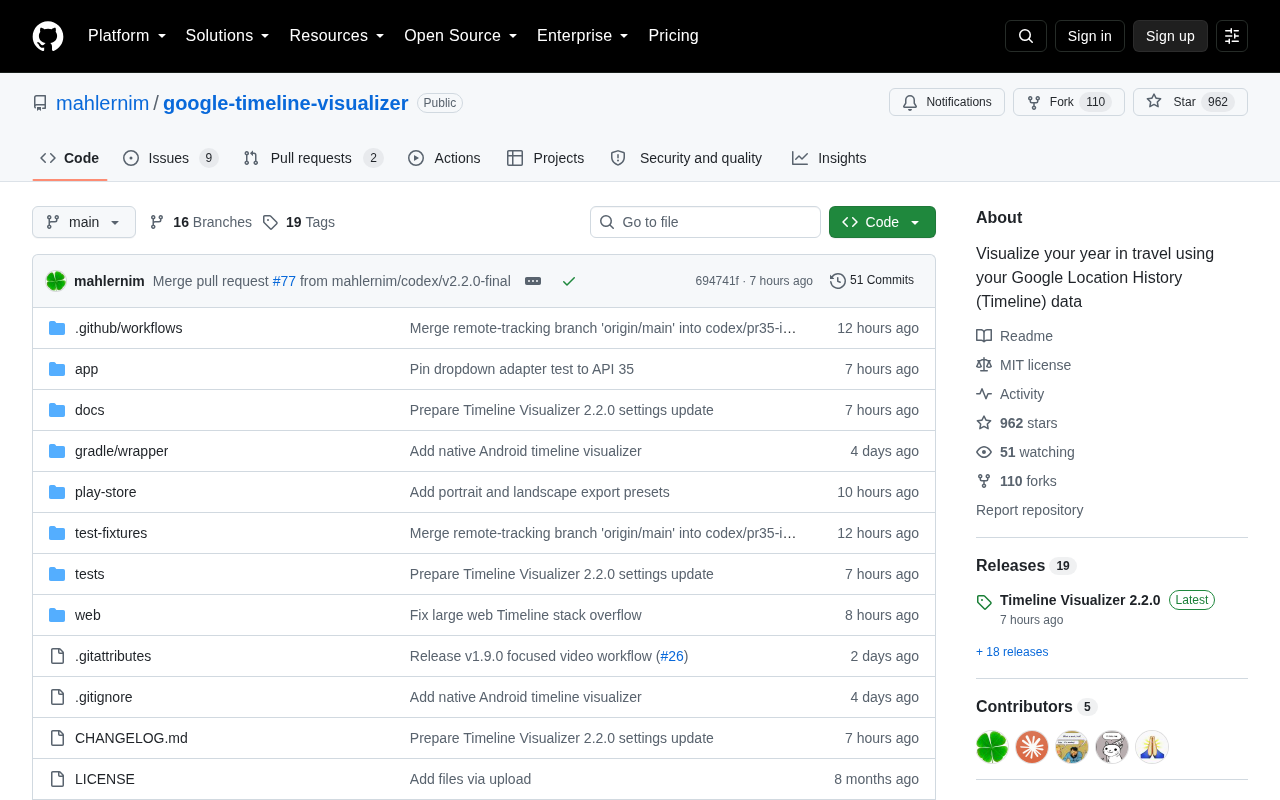
Recently, an open-source project called google-timeline-visualizer has been rapidly gaining traction on GitHub, earning 575 new stars in a single day and accumulating 906 Stars and 102 Forks in total. Created by developer mahlernim, this tool has a crystal-clear core function: it takes your Google Location History / Timeline data and visualizes your travel trajectories from the past year.
For users who love documenting their lives, enjoy reviewing their travels, or are simply curious about their movement patterns over the course of a year, this is an incredibly appealing tool. It transforms cold latitude and longitude coordinates scattered across Google's servers into intuitive, beautifully rendered annual travel maps.
An interesting detail: the project is developed in Kotlin. Kotlin is a modern programming language created by JetBrains, and in 2017, Google announced it as the official preferred language for Android development. Beyond mobile development, Kotlin also boasts powerful multiplatform (Kotlin Multiplatform) capabilities—it can compile to JVM bytecode, JavaScript, and native binaries, enabling the same business logic code to be shared across server-side, web frontend, and mobile platforms. Kotlin's Coroutines mechanism also makes it excel at handling large volumes of I/O-intensive tasks (such as parsing massive JSON location data), offering both code conciseness and execution efficiency. This hints that the tool may target mobile scenarios or leverage Kotlin's JVM ecosystem and multiplatform capabilities for efficient data processing.
What Problem Does It Solve
Google's Timeline feature has been silently recording users' location information in the background for years. While Google officially provides a timeline viewing feature within its Maps app, it's more oriented toward fragmented queries like "where did I go on a specific day" and lacks a holistic, annual-level visual summary.
From Raw Data to Intuitive Visualizations
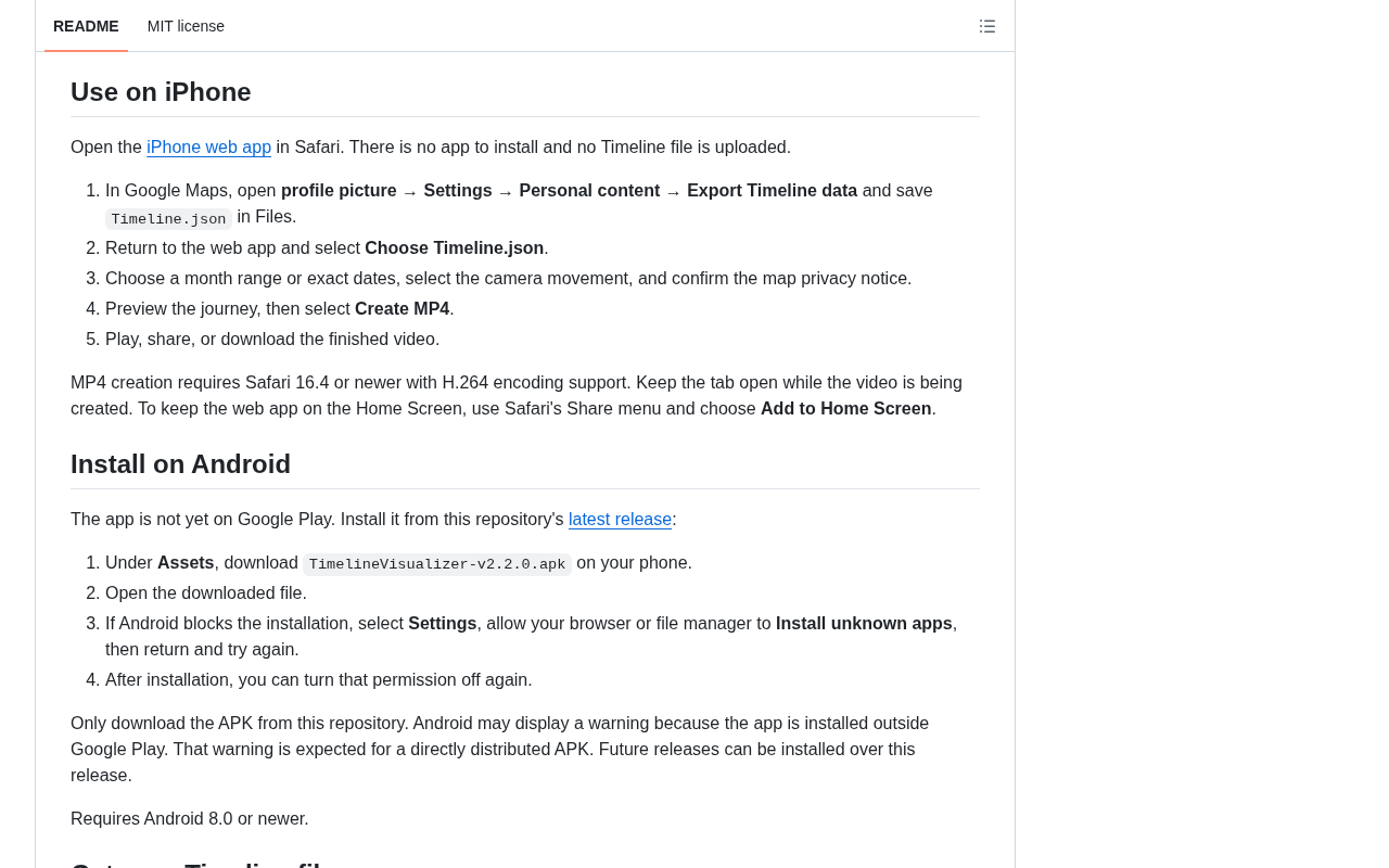
Users can export their location history data through Google Takeout (typically in JSON format). Google Takeout is a data export service provided by Google that allows users to download copies of their data generated across various Google services, covering dozens of products including Gmail, Google Photos, YouTube watch history, and more. After export, the JSON files contain fields such as timestamps (timestampMs), coordinates (latitudeE7/longitudeE7, in units of 10⁻⁷ degrees), accuracy radius, and inferred activity types (such as walking, driving, cycling). A single power user's location history file can reach hundreds of megabytes or even several gigabytes, containing millions of data points—raw data that is virtually unreadable for the average person.
This is where google-timeline-visualizer delivers its value:
- Data Parsing: Reads and processes Google's exported Timeline data files, including cleaning GPS drift points and anomalous location jumps;
- Trajectory Rendering: Draws the full year's movement paths on a map, employing line simplification algorithms and performance optimizations to handle hundreds of thousands of coordinate points;
- Annual Summary: Generates a "year in review"-style travel panorama, letting users see at a glance which cities they visited and which flight routes they took throughout the year.
On the technical implementation side of geographic trajectory visualization, rendering massive GPS coordinate datasets as smooth map trajectories is no simple feat. Raw location points may contain positioning errors caused by building obstruction or signal reflection (GPS drift), requiring smoothing through Kalman filtering or road-matching algorithms. When trajectory points reach the hundreds-of-thousands scale, direct rendering causes UI lag, typically necessitating line simplification algorithms like Douglas-Peucker to reduce point density, or using WebGL for accelerated rendering.
This form of "personal data annual review" shares the same spirit as widely popular products like Spotify Wrapped and GitHub's annual contribution graphs—presenting users' own data back to them in a ceremonial way. The "annual review" as a product format was popularized by Spotify Wrapped in 2016. Its core mechanism leverages the "Self-Reference Effect"—humans naturally have higher memory retention and emotional resonance with information related to themselves. The essence of user sharing is displaying self-identity rather than advertising for the platform, making it an extremely low-cost vehicle for viral distribution.
Why Did It Suddenly Explode in Popularity
For a utility project to gain hundreds of Stars in a short period, several key factors are typically at play.
Strong Emotional and Sharing Appeal
Annual travel maps inherently possess social sharing DNA. People love sharing on social media how many kilometers they covered or how many countries they visited in a year. This shareable visual output drives organic word-of-mouth promotion. As mentioned earlier with the Self-Reference Effect, when users see their unique travel trajectories beautifully presented, their desire to share is greatly amplified. Each share sparks curiosity and imitation among viewers, creating a positive feedback loop.
The Appeal of Privacy Control
In an era where data privacy is increasingly valued, an open-source solution that "uses your own exported data and generates visualizations locally" is far more reassuring than relying on third-party cloud services to upload personal location data. Users retain complete control over their location data, which is especially important for privacy-conscious individuals. Open-source code means anyone can audit the data processing workflow to confirm no data exfiltration occurs—a particularly compelling feature against the backdrop of increasingly prevalent zero-trust security principles.
Timely Feature Changes
A noteworthy background factor: Google has made significant adjustments to its Location History feature in recent years. Google Timeline was originally launched under the name "Location History" in 2013, storing user location data on Google's cloud servers for an extended period. In late 2023, Google announced it would migrate Timeline data from the cloud to local device storage, retaining only the most recent 3 months by default and no longer automatically backing up to the cloud. This change stemmed from years of regulatory pressure and user privacy lawsuits—previous reports had revealed that Google continued collecting location data through other channels even when users had disabled the Location History feature.
This transition prompted large numbers of users to export their historical data before the migration deadline, objectively creating strong demand for third-party visualization tools. Many long-time users who had accumulated years of location data, facing the urgency of "export it or potentially lose it," backed up their data through Google Takeout. Once they had the data in hand, "how to make meaningful use of it" became the natural next question.
Usage and Technical Considerations
Data Acquisition and Workflow
While the tool itself is open-source and free, using it still requires certain steps: users must first go to Google Takeout or export Timeline data from their phone, then import the files into the tool. The export process itself can take several hours (Google packages the data and sends a download notification via email), and the exported archive may contain multiple JSON files split by year or month. Users need to understand the file structure to import correctly. For non-technical users, this step can present a barrier—a common UX pain point shared by similar tools.
Extension Possibilities Through Open Source
As an open-source project, google-timeline-visualizer's greatest advantage lies in transparency and extensibility. The developer community can build upon it with secondary development—adding more visualization styles (heatmaps, time-dimension animations, etc.), supporting different data formats (such as GPX, KML, and other universal geographic data formats), optimizing map rendering performance, integrating additional base map services (Mapbox, OpenStreetMap, etc.), or even extending it into a universal visualization framework supporting location data from other platforms (such as Apple's Significant Locations, Samsung Find My Mobile, etc.). The 102 Forks indicate that many people are already exploring on this foundation.
Conclusion
google-timeline-visualizer is a textbook example of a "small but beautiful" open-source tool. It doesn't have a complex business model or flashy AI gimmicks. Instead, it precisely addresses a genuine user need—enabling everyone to elegantly review their year's worth of movement and travel.
In the niche field of personal data visualization, projects like this remind us that data's value lies not merely in being collected, but in being meaningfully presented. As major platforms gradually return data control to users under privacy compliance pressure, "personal data sovereignty" is evolving from an abstract concept into actionable reality. Tools like google-timeline-visualizer are the concrete vehicles through which users exercise data sovereignty and extract value from their own data. If you're a heavy Google Maps user, consider exporting your Timeline data and discovering what journeys you actually took this year.
Related articles

Felix Rieseberg Personal Homepage
Felix Rieseberg's personal homepage sparks attention on Hacker News. This article covers the Slack engineer's technical background, the rise and fall of nativefier, and the value of a developer homepage as a tech calling card.

@ai-sdk/vue 3.0.306 Patch Release Syncs with [email protected] Update
@ai-sdk/vue 3.0.306 released, synced with [email protected]. A routine patch release for the Vercel AI SDK ecosystem with no public API changes; the Vue adapter layer stays version-aligned with the core package.

Gemini 4 Argon API Launches: The Era of Million-Token Output Begins
Google launches Gemini 4 Argon with sparse MoE architecture, up to 1M output tokens, and a 68.90% Vals Index score, available across API, AI Studio, and the Gemini app.