HTML Native Popover Attribute: Zero JavaScript Popover Interactions

Build fully interactive popovers with pure HTML using the native popover attribute — no JavaScript required.
The HTML native `popover` attribute lets you build fully functional popovers — including click-to-open, light dismiss, and Esc-to-close — without writing any JavaScript. Supported in Chrome 114+, Safari 17+, and Firefox 125+, it leverages the browser's Top Layer for reliable stacking, includes built-in accessibility support, and pairs with CSS for custom animations and backdrops.
Popovers No Longer Require JavaScript
In front-end development, popovers are among the most common interactive components — click a button to reveal content, click outside to dismiss it, press Esc to close. In the past, implementing these behaviors typically required writing substantial JavaScript, or pulling in third-party libraries to manage state, listen for events, and handle focus.
With the official arrival of HTML's native popover attribute, all of that has changed. As the original video author put it: "All of this can be done without writing any JavaScript." This article takes a deep dive into this "magical" new HTML feature.
Standardization History: The HTML Popover API didn't emerge overnight. It went through a lengthy Web standards discussion process, initially driven by the Open UI Community Group (part of W3C), with the goal of unifying how major frameworks implement the ubiquitous "floating layer" UI pattern. In 2023, Chrome 114 was the first to ship official support, followed by Safari 17 and Firefox 125, completing full coverage across all major browsers.
Basic Usage of the popover Attribute
Step 1: Add the popover Attribute to an Element
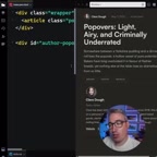
The core idea behind native popovers is straightforward. Start by adding the popover attribute to whichever element you want to use as a popover (for example, a <div>):
<div id="author-popover" popover>
  <!-- Popover content -->
</div>
You might not have noticed, but once you add this attribute, the element disappears "like magic." That's because browsers automatically apply display: none to elements with the popover attribute, hiding them from the render tree until triggered.
There's an important underlying mechanism worth understanding: when a popover is triggered, the element is promoted to the browser's Top Layer — a special rendering layer that exists independently of the normal document flow and z-index stacking context (the <dialog> element and fullscreen elements use the same mechanism). This means that even if the popover element is deeply nested in the DOM, or a parent element has overflow: hidden, the popover will still correctly float above all other content. This completely eliminates the infamous z-index wars and container clipping issues that plague traditional implementations.
Three modes for the popover attribute value:
popover(equivalent topopover="auto"): The default "auto" mode, which supports light dismiss. Only one auto-type popover can be visible at a time — opening a new one automatically closes the previous one.popover="manual": "Manual" mode, which does not support light dismiss and is unaffected by other popovers. Closing must be triggered explicitly. Suitable for persistent overlays like tooltips.popover="hint"(experimental): Designed specifically for hint/tooltip scenarios.
Understanding these three modes allows you to choose the most appropriate behavior for different use cases.
Step 2: Set Up the Trigger Button
Next, you need a button to control the popover's visibility. Simply add the popovertarget attribute to the button and set its value to the id of the popover element:
<button popovertarget="author-popover">
  Show Author Info
</button>
The value of popovertarget must exactly match the id of the element with the popover attribute. The browser will automatically establish the link between the two.
In addition to popovertarget, trigger buttons also support the popovertargetaction attribute for fine-grained control: show (show only), hide (hide only), or toggle (default, toggles visibility). When programmatic control is needed, the corresponding JavaScript APIs are also available: element.showPopover(), element.hidePopover(), and element.togglePopover(). You can also listen for beforetoggle and toggle events to respond to state changes. This makes popover flexible enough for both pure-HTML scenarios and complex interactive ones.

Built-in Interaction Behaviors
Automatic Show and Dismiss Logic
Once you've completed the two steps above, the magic happens: click the button and the popover appears. Better yet, you get a complete interaction experience without writing a single additional line of code:
- Click outside to close: This is called "light dismiss" — clicking anywhere outside the popover automatically closes it.
- Press Esc to close: Matches users' intuitive expectations for overlay interactions.
In traditional implementations, these behaviors typically require listening for global click and keydown events, while carefully handling event bubbling and edge cases. Now, the browser handles all of this natively.
Built-in Accessibility Advantages
Using the native popover attribute comes with a hidden bonus: significantly better accessibility (a11y) support out of the box. The browser automatically handles focus management, semantic annotations for screen readers, and other details — for example, communicating the popover's expanded/collapsed state to assistive technologies via ARIA attributes, and moving keyboard focus into the popover when it opens. These are exactly the details that are most easily overlooked when hand-rolling JavaScript implementations, and have long been a pain point for custom component libraries.
Advanced: Styling and Animation
Adding a Backdrop and Transition Effects
Native popover doesn't mean limited functionality. You can still add rich visual presentation to your popovers:
- Drop shadow: Use CSS
box-shadowto give the popover visual depth. - Backdrop: Use the
::backdroppseudo-element to add a semi-transparent overlay behind the popover. - Animated transitions: Implement slide-in/slide-out effects to make the popover appear and disappear more smoothly.
[popover]::backdrop {
  background: rgba(0, 0, 0, 0.5);
}

[popover] {
  transition: opacity 0.3s, transform 0.3s;
}
What ::backdrop can and can't do: The ::backdrop pseudo-element is automatically generated as an element enters the Top Layer, covering the area below the Top Layer but above the regular document. It supports full CSS customization — background colors, blur filters (backdrop-filter: blur()), and animated transitions all work. Note that popover="manual" mode does not generate a backdrop by default and requires manual CSS handling. When multiple auto popovers are stacked, each gets its own independent backdrop, with stacking order determined by the Top Layer's entry order.
Looking Ahead: Combining with CSS Anchor Positioning
Native popovers currently display centered by default. However, combined with the maturing CSS Anchor Positioning spec, you'll be able to declaratively "anchor" a popover next to its trigger button — enabling tooltips, dropdown menus, and other overlays that need to follow a target element — again without any JavaScript coordinate calculations. Chrome 125+ already supports this spec, and the combination of the two represents the Web platform's vision for a complete, JS-free solution for floating layer scenarios.
Summary: Rethinking the Browser's Native Capabilities
The popover attribute is a perfect example of the modern Web platform's "back to native" trend. We used to rely on JavaScript — or even large component libraries — to implement popovers. Now, browsers have brought this common need down to the platform level with native support.
The benefits are wide-ranging:
- Less code: A few lines of HTML replaces what used to require dozens of lines of JS.
- Better performance: No additional scripts to load and execute.
- Improved maintainability: Fewer potential bugs introduced by custom state management.
- Better accessibility: The browser natively guarantees accessible behavior.
- Avoids low-level rendering pitfalls: The Top Layer mechanism inherently solves z-index and
overflowclipping issues.
Before using this in production, browser compatibility still deserves attention — Chrome 114+, Safari 17+, and Firefox 125+ all broadly support this feature, covering the vast majority of modern users. For front-end developers, taking a fresh look at these "native capabilities" often leads to simpler, more robust code. The next time you're about to write a pile of JavaScript for a popover, ask yourself first: does this really need JavaScript?
Key Takeaways
Related articles
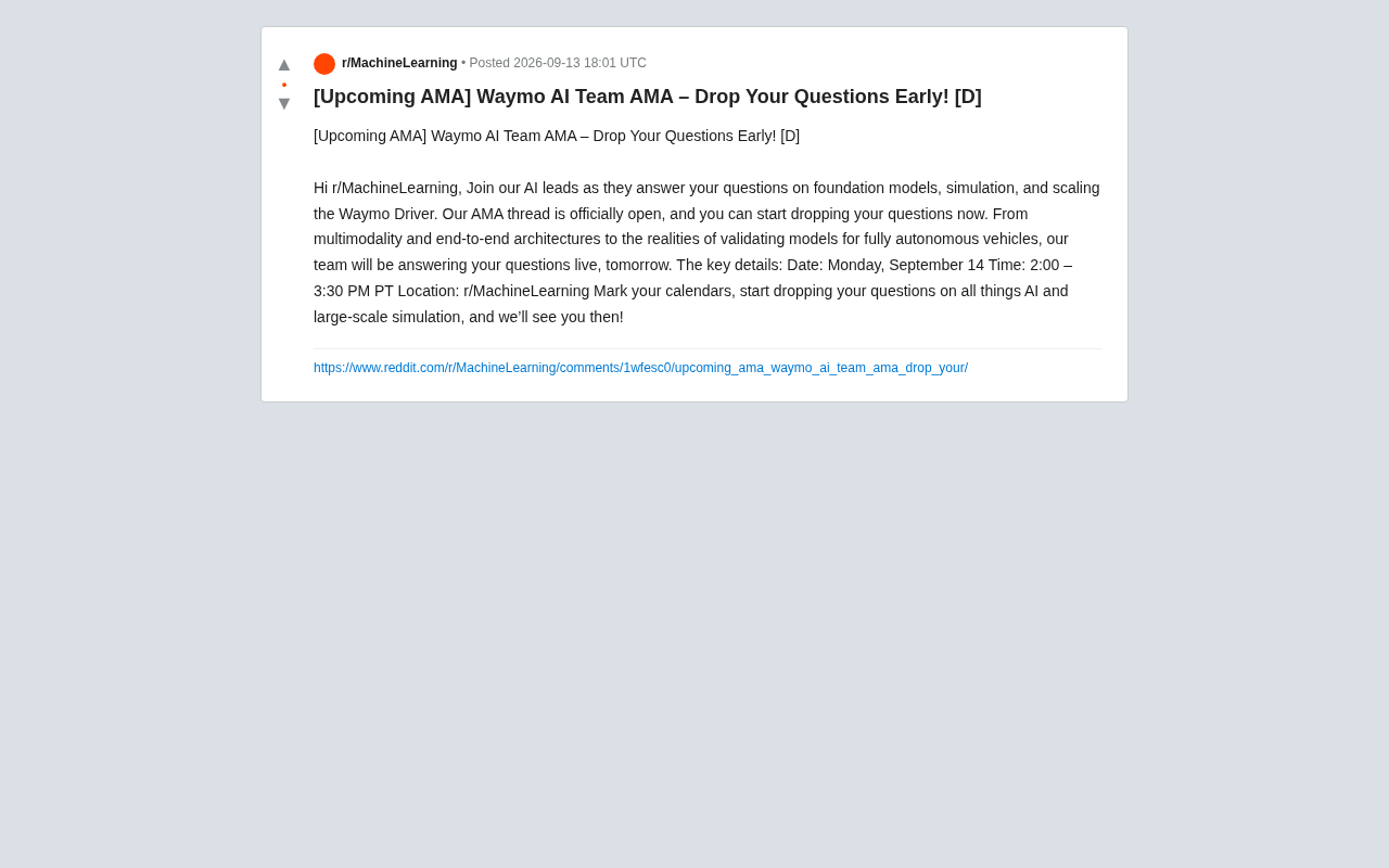
Waymo AI Team to Host AMA: Focusing on Foundation Models and Autonomous Driving Simulation
Waymo's AI technical leads are hosting an AMA on Reddit's r/MachineLearning, covering foundation models, large-scale simulation, multimodality, and end-to-end autonomous driving architectures.
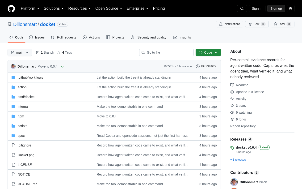
Docket: Building Per-Commit Evidence Trails for AI Agent-Generated Code
Docket builds per-commit evidence trails for AI agent-generated code, making every AI commit traceable, auditable, and verifiable — a pragmatic step in AI coding governance.
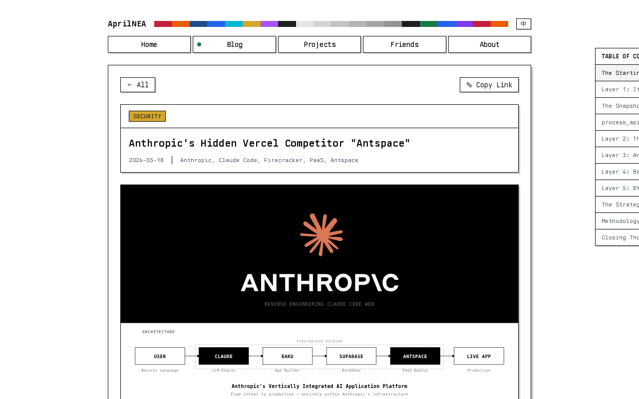
Reverse-Engineering Claude Web's Sandbox: Uncovering Anthropic's Hidden MicroVM
A reverse-engineering analysis of Claude Web's code sandbox reveals Anthropic's likely MicroVM architecture and internal "Antspace" environment, with insights for AI product security.