Making Every LLM Token Equal Width: A Novel Approach to Font Generation

A custom font concept that maps LLM token boundaries to visual width, making tokenization literally visible.
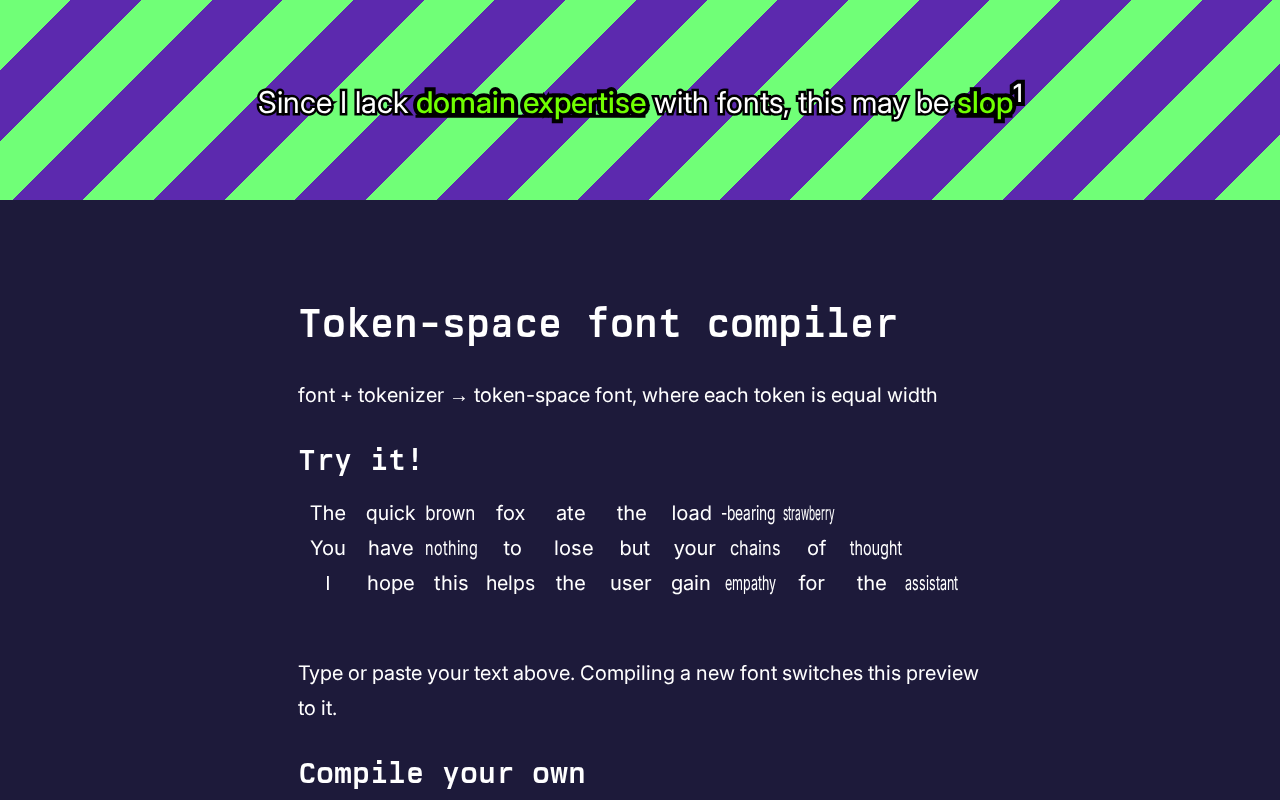
This article covers an experimental project that extends the classic monospace font concept from "equal character width" to "equal token width," mapping LLM tokenizer boundaries directly onto visual rendering. It explains how tokenization splits text into variable-length units invisible to users yet critical to API costs and context usage. Implementing such a font requires overcoming challenges around variable token length, tokenizer binding, and rendering pipeline complexity — potentially leveraging OpenType features or external preprocessing. The project's core value lies in making the model's "perspective" visually intuitive for prompt engineers, developers, and researchers.
From Monospace Fonts to "Token-space" Fonts
In programming and text processing, monospace fonts are nothing new — every character occupies the same horizontal width, making code alignment and table formatting clean and consistent. But a project that surfaced on Hacker News proposes a bolder idea: instead of making every character equal width, make every LLM token equal width.
This seemingly niche concept actually bridges a real gap between how large language models process text and how humans visually perceive it. The project drew 19 points and 5 comments on Hacker News — not a viral hit, but the idea itself is genuinely thought-provoking.
Why Make Tokens Equal Width?
To appreciate the value of this project, you first need to understand that the text an LLM "sees" is fundamentally different from what a human reads.
Humans read text in terms of characters and words. LLMs, on the other hand, pass text through a tokenizer before processing — splitting it into discrete units called tokens. A token might be a complete word, a word fragment, a few characters, or even a punctuation mark combined with a space. For example, the word "tokenization" might be split into "token" and "ization" as two separate tokens, while "the" is typically its own single token.
This splitting process is entirely invisible to end users. When you stare at a block of text on screen, there's no intuitive way to sense how many tokens the model cuts it into or where the boundaries fall — yet token count directly affects API costs, context window usage, and how the model processes the input.
The core idea behind this font project is to use a custom typeface where each token renders at the same fixed horizontal width. That way, visual "width" maps directly to "token count" — you can immediately see how many tokens a passage consumes, and token boundaries become perceptible at a glance.
The dominant algorithm behind most tokenizers is Byte Pair Encoding (BPE). BPE starts with a vocabulary of individual characters, then iteratively merges the most frequent adjacent character pairs in the training corpus into new units, until the vocabulary reaches a target size. This process causes common words (like "the" or "ing") to become single tokens, while rare words or characters from other writing systems get fragmented into multiple subword pieces. Chinese, Japanese, and similar scripts — underrepresented in English-dominated training corpora — often require 1–2 tokens per character, whereas semantically equivalent English text may use fewer. This is the root cause of why Chinese-language API calls can sometimes cost more than English ones. Understanding BPE helps explain why a "token-equal-width" font would look dramatically different across languages.
The Technical Ingenuity and Challenges
Turning this idea into reality is far from simple — it binds two previously unrelated domains: tokenization and font rendering.
A conventional monospace font only needs to assign a fixed advance width to each glyph. But tokens are variable-length character sequences — a single token might contain 1 character or 10. Making them all equal width means the font needs to dynamically compress or stretch each character within a token so that the total width of the whole token stays constant.
This introduces several practical challenges:
Tokenizer Binding
Different models use different tokenizers (e.g., GPT's BPE, SentencePiece for others), and the same text can be split very differently depending on which tokenizer is used. This means such a font is inherently tied to a specific tokenizer — a font designed for GPT's tokenizer becomes meaningless when applied to another model.
Rendering Complexity
A font file only describes glyph outlines; it has no knowledge of where token boundaries lie. Achieving true token-equal-width rendering would likely require leveraging OpenType's advanced features like ligatures and contextual substitution, or running tokenization as a preprocessing step in the rendering pipeline before dynamically adjusting kerning. This is far more complex than generating a standard font.
OpenType ligatures and contextual substitution are the standard mechanisms modern fonts use to handle multi-character combinations. Ligatures allow a font to replace specific character sequences (like "fi" or "ffl") with a single combined glyph; contextual substitution dynamically swaps glyph variants based on neighboring characters. In theory, this mechanism could be used to pre-encode known token sequences as special fixed-width ligature glyphs. However, OpenType ligature rules work via pattern matching on character sequences — they're not a Turing-complete tokenization algorithm. Encoding the tens of thousands of rules in a typical BPE vocabulary purely within the font itself is essentially infeasible. A more realistic approach would be to tokenize externally before rendering, then communicate token boundaries to the rendering engine via kerning adjustments or zero-width character insertion to compress spacing within each token.
Who Would Actually Use This?
The target audience is relatively niche, but the pain point is real.
For prompt engineers, intuitively sensing token consumption helps optimize prompts and pack more useful information into a limited context window. For developers, being able to see at a glance which content is "eating tokens" while debugging LLM applications makes cost control easier. For researchers and educators, this is an excellent visualization tool — it transforms the abstract process of tokenization into something visually observable, helping people build intuition about how LLMs represent input.
An Experiment That Reminds Us "The Model Doesn't Read Like We Do"
Beyond practical utility, the greatest value of this project may be its conceptual provocation.
We're so accustomed to understanding text the human way that we often forget the model "sees" something entirely different. The same passage of Chinese text might consume far more tokens than equivalent English; a rare technical term might be fragmented into several pieces; spaces and newlines each take up tokens too. All of these differences are completely smoothed over by the fonts and typography we use every day.
A token-equal-width font forcibly projects the model's "perspective" back onto the human visual system. It's a fascinating cross-disciplinary experiment — using one of the oldest typographic technologies (fonts) to visualize one of the most cutting-edge AI concepts (tokenization).
Worth noting: given the limited information available from the original source, specific implementation details, supported tokenizers, and actual rendering results remain to be explored further. But as a concept, it's already thought-provoking enough: when we work with LLMs, understanding the world as the model sees it may be just as important as crafting better prompts.
Related articles

Chain of Thought Isn't Just for AI: How Humans Can Use CoT to Improve Thinking Quality
Chain of Thought isn't just a prompt trick for large models. Starting from a Hacker News discussion, this article analyzes why CoT works for human thinking too, breaks down actionable ways to transfer it, and highlights the key differences between human CoT and machine CoT.
Cloudflare Teams Up with OpenAI: Closi…
Cloudflare Teams Up with OpenAI: Closing the Loop from Vulnerability Discovery to Defense with AI
Cloudflare uses OpenAI Daybreak to investigate security vulnerabilities and generate reviewable remediation plans, while developers use Codex to boost coding efficiency and quality.

Orca Multi-Agent Orchestration in Practice: A Guide to Parallel Collaboration with Claude and Codex
Orca is Stable AI's free open-source agent workbench supporting 34 agents like Claude Code and Codex in parallel. Learn its Git worktree isolation, multi-model orchestration, and mobile management.