The Chaotic Aesthetics of Apple's HomeView Ad: A Marketing Code Only Parents Can Read

Apple's HomeView ad swaps minimalist aesthetics for chaotic family mornings to win parents over through emotional resonance.
Apple's ad for the HomeView smart display abandons the brand's signature pure-white minimalism to depict a family of five's chaotic morning. Viewers without parenting experience can barely decode it, while parents instantly resonate and see it as a documentary of real life. The core strategy shifts the product's persuasiveness from features and specs to emotional identification, letting HomeView embed naturally into a real family scene rather than being solemnly displayed. Behind this disciplined chaos is still Apple-style structural control. The cost is sacrificing broad appeal in exchange for strong resonance with target family users — a conscious, risky piece of targeted communication.
An Apple Ad That Doesn't Feel Like Apple
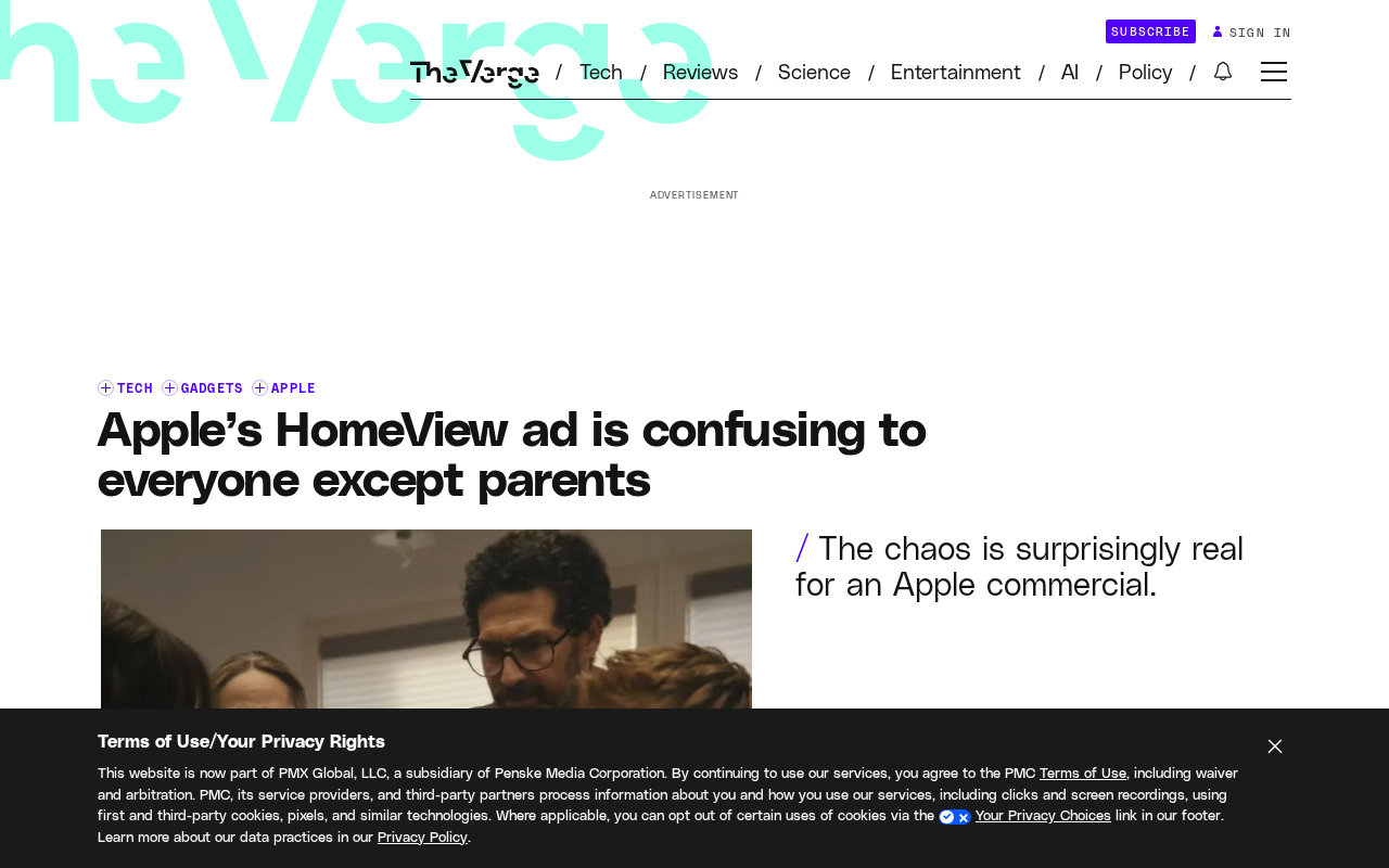
Apple's ad for its brand-new smart display, HomeView, is almost unrecognizable as Apple's work at first glance. There's no pure white background, no minimalist composition. Instead, we get a family of five caught in the morning chaos: someone shouting, keys nowhere to be found, eggshells left on the counter, traffic patterns a mess, pace breakneck.
Apple's long-standing brand language is clean, simple, orderly — and this ad deliberately chooses chaos. That contrast is itself the message: HomeView isn't a tech toy on display in a glass case, it's a family tool plunged into the mud of real life.
Why Most People Don't Get It
For viewers without parenting experience, this spot is basically noise. Cuts are dense, relationships between characters are never explained, and the product itself is never given a solemn "reveal." Anyone used to Apple's keynote-style elegant demos will find it out of control — even a little cheap.
The problem is that this ad's narrative logic isn't built on "understanding the product's features," but on "claiming a state of being." It doesn't explain what HomeView can do; it first gets you to admit that the morning home has always been like this. For people without that life experience, the ad's anchor disappears, and all that's left is the chaos itself.
The logic of "claiming a state of being" in the ad's narrative corresponds in marketing to resonance-based positioning — the brand doesn't persuade consumers by listing features, but first depicts a familiar situation, lets consumers confirm their identity within it, and then embeds the product into that identity narrative. The psychological basis of this strategy is the "self-reference effect": when information is related to the self-concept, both memory and comprehension are significantly enhanced. Apple here abandons the traditional "feature-demo" ad and turns to this kind of narrative that requires the audience to actively project themselves in.
What Parents Get Instantly
For people with kids at home, this ad is basically a documentary. The shouting, the lost items, the never-enough time — these aren't exaggerated dramatic conflicts, they're the standard routine that repeats every single day. The carefully arranged "out-of-control details" in the ad are, in parents' eyes, precisely the most real parts.
This is also where Apple's marketing is smartest this time: it shifts the product's persuasiveness from specs and feature demos to emotional identification. When viewers see their own morning on screen, HomeView's existence no longer needs to be argued — it naturally becomes the screen that "should have been there" in that scene.
The "emotional identification" mentioned in the article is closely related to brand association and emotional connection in traditional ad evaluation systems. Marketing research generally holds that emotionally driven ads tend to outperform purely rational appeals in building long-term brand equity, especially for family products, where purchase decisions are often "it feels right" rather than "the specs are strongest." By shifting persuasion from the spec sheet to emotional resonance in a family scenario, Apple is essentially betting that emotional memory is more durable and harder for competitors' spec sheets to overwrite than functional memory.
The Consistency Behind the Chaos
What's worth noting is that this chaos is disciplined chaos. Apple hasn't abandoned its own aesthetic; it has moved the sense of order from the visuals into the structure: though the pace is fast, every point of chaos serves the same message — this family needs coordination, and HomeView appears at the position of coordination.
In other words, the ad's form imitates life, but its core is still Apple-style control. It first creates disorder, then hints at the solution — this narrative is self-consistent at the brand level.
A Risky Piece of Targeted Communication
The cost of this ad is also obvious: it sacrifices broad appeal in exchange for strong resonance with a specific group. For Apple, this is a conscious trade-off. Purchase decisions for smart displays often come from real needs in family scenarios rather than pure tech novelty, so moving parents matters more than pleasing everyone.
The risk is that excluded viewers may only remember the "mess" and never receive the "why you need HomeView." Whether this ad succeeds ultimately depends on whether it precisely reaches the people who are being tormented by mornings and are considering adding a screen to their home.
So-called targeted communication refers to a brand actively focusing on a specific segment and accepting the risk that other segments may not resonate or may even misunderstand, in exchange for deeper emotional bonding with the target group. Products like smart displays are usually shared family devices; purchase motivation mostly comes from the practical scenario of "the home needs a public screen," not individual tech curiosity. Apple's move is a classic "narrowcasting" strategy: first let core family users claim the product, then let them drive broader awareness, rather than trying to persuade everyone from the start.
Editor's View
Apple rarely gives up the safe card of "making everyone understand," turning instead to an ad that requires life experience to decode. Its chaos isn't a mistake — it's a filtering mechanism. For parents, it's resonance; for others, it's a threshold. This strategy isn't suitable for every product, but for a device meant to enter the shared family space, letting families claim it first may be a more effective first step than showing specs.
One-line Summary
Apple's HomeView ad deliberately replaces minimalist aesthetics with a chaotic family morning, using emotional identification to target parents.
Paragraph Summary
Apple's ad for the HomeView smart display ditches the brand's usual pure-white minimalism to show a family of five in morning chaos. Viewers without parenting experience can barely decode it, while parents instantly resonate and see it as a documentary of real life. The core strategy is to shift the product's persuasiveness from features and specs to emotional identification, letting HomeView naturally embed itself into a real family scene rather than being solemnly displayed. Behind this disciplined chaos is still Apple-style structural control. The cost is sacrificing broad appeal in exchange for strong resonance with target family users — a conscious, risky piece of targeted communication.
Related articles

Hands-On with the Gemini 4 Argon API: Thinking Levels and Background Mode Explained
A Free Code Camp crash course on the Gemini 4 Argon API: from getting a key and sending your first request to controlling reasoning costs with thinking levels, enabling multi-turn chat with previous_interaction_id, and generating a Breakout game in background mode—plus a Google engineer's take on the model's capabilities.

Reinforcement Learning Takes On Getting Over It: Distributed Training Strategies Behind 63% Progress
A developer uses deep reinforcement learning to tackle Getting Over It. The agent climbs from the bottom to 63% progress but gets stuck at the anvil. The project is open-sourced, using divide-and-conquer training and CPU-only training, seeking community collaboration to break the bottleneck.

Sigma FP2 Released: The World's Smallest Full-Frame Camera Gets Sensor and Screen Upgrades
Sigma launches the FP2 full-frame camera, retaining its smallest-and-lightest design with three key upgrades: improved sensor, articulating LCD screen, and longer battery life—built for portable video creators.