The Evolution of the Mac Dock: From OS X to macOS 27

Since its birth in 2001, the Mac Dock has evolved through features and controversy, and may incorporate AI and more flexible customization in the future.
Since the release of Mac OS X 10.0 in 2001, the Mac Dock has been a core interface element of macOS. Originally inspired by NeXTSTEP and the Windows taskbar, it combined with the Aqua interface to form a unique style. Functionally, it grew from a basic launcher to include separators, Stacks, Mission Control integration, and more. User controversy over screen space and animation led to third-party alternatives like uBar, while Apple offered a "Reduce Motion" option. Looking ahead, macOS 27 may introduce AI suggestions and more flexible customization, continuing to balance efficiency and aesthetics.
The Origins and Original Design Intent of the Mac Dock
The Mac Dock is one of the most iconic interface elements of macOS. Since the release of Mac OS X 10.0 in 2001, it has been the central hub for users to launch apps, switch windows, and manage files. Although the Dock's appearance and functionality have gone through many iterations, its core concept has never changed: pinning frequently used apps and documents in an easily accessible location.
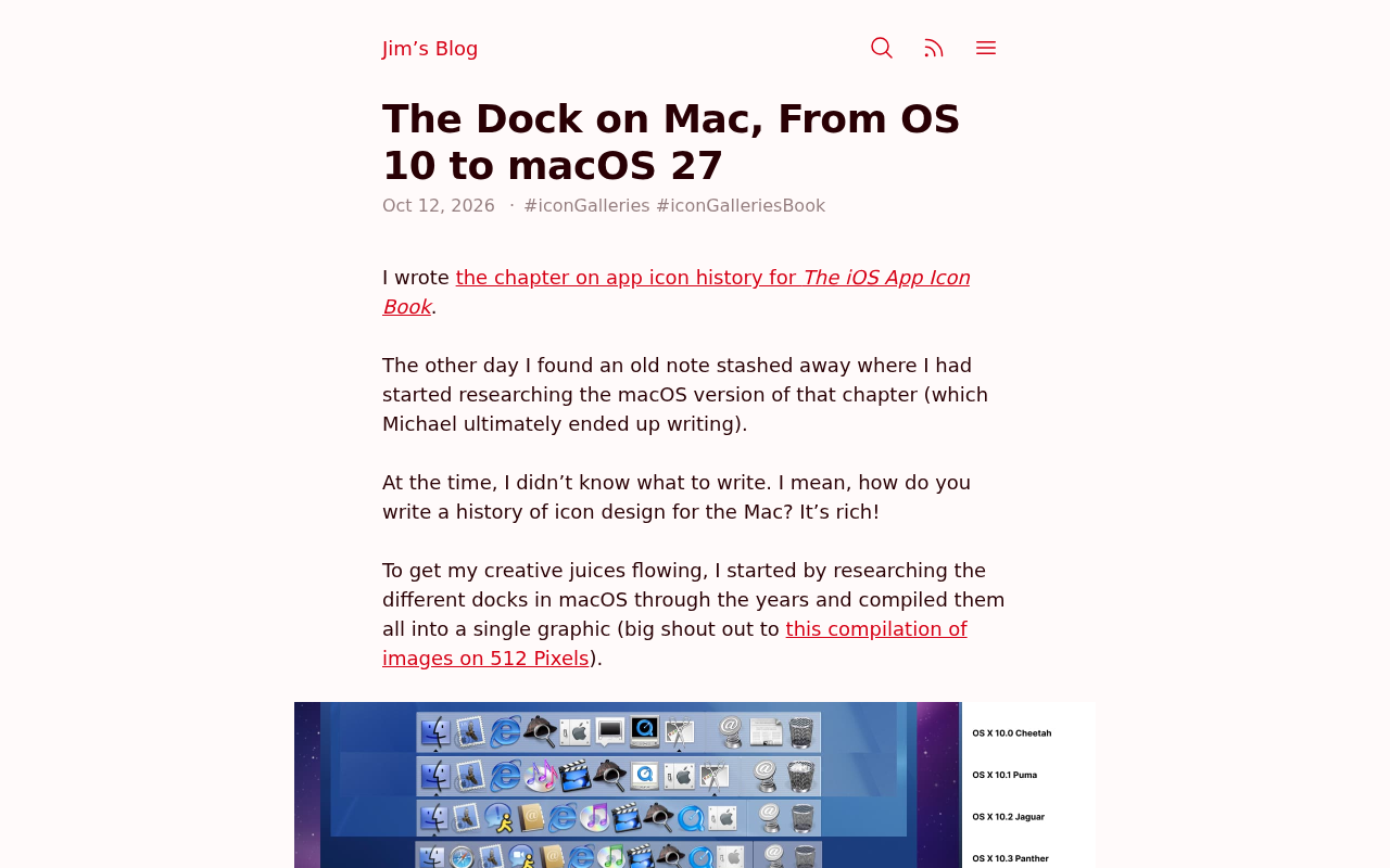
In a Hacker News discussion, a user pointed out that the Dock was partly inspired by the NeXTSTEP Dock and the Windows taskbar, but Apple combined it with the Aqua interface to give it a unique visual style. Initially, the Dock only supported app icons and minimized windows, and icons would use a "bouncing" animation to indicate launch status—a design that still remains today.
NeXTSTEP is an operating system developed by NeXT, the company Steve Jobs founded in 1985 after leaving Apple. Its Dock was located on the right side of the screen, mainly used to store frequently used app icons, and supported drag-and-drop operations. The Windows taskbar, introduced in 1995 with Windows 95, was located at the bottom of the screen and mainly displayed buttons for open windows and the system tray. When developing Mac OS X, Apple drew on ideas from both, but redesigned it as a semi-transparent floating bar at the bottom of the screen and introduced the Aqua interface—a visual style inspired by water that emphasized gloss and transparency—making the Dock an iconic element that combines both function and aesthetics.
Functional Evolution: From a Basic Launcher to a Multitasking Hub
As macOS versions updated, the Dock's functionality continued to expand. Mac OS X 10.1 introduced Dock separators, allowing users to separate apps from folders and minimized windows. 10.5 Leopard brought the 3D glass-like Dock and the Stacks feature, letting users drag folders into the Dock and fan them open.
OS X Lion in 2011 added Mission Control integration, allowing the Dock to show previews of currently open app windows. OS X Yosemite in 2014 made it completely flat, unifying it with the iOS design language. According to community discussions, macOS 27 may further integrate AI suggestions, such as dynamically adjusting Dock icon order based on usage habits.
Stacks is a feature introduced in Mac OS X 10.5 Leopard that allows users to drag folders into the right side of the Dock, where clicking expands their contents in a fan or grid for quick file access. Mission Control is a window management tool integrated starting with OS X Lion. Triggered by gestures or keyboard shortcuts, it displays all open windows, desktop spaces, and the Dashboard, while the Dock remains visible in this mode and supports directly switching apps or windows. Together, these features transformed the Dock from a simple launcher into a centralized multitasking hub.
User Controversy and Third-Party Alternatives
The Dock is not without its critics. Some users feel it takes up screen space and cannot be fully hidden, especially on small screens. In Hacker News comments, some mentioned that third-party tools such as uBar and DockView offer more flexible taskbar alternatives.
In addition, the Dock's "recent apps" area and minimize effects have also sparked controversy. Some users miss the cleaner visual effects of earlier versions and believe excessive animation slows down operations. However, Apple offers a "Reduce Motion" option in Accessibility to alleviate this issue.
uBar is a third-party macOS taskbar replacement tool that replaces the Dock with a more traditional window list and supports multiple monitors, window grouping, and customizable appearance, aiming to improve multitasking efficiency. DockView focuses on adding window previews to the Dock, showing live thumbnails on mouse hover. The emergence of these tools reflects some users' dissatisfaction with the native Dock's screen footprint and flexibility. The "Reduce Motion" option Apple provides in Accessibility can turn off the bouncing animation of Dock icons and minimize effects, easing discomfort for users sensitive to animation.
Future Outlook: Possible Changes in macOS 27
Although Apple has not yet announced detailed information about macOS 27, based on historical trends, the Dock may become further integrated with system intelligence. For example, Siri Suggestions could appear on the right side of the Dock, or machine learning could predict the user's next action.
On the other hand, with the convergence of iPadOS and macOS, the Dock's interaction on touch devices may also adjust. Some developers speculate that Apple may allow users to customize the Dock's corner radius and transparency to match different wallpaper styles.
No matter what the future holds, as the cornerstone of the Mac experience, the Dock's evolution will continue to reflect Apple's pursuit of balancing efficiency and aesthetics.
Siri Suggestions is a feature Apple introduced in macOS Sierra that recommends apps, contacts, calendar events, and more in Notification Center or Spotlight based on user habits and current context. If integrated into the right side of the Dock, the Dock would become not just a passive launcher, but an intelligent entry point that proactively predicts user needs. In addition, the convergence of iPadOS and macOS (such as Mac Catalyst and Universal Control) may prompt adjustments to the Dock's touch interactions, such as increasing icon spacing, supporting touch dragging, and allowing developers more fine-grained control over the Dock's visual parameters, such as corner radius and transparency, to adapt to different devices and wallpapers.
One-line Summary
The Mac Dock, born in 2001, has gone through functional evolution and controversy, and may in the future incorporate AI and more flexible customization.
Paragraph Summary
Since the release of Mac OS X 10.0 in 2001, the Mac Dock has been a core interface element of macOS. It was initially inspired by NeXTSTEP and the Windows taskbar, but combined with the Aqua interface to form a unique style. Functionally, the Dock gradually added separators, Stacks, Mission Control integration, and more. Users have debated its screen space usage and animation effects, leading to third-party alternatives such as uBar, while Apple also offered a "Reduce Motion" option. Looking ahead, macOS 27 may introduce AI suggestions and more flexible customization options, continuing to balance efficiency and aesthetics.
Related articles

How Big Can Stars Really Get? The Physical Limits of the Largest Stars
Red supergiants are the largest stars by volume, with radii up to 2,000 times the Sun, engulfing the inner solar system. But there is no precise upper limit on stellar size—models predict up to 15,000 solar radii. The most massive blue stars are far smaller than red supergiants—biggest and heaviest are two different things.

Apple HomeView Smart Display Full Feature Breakdown: Wall-Mount or Desktop, $299
Apple launches HomeView, a $299 smart display with wall-mount and desktop options, 12MP camera for facial recognition, smart home control, music playback, and recipe step-by-step cooking. Full breakdown of watch faces, apps, privacy, and cooking integration.

Where Did the Promised New Studio Go? Craft Computing Answers After Five Years
Craft Computing's host responds to viewer questions: the new studio promised five years ago was shelved as construction costs soared from $30,000 to $75,000, and was replaced by a 168-square-foot garage conversion.