UK Real-Time Railway Map: Technical Insights from an Open Data Visualization Project

How open data, real-time streaming, and WebGL power a live map of every train in the UK.
This article examines the technical architecture behind a UK real-time railway map that gained attention on Hacker News. It covers the open data ecosystem (GTFS, Darwin, TRUST), position interpolation using OSM track geometry and Bezier easing, high-concurrency data pipelines with Kafka and WebSocket, and GPU-accelerated rendering with WebGL and deck.gl — illustrating how public data and modern tooling enable individuals to build production-grade geospatial applications.
When Railway Networks Meet Real-Time Visualization
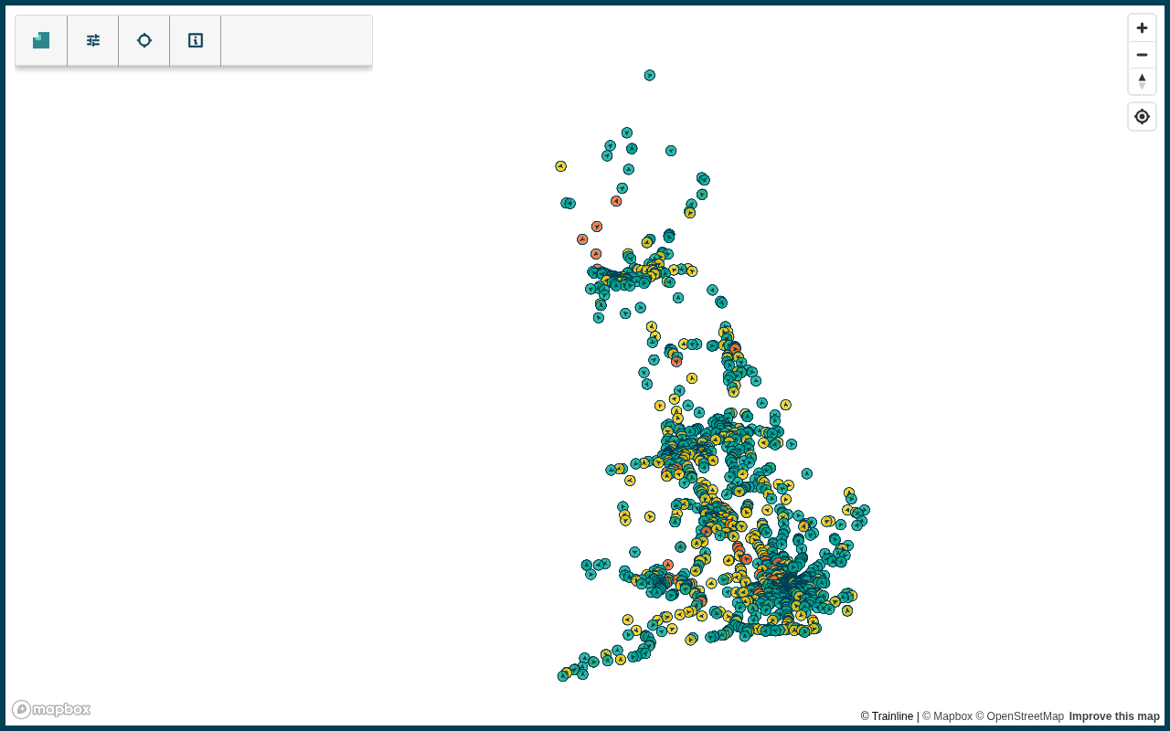
A project mapping the real-time status of the UK railway network recently gained traction on Hacker News. It visualizes live train movement data across the entire country, allowing every train currently in service to be tracked on screen. This project represents a genuinely instructive technical exercise — demonstrating how complex, real-time transit data can be transformed into an intuitive, interactive visualization.
For everyday users, a map like this offers an instant snapshot of how many trains are currently running, where they are, and their operational status. For developers, it's a compelling case study in real-time data processing, geographic rendering, and open data applications.
The Open Data Foundation Behind It
The UK is a world leader in open railway data. National Rail and Network Rail have long published train operation data — including schedules, real-time positions, and delay status — through open data platforms accessible to both the public and developers. These datasets are typically exposed via standardized interfaces, including the universal GTFS and GTFS-Realtime protocols, as well as UK-specific data push mechanisms.
GTFS (General Transit Feed Specification) was originally co-developed by Google and TriMet in Portland in 2005, and has since become the de facto global standard for public transit data exchange. Its design philosophy centers on a set of structured CSV files describing routes, stops, trips, and timetables. Any agency that exports data to this specification can have it consumed directly by Google Maps, Apple Maps, and other navigation apps worldwide — dramatically lowering the barrier to sharing public transit data. GTFS-Realtime is its real-time extension, using Protocol Buffers binary format to allow agencies to publish three types of low-latency messages: VehiclePosition, TripUpdate, and Alert.
On top of this, the UK also maintains its own Darwin data push system and Network Rail's TRUST (Train Running System TOPS) message stream. TRUST is built around "activation/cancellation/movement" events triggered each time a train passes a signalling point, forming the foundational data layer for UK train tracking.
Darwin deserves a closer look: developed and maintained by Thales Group, it integrates signalling data from the Network Rail infrastructure layer with timetable data from individual operators, delivering real-time predicted arrival and departure times for every train via an XML push stream. Darwin dates back to 2007, originally launched as a replacement for the UK's Customer Information System (CIS), and has since evolved through multiple iterations into today's Darwin 2.0. Its subscription interface uses ActiveMQ's Stomp protocol — a lightweight, text-frame-based message transport protocol. Once registered, developers can subscribe to specific topics via a standard STOMP client to receive a near-complete national train movement feed, which can amount to tens of millions of messages per day. Darwin's core value lies in its prediction algorithm: rather than simply reporting current delays, it uses historical operational data and current network conditions to forecast how a delay will propagate across subsequent stations — information used by waiting passengers and third-party apps alike. This layered protocol architecture — "GTFS international standard + Darwin prediction layer + TRUST event stream" — makes the UK one of the few examples in the open railway data ecosystem that successfully balances global interoperability with domestic precision.
Where Real-Time Data Comes From
The core of a real-time railway map is the continuous acquisition of train position data. This data typically comes from three sources:
- Signalling system data: The railway signalling system records when trains pass each signal point, from which approximate positions can be derived.
- Timetable data: Combined with scheduled timetables, the system can interpolate estimated train positions between two known points.
- Real-time update feeds: Delays, cancellations, and temporary changes are pushed via message queues to the application in real time.
Interestingly, not every train in the UK is equipped with GPS for real-time reporting — many position readings are "estimated" values derived from signal points and timetable data. This is fundamentally different from flight tracking: ADS-B (Automatic Dependent Surveillance–Broadcast) is the standard broadcast positioning protocol in modern aviation, where aircraft actively broadcast data frames containing GPS coordinates, altitude, and speed roughly every 0.5 seconds. Platforms like Flightradar24 aggregate these signals through tens of thousands of volunteer receiver stations worldwide. ADS-B operates at 1090 MHz, and any hobbyist with a cheap RTL-SDR software-defined radio receiver can receive and report these signals from home — this decentralized, crowdsourced sensing network is the fundamental reason flight tracking data is so high quality.
Railways are a different story. Track circuits and axle counters can only detect whether a train is present in a given section, not its precise coordinates. GPS devices suffer from signal obstruction in tunnel-heavy urban rail environments, and retrofitting thousands of active trains nationwide with GPS reporting modules faces enormous costs and multi-operator coordination hurdles. This fundamental difference in sensor technology means railway maps must rely on interpolated estimates, making their positional accuracy inherently lower than flight tracking — and it gives rise to a unique set of data engineering challenges.
Key Technical Challenges
Building a smooth, real-time map from railway data looks simple on the surface, but involves several significant technical hurdles.
Position Interpolation and Smooth Animation
Raw data typically consists of discrete signal-point passage events. Updating train positions on a map in discrete jumps would create a jarring experience. To address this, position interpolation must be performed on either the client or server side, allowing trains to move smoothly along their track paths.
The core of railway position interpolation is mapping discrete temporal events onto a continuous spatial path. Developers typically need track geometry data — usually from OpenStreetMap or officially published GeoJSON/Shapefile sources — to extract the polyline coordinates of each track segment, then interpolate the current position along the path proportionally based on a train's arrival times at adjacent signal points.
OpenStreetMap (OSM) is worth highlighting: it is the world's largest collaborative geographic database. Railway tracks are tagged with attributes like railway=rail and railway=subway, with rich metadata including track gauge, electrification type, and maximum speed. In developed countries like the UK, OSM coverage approaches official survey data quality, making it the go-to source for independent developers seeking high-precision track geometry.
More sophisticated implementations also account for train acceleration models — trains accelerate when departing a station and decelerate when approaching one. Simple linear interpolation produces noticeable errors during these phases, so engineering practice often employs Bezier Easing functions or physics-based kinematic interpolation for a more realistic animation. Bezier curves are widely used in computer graphics to describe smooth paths; their "ease-in-out" form — slowing at the start and end, faster in the middle — naturally matches the physical acceleration and deceleration characteristics of trains. Applying this mathematical tool to position interpolation is essentially a cost-effective computational approximation that substitutes for expensive real-time GPS acquisition — a textbook example of engineering trade-offs.
This requires developers not only to handle time-dimension train data, but also to obtain accurate railway track geometry — the geographic coordinates of the track path. The precision with which these two data streams are fused directly determines the quality ceiling of the final visualization.
High-Concurrency Real-Time Data Processing
At peak times, the UK railway network may have thousands of trains operating simultaneously. The system must continuously receive data streams, update the state of every train, and push changes in real time to all online users.
WebSocket is a full-duplex communication protocol built on TCP. Compared to traditional HTTP polling, it eliminates repeated handshake overhead and allows servers to push data to clients proactively, with latency typically as low as milliseconds. In the backend architecture of a real-time railway map, data from upstream sources (such as Network Rail's Stomp message stream) first enters a message queue like Kafka or RabbitMQ for buffering and distribution. Backend services consume the queue messages, aggregate state, and then broadcast updates to all online clients via a WebSocket server.
Kafka, open-sourced by LinkedIn in 2011, was designed precisely for high-throughput real-time log stream processing. Its Partition and Consumer Group mechanisms natively support horizontal scaling — in a railway map context, partitioning by train ID or geographic region allows different regional state aggregation services to consume independently, avoiding single-point bottlenecks.
It's worth noting the key difference between Kafka and traditional message queues like RabbitMQ: Kafka's log storage model persists messages to disk, with consumers independently tracking their read progress via an offset. This means the same batch of messages can be consumed by multiple downstream services at different rates — in the railway context, the same train event stream can be consumed by a real-time map service for visualization and simultaneously by an analytics service for delay statistics, without interference.
Message queues play a critical "buffer valve" role in the overall architecture: they absorb sudden upstream data bursts, preventing backend service overload, while persistence ensures no events are lost during brief service restarts. This "data source → message queue → state aggregation → WebSocket push" pipeline architecture is the mainstream engineering paradigm for this class of real-time visualization systems.
Rendering Performance for Large Numbers of Moving Targets
When hundreds or thousands of moving targets are displayed simultaneously on screen, traditional DOM element rendering quickly hits a performance ceiling. Production-grade visualization projects typically use Mapbox GL, deck.gl, or Leaflet with Canvas layers to ensure smooth performance even on lower-end devices.
WebGL (Web Graphics Library) is the browser's built-in OpenGL ES 2.0 binding, allowing JavaScript to invoke the GPU directly for rendering. Understanding its performance advantage requires examining the browser rendering pipeline: traditional SVG or HTML DOM rendering processes each element sequentially on the CPU in the main thread — styling, layout, and painting thousands of dynamic elements rapidly exhausts the frame budget (16.7ms at 60fps). WebGL, by contrast, uploads vertex data in batches to GPU memory and leverages the GPU's thousands of parallel compute cores, meaning rendering tens of thousands of points theoretically takes about the same time as rendering one.
Both Mapbox GL JS and deck.gl use WebGL as their underlying engine. The former submits map tiles, layers, and labels to the GPU for parallel rendering, maintaining 60fps smooth performance even on mobile. deck.gl was open-sourced by Uber's visualization team in 2015, originally built for urban mobility data analysis. Its architectural core is the decoupling of data layers from the rendering engine — developers simply declare data and visual mappings, and the underlying engine automatically compiles the data into GPU-executable shader programs.
deck.gl's ScatterplotLayer and PathLayer can render hundreds of thousands of data points in a single frame, with built-in support for on-demand Aggregation and LOD (Level of Detail) control — automatically clustering nearby trains at low zoom levels and expanding to individual icons when zoomed in, further reducing unnecessary rendering overhead. This declarative API design dramatically lowers the barrier to using WebGL, enabling engineers without a graphics background to handle real-time rendering of millions of data points.
Compared to traditional SVG or DOM-based approaches, WebGL's performance advantage begins to grow exponentially once the number of targets exceeds a few thousand — making it essentially the only viable technical choice for a railway map that needs to track thousands of trains nationwide while maintaining fluid interactivity.
The Value and Significance of This Type of Project
Transforming Open Data into Public Goods
The most direct value of this project is demonstrating how open data from governments and public institutions can be transformed by independent developers into practical tools for the general public. When foundational data is made available in a standard, accessible format, communities can create innovative applications that official bodies may never invest resources to build themselves — this is the core driving force of the open data ecosystem.
It's worth noting that the UK's open data practices are not an isolated case, but rather a systematic effort backed by policy. The UK government's data.gov.uk platform, launched in 2010, and the subsequent Open Government Licence provided a unified legal authorization framework for vast amounts of public data — including railway data — explicitly permitting free reuse for both commercial and non-commercial purposes. Together with the US federal government's "Open by Default" policy and the EU's Public Sector Information Re-use Directive, these form the three major policy cornerstones of today's global open data movement.
For developers, understanding this policy context is crucial: data availability depends not only on the existence of a technical interface, but also on whether the underlying license terms permit derivative development and commercialization. The UK railway data's authorization terms are precisely what allows independent developers to build projects like this without legal concern.
Reference Value for Transportation Research and Planning
Real-time railway maps are far more than visual spectacle. Researchers and transportation planners can use these visualizations to directly observe network operating conditions, congestion node distribution, and delay propagation patterns — providing insights that combine intuitive perception with data support for optimizing transit systems. When a single train's delay cascades through a transfer hub and spreads across the entire network, a real-time map often reveals the root cause of systemic vulnerability more clearly than any table of numbers.
A Transferable General-Purpose Tech Stack
This technical approach — open data integration, real-time stream processing, geographic visualization — can be applied almost directly to other domains: bus tracking, logistics fleet monitoring, shared bike distribution, and even drone route management. Mastering the implementation patterns of this type of project means acquiring a general-purpose toolkit for real-time geospatial visualization.
Summary
The "UK Real-Time Railway Map" is just a modestly popular share on Hacker News, but the technical philosophy it reflects deserves attention from every developer: when high-quality open data, mature real-time processing technology, and excellent visualization tools come together, individual developers or small teams can build applications that rival commercial products.
In an era where data is increasingly becoming infrastructure, projects like this — which may seem niche — are the best testament to a healthy open data ecosystem. Truly valuable innovation often emerges from the clever use of public resources, combined with relentless attention to technical detail.
Related articles

Osprey: General-Purpose Pretraining Makes Speculative Decoding Draft Models More Efficient
Osprey treats pretraining as a reusable, target-agnostic asset. Through pruning and lightweight adaptation, a single draft model transfers across multiple LLMs, boosting mean acceptance length by 16%-22%.
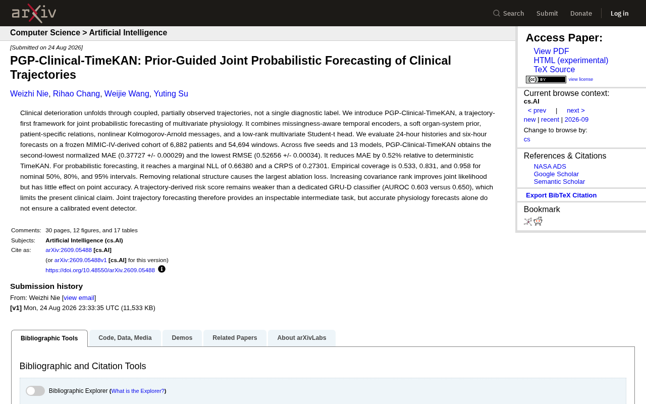
PGP-Clinical-TimeKAN: A Detailed Guide to the Multivariate Physiological Indicator Joint Prediction Framework
An in-depth analysis of the PGP-Clinical-TimeKAN framework for joint probabilistic prediction of multivariate physiological indicators, covering trajectory-first paradigm, KAN message passing, MIMIC-IV validation, and ablation studies.
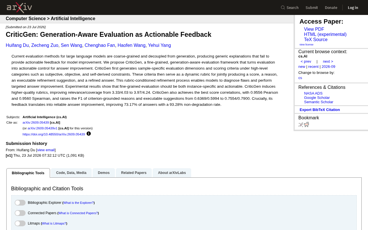
CriticGen: A New Framework That Transforms AI Evaluation into Actionable Improvement Feedback
CriticGen proposes a generation-aware evaluation framework that transforms AI assessment from passive scoring to an active optimization loop, achieving 73.17% answer improvement and 93.28% non-degradation rate.