Vercel Releases Geist Serif: A High-Contrast Display Serif
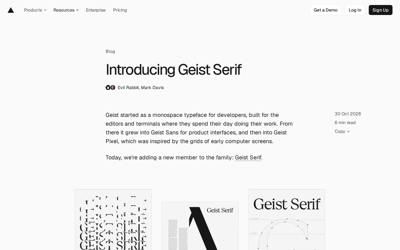
Vercel releases Geist Serif, adding an editorial-style display serif to the family.
Vercel's Geist family welcomes its fourth member, Geist Serif, a display serif for headlines and posters. It shares stems, width, posture, cap height, and x-height with Geist Sans, so it can be swapped into any layout without shifting lines. Leveraging modern screen detail density, it thins vertical strokes by 50% and tightens sidebearings for extreme contrast. An Element Shape variable axis offers round, square, triangle, and heart dot variants. The release includes 894 glyphs, 5 stylistic sets, and support for 352 languages, with full weights, a text version, and italics planned.
Vercel's Geist typeface family has gained a new member. From the original monospaced Geist Mono, to Geist Sans for product interfaces, to Geist Pixel that pays homage to the grids of early computer screens, this system has expanded as a series of "typographic history chapters." Now the fourth member, Geist Serif, has officially launched, pulling the family from terminals and interfaces into the territory of magazine editorial design.
One system, a new voice
Geist Sans handles body text and interface copy in Vercel products, but for headlines the team wanted a "second voice"—one that must belong to the same system, rather than being cobbled together from a random unfamiliar typeface off a dropdown menu.
Many tech brands, in search of personality, have turned from clean sans-serifs toward retro computer-advertising aesthetics. Geist Serif takes a different path: leaning toward fashion, editorial design, and magazine headlines. The team describes it as a tribute to the artists behind Rolling Stone and Harper's Bazaar.
This gives each of the four members of the Geist family its own era of typographic history: the Swiss design movement, early terminals and DOS computing, the pixel grid, and now the print editorial tradition.
The Swiss Style is a design movement that emerged in Switzerland in the 1950s, represented by figures such as Josef Müller-Brockmann, emphasizing sans-serif typefaces (like Helvetica), grid systems, and an objective, rational visual language. It has profoundly influenced modern corporate visual identity and interface design, and the clean, neutral character of Geist Sans stems directly from this lineage.
The Vercel design system refers to the unified visual language the company has built around its developer tools, covering color, spacing, components, and typography. The Geist family is its typographic layer, aimed at maintaining visual consistency across product interfaces, code display, and marketing pages, avoiding the tonal disconnect that comes from mixing in third-party typefaces.
Display first: a serif built for modern screens
Geist Serif was initially sketched by Evil Rabbit, then expanded by Andrés Briganti; the early letters already carried the expressive serif character of typefaces like Victor Serif and Stanley. After Mark Davis took over the drawing, the team decided the first release would be a display typeface serving large sizes such as headlines and posters, with the full family continuing in development.
Print media has always struggled with fine hairlines and sharp serifs, but modern displays can carry extremely high detail density. Based on this, the team thinned every vertical stroke by 50% and tightened sidebearings, pushing contrast to the limit. Each serif is built with a wedge on one side and a curve on the other—classical in proportion, yet new in construction, optimized specifically for digital devices.
Davis put it plainly: they were making something that "could only belong to today"—no clunky, blocky compromises for screens from a decade ago, no mechanical concessions to physical ink, just serifs placed at the perfect point.
A display typeface is one designed specifically for large sizes (headlines, posters, covers), typically with strong stroke contrast and rich detail, rather than optimized for readability at small body-text sizes. Geist Serif's first release is positioned as a display typeface, meaning it suits headlines and brand expression, but reading body text may be difficult due to the high contrast—which is precisely why the team plans to develop a text version later.
Hairlines and high-contrast serifs: in these serif typefaces, thin strokes can be as slender as a hair, forming strong contrast with thick strokes, as seen in classics like Didot and Bodoni. In traditional printing, thin lines tend to break up or fail to render well, but high-resolution screens can render them precisely, which is why the team dared to thin vertical strokes by 50%.
Sharing a skeleton with Geist Sans
Geist Serif's goal is to sit tight against its sans-serif sibling, so that even overlaid the two don't clash: vertical stems align with Geist Sans, and width and posture are shared. The jagged serifs and high contrast give it an editorial character, and during drawing the team kept repeating one phrase—"Geist grew teeth."
At the metrics level, the two share the same cap height and x-height, so it can be swapped directly into any Geist layout without shifting line positions. Mixing Sans, Mono, Pixel, and Serif in a single sentence, every word looks the same size. The key metrics given in the materials are: UPM 1000, cap height 710, x-height 530; Geist Serif's ascender is 750 and descender is -200 (Sans is 710 and -150 respectively).
One axis, four variants
Like Geist Pixel, Geist Serif carries a variable axis that switches the shape of every dot in the typeface, including the dots on i and j as well as punctuation. The axis is called Element Shape (ELSH) and offers four variants: the default round Regular, Square, Triangle (a nod to the Vercel logo), and Heart.
Each variant is also released as a standalone static file. When using the variable font, variants can be selected via font-variation-settings.
A variable font is a font format in the OpenType specification that allows continuous adjustment of attributes such as weight, width, and slant through one or more design axes within a single file, rather than packaging a separate file for each variant. Geist Serif's Element Shape axis is a custom axis, identified by the four-letter tag ELSH, with values corresponding to different dot shapes.
font-variation-settings is a CSS property used to explicitly set axis values for variable fonts on the web, for example font-variation-settings: "ELSH" 2; switches to the Triangle variant. It is lower-level than standard properties like font-weight, making it suitable for controlling custom axes.
Hand-polished glyphs and specifications
The typeface has grown from 227 glyphs in July to 894 today, covering 352 Latin-script languages, and the team processed over 52,000 kerning pairs to calibrate spacing. The details are almost absurdly precise: the eye of the letter g is tilted exactly 7 degrees.
Release specifications at a glance: 1 weight (Regular), 4 variants, 894 glyphs, 5 stylistic sets (ss01 to ss05), 352 supported languages.
Kerning refers to adjusting the spacing between specific letter pairs so the visual rhythm is even—for example, combinations like "AV" or "To" look loose without adjustment. Over 52,000 kerning pairs means the team manually or semi-automatically calibrated spacing for every possible letter combination, an important indicator of professional typeface quality.
Stylistic sets are an OpenType feature that provide optional alternate glyphs under tags like ss01 to ss05, which users can enable in software that supports the feature to replace the forms of certain letters or symbols. They don't change the typeface's basic structure, only offering stylistic options.
Installation and usage
Geist Serif ships in the same package as the rest of the family—just run npm i geist. The exported CSS variables include: GeistSerif (variable, all shapes, --font-geist-serif), plus variables for GeistSerifRegular, GeistSerifSquare, GeistSerifTriangle, and GeistSerifHeart respectively. Each entry point is independent, meaning you only bundle the font files you actually use. In layout.tsx, you can import GeistSerifRegular from 'geist/font/serif/regular' and mount its variable. Font files can also be downloaded separately, and all stylistic sets and glyphs can be inspected at vercel.com/font.
What's next
Regular is only the first step. The variable font is planned to cover the full weight range from Thin (100) to Black (900), and the team says the g in the Black weight is a letter they never tire of. To explore a text version, they built a forging tool that can measure strokes (including where strokes intersect) and embolden the outlines of display glyphs, editing the outlines directly so real sentences can be set to verify which strokes need more weight.
The italic, meanwhile, is generated entirely in Python: after straightening existing italics and comparing them with the corresponding uprights, the differences that remain once the angle is removed become clearly visible, and these differences are turned into testable, revisable rules. This italic won't be the final version, but dissecting glyphs in code lets the team find the boundaries faster. In addition, Cyrillic support is planned to align with Geist Sans and Geist Mono, and Geist Serif will also come to Google Fonts after launch.
Together, the four families cover the full range from UI text and code to expressive display type. For developers, this means switching headline styles in a Vercel project no longer requires bringing in a third-party typeface with a clashing character—the same skeleton, the same metrics, only the "voice" changes.
Related articles

Salesforce Acquires Rune for $375M: AI Logistics Tech Bolsters Defense Business
Salesforce reportedly acquires defense tech startup Rune for $375M. Rune's AI logistics tech will strengthen Salesforce's Missionforce defense platform, continuing its M&A spree.

Why Fair Use Benefits Everyone in the AI Era
Starting from a Hacker News discussion, this article analyzes the legal logic and controversies of the fair use principle in AI training and content creation, and its dual impact on creators and the tech ecosystem.
Mistral Large 4 Open-Sources a Trillion Parameters, Microsoft Offers Voluntary Severance to 60,000 Employees
Mistral Large 4 open-sources a trillion-parameter multimodal model with a coding agent score of 48; SanDisk earnings show AI inference reshaping NAND demand; Google Gemini adds in-app file editing, OpenAI raises Codex quotas, and Microsoft offers voluntary severance to 60,000 employees.