AI-Generated Posters Don't Have to Be Ugly: What Actually Determines Design Quality
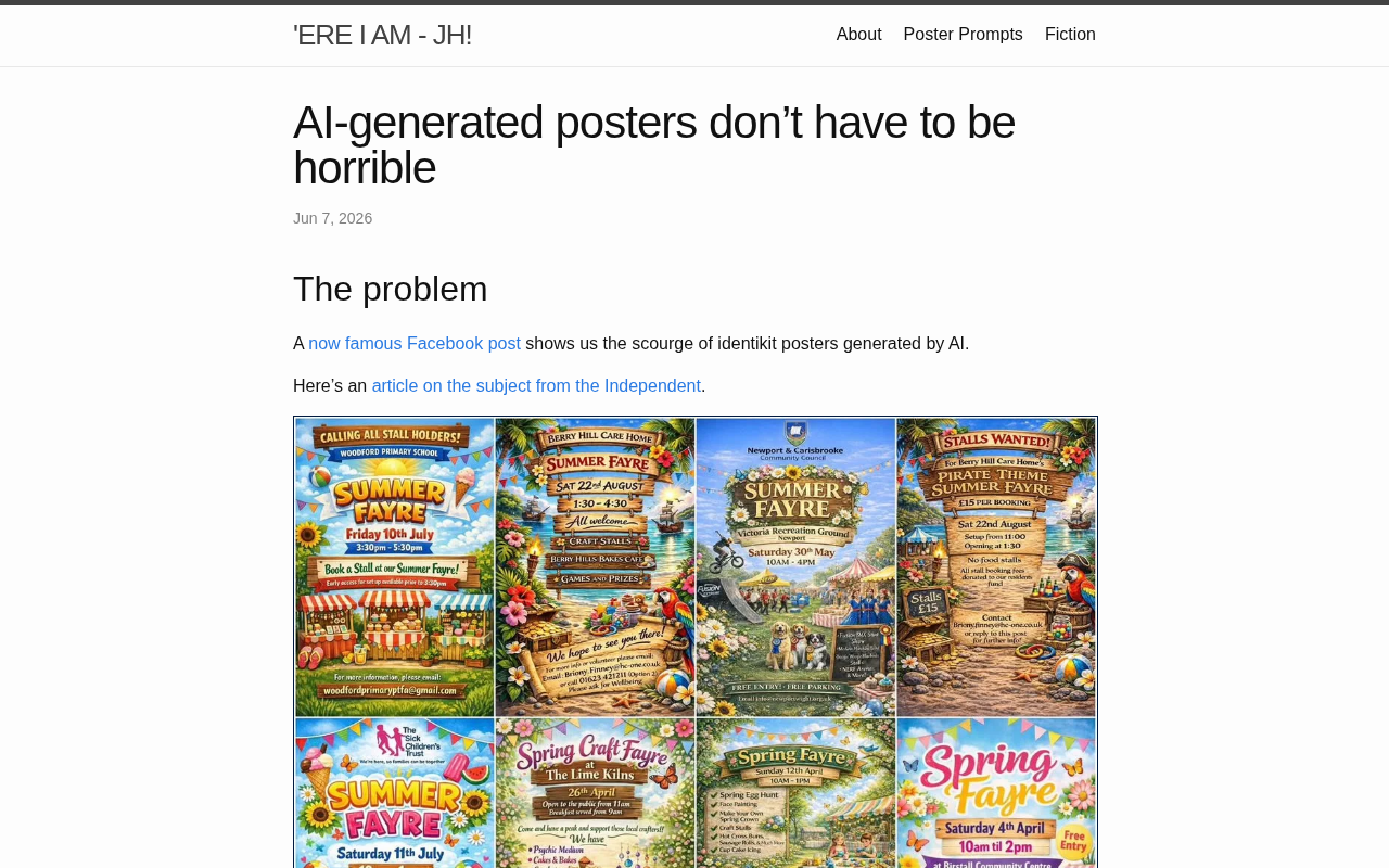
AI poster quality depends on how you use the tool, not the tool itself — human oversight is the key.
A Hacker News discussion on AI-generated posters argues that their reputation for looking cheap and tacky stems not from technical failure, but from a lack of design intent and aesthetic judgment. The two core issues — distorted text (a structural flaw in diffusion models) and poor composition (caused by prompts failing to convey grid systems and visual hierarchy) — can both be addressed by repositioning AI as a collaborator: use it to generate visual drafts and raw material, then apply human judgment for selection, layout, and refinement. Explicit, detail-rich prompts further close the quality gap.
Why AI-Generated Posters Get Such a Bad Rap
In design communities, AI-generated posters have long carried the stigma of looking "cheap" and "tacky" — cluttered layouts, distorted text, jarring color combinations. Many professional designers have dismissed AI tools entirely as a result. A Hacker News discussion titled AI posters don't have to be horrible recently reignited the conversation around this problem.
The core argument is straightforward: when AI-generated posters look bad, the tool itself usually isn't to blame. The real culprits are poor usage practices and a lack of aesthetic oversight. When we treat generative models as a magic "one-click" solution, inconsistent results are inevitable. But when used as a design aid — guided by clear creative intent — the quality of output can improve dramatically.
Where Things Go Wrong
Most cringe-worthy AI posters share problems that fall into a few recurring categories.
The Persistent Problem of Text Rendering
Diffusion models have an inherent weakness when it comes to text. Generated characters frequently contain spelling errors, distorted strokes, or chaotic layouts. This is often how you can spot an AI poster immediately — the headline text is almost always a giveaway. The standard fix is to decouple text from imagery: use AI to generate the background and visual elements, then overlay clean, properly typeset text using traditional design tools.
The underlying mechanics of diffusion models make them fundamentally ill-suited for text. These models generate images by iteratively denoising, essentially learning statistical patterns in pixel distributions — not the semantic structure of characters. Text demands extreme precision; a single misplaced stroke produces a wrong character or gibberish. But diffusion models have no mechanism to enforce "linguistic correctness" as a constraint. Some models (such as FLUX and SD3) have improved on this by incorporating text encoders and higher-quality training data, but text remains a structural weakness of the diffusion paradigm. This is precisely why decoupling the AI generation layer from the typography layer is considered the most robust solution in the industry. The combination of image generation models with tools like Canva or Figma is, at its core, a workaround for this fundamental limitation.
Missing Design Constraints
Without clearly defined grid systems, visual hierarchy, and intentional use of white space, AI tends to pile on elements, resulting in crowded, unbalanced compositions. Great poster design follows rigorous visual principles — and a simple text prompt struggles to convey these unspoken rules.
The grid system is an invisible framework used in graphic design to govern the placement and proportional relationships of elements. Rooted in 20th-century Swiss International Style, it's widely used in posters, magazines, and UI design to define margins, columns, and line spacing — creating a sense of visual order and breathing room. Visual hierarchy refers to guiding the viewer's reading order through deliberate differences in font size, weight, color, and position. Both principles typically exist as internalized knowledge within a designer's training, making them extremely difficult to express precisely through natural language prompts. Without external constraints, models tend to "fill the canvas," generating visual noise through element overload. Structured prompt frameworks or reference images can help bridge this gap.
Practical Approaches to Better AI Posters
The key insight from the discussion is reframing AI as a collaborator, not a replacement.
One viable workflow: use AI to rapidly generate multiple visual direction drafts as a source of inspiration and raw material; have a designer or aesthetically-informed user then select, crop, and rework the results; finally, use professional tools to handle typography, color correction, and detail refinement. This "AI generates the material, humans provide the judgment" model retains the efficiency advantages of generative tools while sidestepping their weaknesses in structure and text.
Prompt refinement also matters enormously. Explicitly specifying style, composition, color palette, and even design movement references can significantly improve the usability of initial outputs. Rather than expecting a model to automatically understand what "looks good," the better approach is to communicate your aesthetic standards explicitly.
What This Means for Creators
The discussion was modest in scale — the post received only 7 upvotes — but it highlights a widespread misconception: blaming the technology for low-quality AI output. In reality, the ceiling of any tool is usually set by the skill and taste of the person using it.
For content creators and designers, the productive path forward isn't resistance to AI — it's learning how to harness it. That means understanding the boundaries of what models can do, building human-AI collaborative workflows, and retaining human judgment as the final quality gate. When aesthetic discernment and technical tooling work in concert, AI-generated posters can absolutely shed the "cheap" label and become efficient, reliable creative partners.
Related articles
Claude Full Feature Test: One Prompt Generates a Research Paper, PDF, and Webpage Simultaneously
Testing Claude's top-tier model: one prompt generates a research paper, PDF, and webpage. A breakdown of its search, coding, and document capabilities — plus an honest look at third-party access risks.

Claude Code for Beginners: A Learning Roadmap to Building Complete AI Applications Without Writing Code
A five-stage learning roadmap for building complete AI applications with Claude Code — no coding required. Covers WebCoding tools, Agents, and Workflow design.
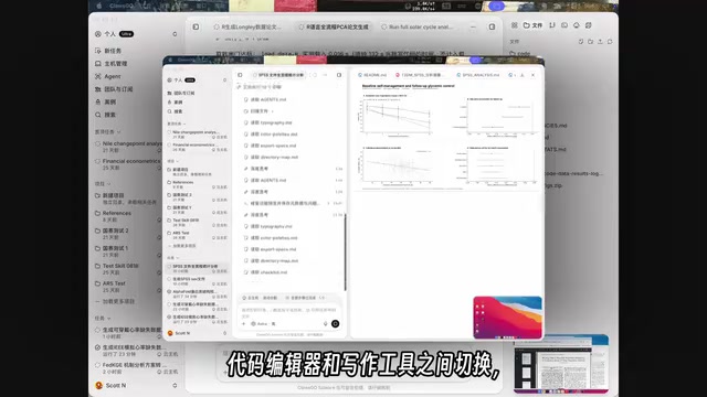
The Research-Grade Claude Code Has Arrived: How Colossal Science Closes the Last Mile of AI for Science
Colossal Science (Closco), the research-grade Claude Code, connects literature, data, code, figures, and papers to close the last mile of AI for Science.