Apple Music Gets a New Icon? iOS 27.2 Beta Leaks Black-and-White Design

Apple Music's icon switched from red-and-white to black-and-white in the iOS 27.2 beta, sparking rebrand speculation.
According to 9to5Mac, Apple Music's icon in the iOS 27.2 beta has been quietly replaced from its signature red-and-white scheme to black-and-white, with the eighth note's tilt angle also sharper. This is the second sighting after the new logo appeared on the Apple Music Hall website last month, with two independent sources corroborating each other. The beta replacement directly overwrites the default icon rather than being a user-switchable theme. Analysts suggest it may pave the way for a more flexible iOS icon tinting system, reflect a restrained brand positioning, or simply be an experimental design. Apple has not responded, and the official release remains uncertain.
Apple Music's signature red may soon be a thing of the past. According to 9to5Mac, in the latest iOS 27.2 beta, the Apple Music app icon has quietly been replaced with a black-and-white version.
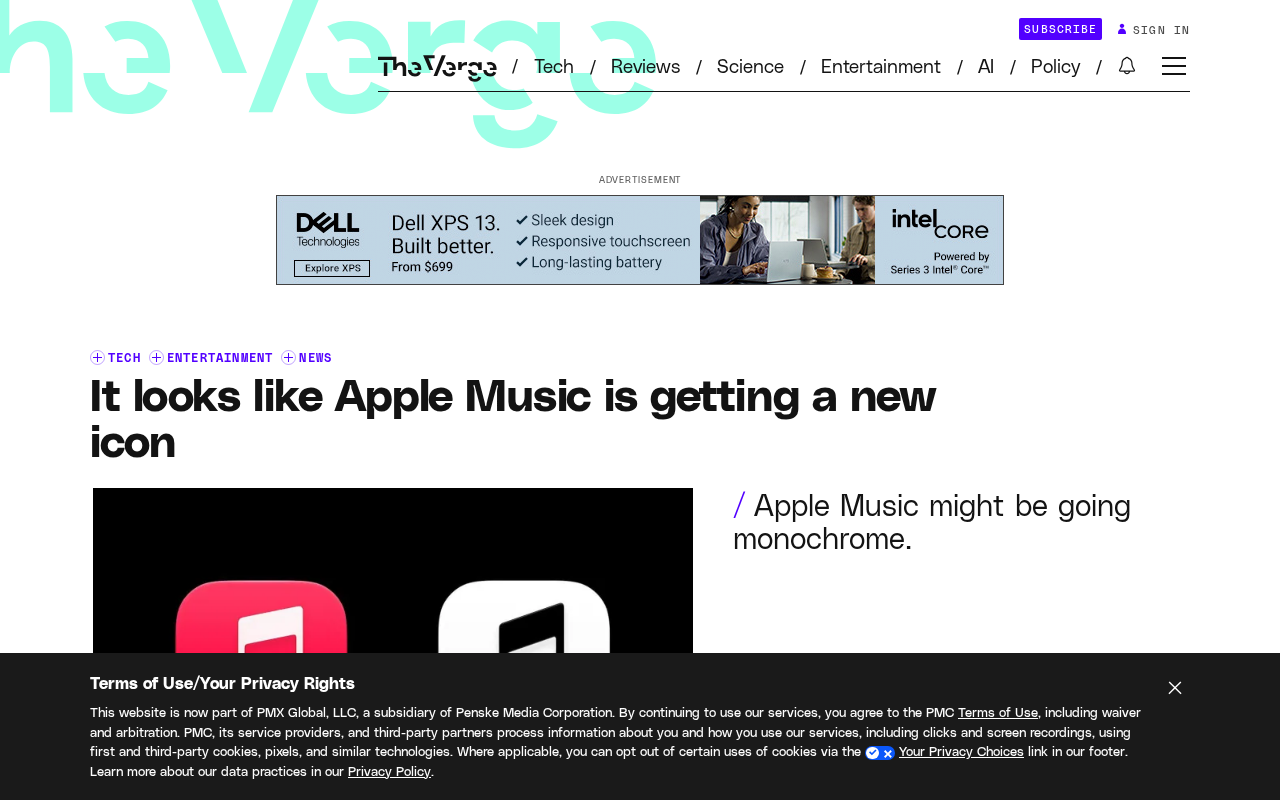
What Changed in the Icon?
The most obvious change is the color scheme. The original red-and-white icon has been replaced with a black-and-white two-tone design, giving the overall visual style a suddenly cooler, more restrained feel. Beyond the color, the eighth note on the icon has also been adjusted — its tilt angle is now slightly sharper than the original version.
This level of change is unusual in Apple's design language. Since Apple Music launched in 2015, red has been a core element of its brand identity, running through the icon, interface accent colors, and even marketing materials. Stripping the red out entirely means either a complete brand overhaul or Apple preparing for some kind of new visual system.
Not the First Hint
This isn't the first time the new logo has surfaced publicly. Last month, someone spotted traces of the new Apple Music logo on the Apple Music Hall website. At the time, the outside world didn't pay much attention — after all, experimental materials appearing on a website aren't unusual. But now the same design has appeared in an iOS beta, and with two independent sources corroborating each other, it's no longer so simple.
According to 9to5Mac's report, the change in the beta isn't a user-switchable theme option, but a direct replacement of the default icon. This detail is worth noting — if Apple were merely offering users a dark mode icon option, it typically wouldn't directly overwrite the default design in a beta.
iOS beta versions are preview releases of the operating system that Apple distributes early to developers and public beta testers, usually containing new features and design changes that haven't been finalized. Design changes in betas don't equate to the final form of the official release — Apple often repeatedly adjusts across multiple beta iterations, or even completely rolls back certain experimental changes. Therefore, while the icon replacement in the beta carries high reference value, it can only be interpreted as a "design direction" rather than an "established fact." Historically, Apple has introduced design proposals during the beta phase only to abandon them many times, which is an important precondition to factor in when judging this icon change.
Why Would Apple Remove the Red?
One reasonable speculation is that Apple is pushing forward an overall visual update across its operating systems. iOS has been adjusting its design language over the past several versions, from lock screen customization to icon tinting, with users gaining more and more control over the interface's appearance. Black-and-white icons may be paving the way for a more flexible icon tinting system — when the icon itself is neutral in color, system-level tinting effects become more consistent.
Another possibility is a brand-level consideration. Apple Music's competitors in the streaming market — Spotify uses green, YouTube Music uses red — color recognition has become a means for each to compete for user attention. Apple choosing black and white goes against the grain, perhaps to convey a more restrained, more "tool-like" product positioning.
Of course, there's also a more plain explanation: the icon change in the beta may simply be an experiment by the design team, and whether it ultimately lands in the official release remains unknown. It's not uncommon for Apple to try various design proposals in betas and then abandon them.
iOS's icon tinting feature is a system-level customization capability Apple officially introduced in iOS 18. It allows users to apply a unified monochrome filter to home screen icons, so that third-party app icons visually align with the system style. This feature relies on the system dynamically tinting icon pixels, and the complexity of the original icon's own colors directly affects the consistency and aesthetics of the final rendering. When an app icon itself uses a highly saturated single color (such as Apple Music's red), system tinting often struggles to fully cover the original hue, potentially resulting in color shifts or edge residue; if the icon uses a black-and-white neutral scheme, the adaptability and consistency of system tinting improve significantly. This provides a technical basis for the speculation that "Apple may be paving the way for a more flexible icon tinting system."
What It Means for Users
If this change ultimately makes it into the official release, the biggest impact may be on users who rely on icon colors to quickly locate apps. A red icon carries high visual weight on the Dock or home screen, and once it becomes black and white, Apple Music may no longer "pop" as much.
For dark mode users, a black-and-white icon is actually good news. Red icons can sometimes appear harsh on dark backgrounds, while a black-and-white scheme blends better into dark interfaces.
Apple has not yet made any official response to this matter. Considering that iOS 27.2 is still in the beta stage and there's still some time before the official release, there's a fair chance the icon design could change.
Dark Mode is an interface theme Apple introduced in iOS 13 that reduces screen brightness by turning background colors dark, easing visual fatigue during nighttime use. It's not simply "inverting colors" — it requires apps to redesign their color schemes to adapt to dark backgrounds. In this context, highly saturated red icons or interface elements can appear harsh on dark backgrounds due to excessive contrast, while black-and-white icons blend more naturally with dark interfaces. This is also why the icon shifting from red to black and white is seen as a design adjustment that's friendlier to dark mode users.
One-line Summary
Apple Music's icon changed from red-and-white to black-and-white in the iOS 27.2 beta, sparking speculation about a rebrand.
Paragraph Summary
According to 9to5Mac, Apple Music's icon in the iOS 27.2 beta has quietly been replaced from its signature red-and-white color scheme to a black-and-white one, with the eighth note's tilt angle also becoming sharper. This is the second time the new logo has been spotted by the outside world after appearing on the Apple Music Hall website last month, with two independent sources corroborating each other and increasing the credibility of the change. The replacement in the beta isn't a user-switchable theme option, but a direct overwrite of the default icon. The article analyzes that this move may be paving the way for iOS's more flexible icon tinting system, may be a restrained brand-level positioning, or may simply be an experimental design during the testing phase. Apple has not yet responded officially, and whether the official release will follow suit remains uncertain.
Related articles

When Did Paid Childcare Become the Norm? Working Mothers and the Evolution of Childcare
When did paid childcare become the norm? This article traces the evolution from the rise of childcare centers in the 1970s–80s and the 1990s linking of federal subsidies to work requirements, to declining stigma and rising costs, and explores advocates' 25-year effort to catch up with other countries on childcare and paid parental leave.

Red Flags for Product-Market Fit: A Practical Guide from Top VCs and the Superhuman Founder
Investors from Iconiq and Sapphire Ventures and Superhuman founder Rahul Vohra share PMF red flags and practical methods, including the 40% disappointment rule, retention curves, and acquisition costs.

What Task Should AI Agents Take Over Most? Heated Reddit Discussion
Reddit discussion: Which task do you most want AI agents to take over completely? Cross-app data migration, CRM updates, and report generation top the list, but insufficient reliability and the trust gap are the biggest obstacles to automation adoption.