Cue: The UI Component Library Built for Awwwards-Tier Design
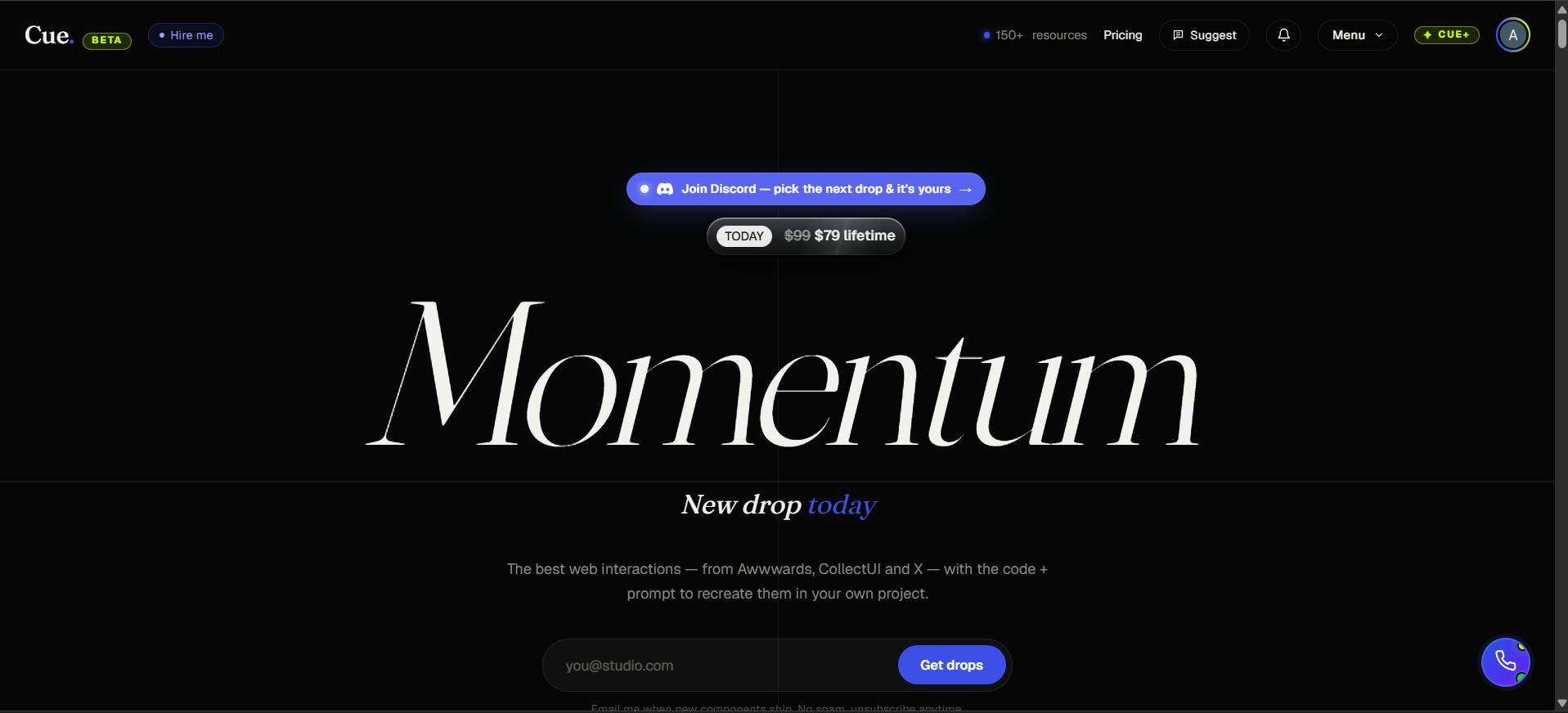
Cue is a UI component library targeting Awwwards-level design aesthetics with hero sections, micro-animations, and unique layouts.
Cue is a UI component library positioned around "Awwwards-tier" aesthetics, carving out a differentiated niche in a commoditized component market. Unlike mainstream solutions such as Bootstrap or shadcn/ui that prioritize functional completeness and developer efficiency, Cue focuses on visual impact — bold hero sections, smooth interactions, unique layouts, and micro-animations — all aimed at nailing that crucial first impression. Its target audience spans designers and developers alike, with a sweet spot for indie developers, freelancers, and small studios building landing pages, portfolios, or product launches where visuals matter most. That said, the product is still in early stages, and key questions remain around the inherent tension between pre-built "wow factor" and genuine uniqueness, animation performance, accessibility compliance, and overall library completeness.
In the world of web development, UI component libraries are nothing new. From Bootstrap to Material UI to the recently popular shadcn/ui, developers have never been short of ready-made buttons and cards. But a new tool called Cue landed on Product Hunt with a different angle — it's not aiming for "good enough." It's aiming for "jaw-dropping."
What Problem Cue Is Trying to Solve
Cue's official tagline is bold and unapologetic: The Awwwards-tier UI component library. Awwwards is a globally recognized web design awards platform, and the sites it recognizes tend to represent the pinnacle of visual design, interaction, and creative execution. By baking that name directly into its positioning, Cue sets a clear benchmark for itself: don't settle for functional — aim for exceptional design.
One line from the official description captures this philosophy well: "Build websites that don't just work — they stand out." That's a sharp contrast to most component libraries, which lead with efficiency, consistency, and maintainability.
Awwwards (short for Awards for Design, Creativity and Innovation on the Internet) was founded in 2009 and is widely considered one of the highest honors in web design. Sites awarded "Site of the Day" or "Site of the Month" typically score high marks from a judging panel across four dimensions: Design, Usability, Creativity, and Content. The sites that make the cut usually come from top-tier digital creative studios with production budgets that can run into the tens of thousands of dollars. That's why putting "Awwwards-tier" in your product positioning is quite a bold promise — it implies that what you can build with this library will visually hold its own against professional studio work.
Component Makeup: Focused on Visual Impact
Based on the official description, Cue's components are concentrated in the "front door" of a website:
- Bold hero sections: High-impact above-the-fold hero blocks
- Smooth interactions: Fluid, polished interaction effects
- Unique layouts: Distinctive page layout structures
- Thoughtful micro-animations: Carefully crafted micro-animations
These are precisely the elements that shape a visitor's first impression. Unlike functional components such as forms, tables, and navigation menus, Cue clearly prioritizes the parts of a site that create memorable visual moments. Its tagline "Build less. Create more." reinforces this — spend less time on repetitive work and save your energy for creative expression.
Micro-animations refer to brief, fine-grained animations in a UI — typically lasting 200–500 milliseconds — that respond to user interactions or draw attention, such as subtle button deformation on press, fade-in effects as content scrolls into view, or color transitions on hover. Unlike full-screen transitions, micro-animations add a sense of realism and depth without interrupting the user's flow. They're one of the key details that separate polished, premium designs from cheap templates. On the implementation side, micro-animations typically rely on CSS transitions/animations or JavaScript animation libraries like GSAP or Framer Motion — each with distinct trade-offs in performance overhead and control, which is a key factor to evaluate when integrating this kind of component library.
Who It's Built For
On Product Hunt, Cue is listed under three categories: Design Tools, Developer Tools, and Web Design — spanning both the design and development sides. That suggests its target users likely include:
- Independent developers who want to quickly build high-quality landing pages
- Frontend engineers who care about aesthetics but don't want to hand-code complex animations from scratch
- Freelancers and small studios that need to deliver visually impressive work to clients
For these users, a ready-made set of award-caliber components can significantly reduce the distance between "design concept" and "live product" — especially in high-stakes first-impression scenarios like marketing pages, portfolios, and product launch sites.
The Trade-Offs in Its Positioning
It's worth thinking critically about the fact that "Awwwards-tier" is both Cue's biggest selling point and potentially its limiting factor. Highly stylized, visually expressive components come with a few real-world challenges: first, there's the tension between flexibility and individuality — when enough people use the same striking pre-built designs, they start looking alike, which undercuts the very "uniqueness" being promised. Second, components heavy on animation and visual effects tend to demand more careful attention to performance and accessibility.
It's also worth noting that, based on current Product Hunt data, Cue is still in early stages (11 upvotes, 1 comment, ranked #16), and the component library itself is described as a "growing collection" still being expanded. Whether it can genuinely deliver on its "award-tier" promise will depend on the completeness of its future components, documentation quality, and community feedback.
Accessibility (often abbreviated as a11y) is an easy-to-overlook but critically important topic for animation-heavy component libraries. Some users experience discomfort from heavy motion due to vestibular disorders, and the WCAG 2.1 standard explicitly requires that websites follow the "reduce motion" guideline (Success Criterion 2.3.3), respecting the OS-level "Reduce Motion" preference via the
prefers-reduced-motionCSS media query. For a library that leads with animations and visual effects, developers may need to manually implement accessibility accommodations if this support isn't built in — especially for commercial projects targeting European and North American markets, where accessibility compliance can carry legal weight in some jurisdictions.
Takeaway
Cue represents a niche direction in the UI component library market: as basic components become increasingly commoditized, differentiation is shifting toward design aesthetics and visual experience. For projects where "the site looking great" is a core requirement, Cue offers a shortcut. Whether it can truly stand out in a crowded landscape of component libraries will depend on its ability to continuously deliver components that are both beautiful and practical. Developers who are curious can check it out at cuedesign.space.
Related articles
The Hidden Risks of Culvert Failure: An Overlooked Infrastructure Hazard
Culverts are hidden drainage structures buried beneath roads. Their failure can silently hollow out road beds, cause localized flooding, and trigger deadly collapses — yet they remain chronically overlooked.
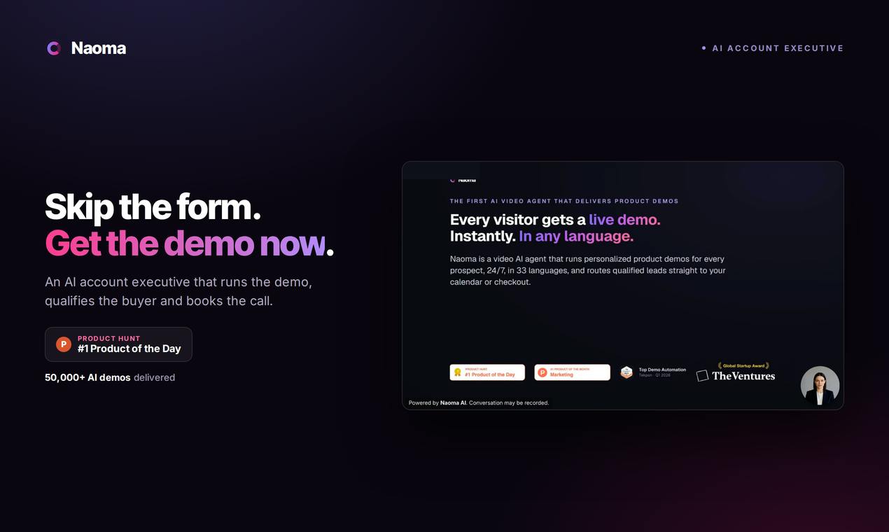
Naoma AI Demo Agent V2: Turning Website Traffic into Booked Meetings with AI Sales
Naoma AI Demo Agent V2 replaces demo request forms with an AI sales rep that demos products, qualifies leads, and books meetings in real time. 50K+ demos run.
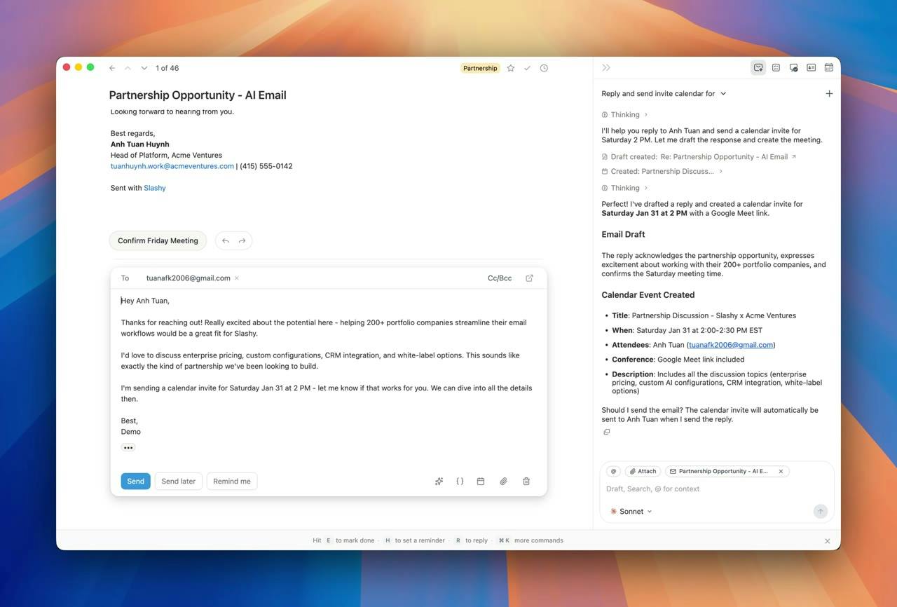
Slashy Assistant: The AI Email Assistant That Handles Your Inbox for You
Slashy Assistant is an AI-native email client with a built-in smart assistant that drafts replies in your voice, organizes email, schedules meetings, and tracks follow-ups. Accessible via iMessage, Slack, and phone — set up in five minutes.