Fixing Fluid Typography: Combining Container Queries with @property
Combine clamp(), container query units, and @property to fix fluid typography font-size inconsistencies across multiple containers.
Fluid typography uses `clamp()` with viewport units for smooth scaling, but viewport units can't sense container boundaries, causing font sizes to keep growing after the wrapper hits its max width. Switching to container query inline units (`cqi`) fixes this — as long as the wrapper is explicitly declared as a container. But when a page has multiple containers (like a card layout), identical font-size declarations render at different sizes since each resolves against its own container. The fix is `@property`: registering a custom property as `<length>` forces the browser to compute and store the resolved value at the wrapper level, so the same number is inherited across all nested containers — balancing responsive layout with design consistency.
Fluid Typography is a widely adopted technique in modern web design that allows font sizes to scale smoothly with the viewport. In practice, however, it surfaces several frustrating issues. This article — based on a demo by well-known frontend educator Kevin Powell — walks through three common pain points and their solutions, with the core idea being to combine clamp(), container query units, and @property.
Problem 1: Font Size Keeps Growing After the Container Reaches Its Max Width
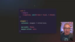
The most common approach to fluid typography is using clamp() with viewport units to set font size bounds. The problem is that clamp()'s maximum value is evaluated against the viewport width (vi, the logical inline viewport unit) — not the actual width of the container the text lives in.
When a page's wrapper has already reached its maximum width and the card and heading occupy no more space, the viewport keeps growing. The browser thinks "we haven't hit the max yet," so the font size keeps inflating — creating a noticeable "squishy zone" that looks visually awkward.
The solution is to replace viewport units with container query inline size units, since container units are aware of the actual size of their containing element. However, there's a commonly overlooked gotcha with this approach.
clamp(min, preferred, max)is CSS's three-value clamping function. It returns the middle value: the minimum if the preferred value is below it, the maximum if above, and the preferred value otherwise. A typical fluid typography pattern looks likeclamp(1rem, 2.5vi, 2rem), wherevi(viewport inline size) equals 1% of the viewport's logical inline dimension — in horizontal writing modes, that's 1% of the viewport width. The hidden danger: all three arguments inclamp()are evaluated in the same computation context, so the maximum value2remis triggered solely based on viewport width, with no relation to the actual width of any container on the page. When your design calls for a wrapper capped at 1200px but the user's monitor is 1800px wide, the viewport keeps growing while the wrapper has already stopped — yet the browser still considers the preferred value within bounds, and the font size bloats even though there's visually "no more space."
Problem 2: Container Units Require an Explicitly Declared Container
Simply swapping viewport units for container units won't immediately fix things. Without an explicitly defined container, container query units fall back to referencing the viewport — giving you the exact same result as before, squishy zone and all.
The right approach is to explicitly declare the wrapper as a container. Kevin noted in his demo that he no longer names his wrapper element container to avoid confusion with the container concept in the Container Queries spec. The name itself doesn't matter, but consistency does.
Once the wrapper is declared as a named container, all elements inside it calculate their container query inline units relative to the wrapper's size. This means when the wrapper hits its max width, the font size stops growing too — which is exactly what design intuition would expect: if the space the text occupies isn't getting larger, the font size shouldn't either.
If that's all you need, the problem is solved here. But once your project introduces multiple containers, new issues emerge.
Container Queries are a CSS feature that lets elements apply styles based on the size of their containing element rather than the viewport. To enable this, you declare
container-type: inline-size(optionally withcontainer-name) on a parent element, telling the browser it's a "size container." The container query inline unitcqi(equal to 1% of the container's inline size) only resolves relative to a declared container if it can find one; if no container is found up the DOM tree, the spec requires falling back to the viewport. This means "forgetting to declare a container" results in behavior identical to before the change — making it extremely hard to notice. Example declaration:container-type: inline-size; container-name: wrapper;— after this, child elements usingcqiwill base their calculations on that wrapper's actual width.
Problem 3: Multiple Containers Cause Inconsistent Font Sizes
As container queries become more prevalent, a single page often uses containers in multiple places. Take a card layout: cards that start out stacked vertically are rearranged into a horizontal row, and to allow them to restack when space is tight, you use @container to query each card's available size.
This requires declaring each individual card as a container. The layout issue is solved — cards stack and stretch correctly — but a side effect appears: identical font size declarations on three cards render at three different sizes. That's because each font size now references its own card's container dimensions rather than the shared wrapper.
For anyone maintaining a design system, this inconsistency is a nightmare — the same declaration produces different results, undermining predictability.
Using @property to Lock in Consistent Font Sizes
To address this, Kevin drew inspiration from an article by Ana Tudor and presented an elegant solution using @property.
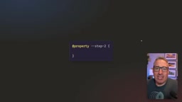
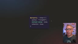
@property lets you register custom properties, and registered properties store their values differently from regular custom properties. Registration requires three things: syntax (value type), initial-value, and inherits.
@property --step-2 {
  syntax: '<length>';
  initial-value: 1rem;
  inherits: true;
}
Here, syntax is set to <length> because font sizes are length values with units (rem, px, etc.) — not unitless numbers. On inherits, Kevin ultimately chose true so values set on a parent element cascade down to children. He also noted that inherits: false can actually be more convenient in certain scenarios, and linked a related video.
The key step after registration is re-declaring --step-2 on the wrapper's direct children. Because it's a registered length-type property, the browser actually evaluates the clamp() expression and stores the computed numeric value — rather than treating it as an opaque string like a regular custom property would.
This means the font size calculation is frozen at the wrapper's container size. From that point on, no matter how individual card containers vary, all three cards resolve to the same font size — preserving the responsive layout from container queries while eliminating inconsistency. This is the most fundamental difference between @property and a plain custom property.
@propertyis part of the CSS Houdini spec, allowing developers to formally register custom properties in stylesheets so browsers understand their type and initial value. A regular custom property (--foo: calc(1px + 2px)) is treated by the browser as an opaque string, inserted and parsed only when referenced byvar(); once registered as<length>, the browser immediately computes the concrete value when the property is assigned and stores that resolved number — subsequentvar()references return an already-determined result. This distinction determines "where the calculation context is frozen." An unregistered property'sclamp()expression is re-evaluated at every element that references it, producing different results across different containers; a registered property completes its calculation at the point of assignment, and what gets inherited is a single resolved value — ensuring cross-container consistency.@propertyhas had solid support across Chrome, Firefox, and Safari since 2023.
An Optional Reset Pattern
Sometimes you might want to "opt out" and let a specific element use font sizes based on its own container. Kevin demonstrated a reset technique: declare an additional unregistered custom property (e.g., --step-2-reset).
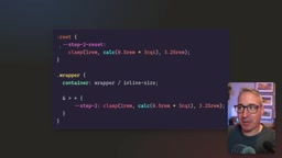
Unregistered custom properties are not computed — they store the entire expression as a string. This allows you to cleanly reuse declarations and, when needed, rebind font sizes to a specific container (like the card itself). Combined with inherits: true, a value reset on a card will cascade down to all its children.
That said, Kevin also acknowledged that if you always want font sizes based on each element's own container, there's no reason to bother registering the property in the first place — this reset is more of a demonstration of what's technically possible than a best practice recommendation.
Summary
This approach chains together three CSS capabilities to solve a long-standing fluid typography problem:
clamp()handles smooth font size scaling;- Container query units replace viewport units, anchoring font sizes to the actual container dimensions;
@propertyregisters a length-type custom property, locking font size calculations to a specific container's resolved value and guaranteeing cross-container consistency.
The mental model takes a little time to absorb, but for developers who want both design system consistency and the power of container queries, this is a genuinely practical technique. @property now enjoys solid browser support across all major browsers — it's safe to start using.
Related articles

Identifying Characters from 'Time Difference 5 Hours 3' Posters: A Fun Observation Experiment
A content creator fails to recognize even himself in Time Difference 5 Hours 3 posters, revealing how humans navigate image recognition when art styles are unified.
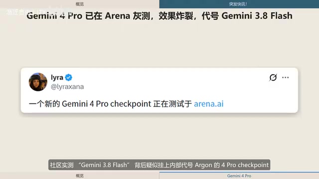
Gemini 4 Pro Spotted in Arena Ghost Testing: Major Upgrades in 3D and Physics Capabilities
Google's Gemini 4 Pro, codenamed Argon, may be ghost-testing in Arena as Gemini 3.8 Flash. Community tests show major 3D, physics, and interactive content gains, 256K output, and rumored 2M context.
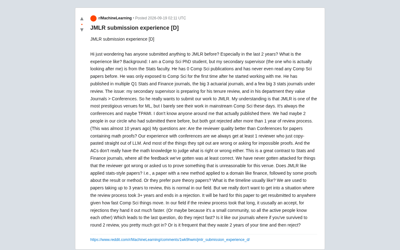
What's It Like to Submit to JMLR? The Real Dilemmas of an Interdisciplinary PhD
A CS PhD student on Reddit asks about submitting to JMLR amid a clash between two academic cultures — exploring review quality, paper style, and timeline risks.