Pure CSS Popovers: A Native Approach Without JavaScript

Build animated, accessible popovers with zero JavaScript using modern CSS native features.
Modern CSS can replace JavaScript for popovers. Using the native Popover API, @starting-style, transition-behavior: allow-discrete, and CSS Anchor Positioning, you can build animated, keyboard-accessible popover components declaratively—with less code, better accessibility, and lower maintenance costs.
Can CSS Really Replace JavaScript for Popovers?
There's a long-running debate in the front-end community: as CSS keeps expanding its capabilities, is it "overstepping" its boundaries? After a video demonstrating a pure CSS popover went viral, plenty of developers pushed back—"You can do all of this with just a few lines of JavaScript. Is memorizing all these CSS property values really worth it?"
The answer turns out to be quite compelling: native HTML and CSS can not only achieve equivalent functionality, but they also come with built-in accessibility support, less code, and lower maintenance costs. This article walks through the entire approach, showing how to build an animated, keyboard-accessible popover component with declarative CSS—all with zero JavaScript.
The Foundation: The Native Popover API
The key to this implementation is HTML's native popover attribute. This is a new feature already widely supported in modern browsers, allowing developers to build popovers without relying on any framework or script.
The Popover API is a native HTML specification spearheaded by the WHATWG (Web Hypertext Application Technology Working Group). Founded in 2004, WHATWG was originally an independent working group formed spontaneously by browser vendors (Mozilla, Opera, Apple) who were frustrated with the stagnation of the W3C's HTML spec evolution. Its core philosophy is the "Living Standard"—the standard never freezes at a version number, but is continuously iterated and updated to reflect the real state of browser implementations. The Popover API gained broad support in Chrome 114, Firefox 125, and Safari 17 in 2023, now covering over 90% of browser users worldwide. It emerged to solve the long-standing "popover dilemma" in front-end development—where developers had to rely on third-party libraries (like Tippy.js or Popper.js) or write large amounts of JavaScript to handle focus trapping, z-index stacking management, and accessibility semantics. The native API builds this complex logic into the browser engine layer, fundamentally reducing the developer's workload.
Worth understanding in depth is that the Popover API was designed with full consideration of the "Top Layer" rendering mechanism. Browsers maintain a Top Layer Stack that is independent of the normal document render tree. All elements activated via the Popover API, the <dialog> element, or the Fullscreen API are promoted to this layer, naturally sitting above all normal page content. This mechanism completely bypasses the limitations of z-index stacking contexts—in the past, developers had to manually set extremely high z-index values (like 9999) on popovers, constantly worrying that a parent container's transform or isolation property might accidentally create a new stacking context and cause the popover to be obscured by other elements. A parent's overflow: hidden was an even more natural nemesis of popovers, clipping them outright. The Top Layer mechanism fundamentally eliminates these "positioning hell" problems that have plagued front-end engineers for so long. Popover elements are consequently shown as an independent #top-layer container in DevTools, making debugging easier.
The entire structure requires only two components:
The Trigger Button and the Target Element
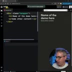
Create a button with a popovertarget attribute pointing to the target element's ID:
<button popovertarget="myPopover">Open</button>
<div id="myPopover" popover>This is the popover content</div>
With just the popover attribute and its association with popovertarget, the popover automatically handles opening and closing. More importantly, it is inherently accessible—it supports closing with the Esc key and automatically dismissing when clicking outside (light dismiss). In traditional JS solutions, all of these would require manually writing event listeners.
This is precisely the core value of native APIs: the browser handles focus management, accessibility semantics, and interaction logic for you, so developers don't have to reinvent the wheel. Specifically, the browser automatically assigns appropriate ARIA roles to popover elements (such as dialog or listbox), maintains focus order, and announces state changes to screen readers—precisely the parts most often overlooked and hardest to debug in pure JavaScript implementations.
Understanding the "Focus Trap" is especially important for evaluating this advantage. When a modal popover opens, accessibility guidelines require that keyboard focus be "trapped" cycling within the popover, preventing users from tabbing out to the background content. In JavaScript implementations, this requirement typically involves complex logic: listening for keydown events, maintaining a list of focusable elements, and jumping focus between the first and last elements of the list—and it's highly prone to edge-case bugs. The Popover API builds this complete focus management logic into the browser engine, and together with light dismiss (click-outside to close) and Esc key response, forms a complete contract of interaction semantics. In an era where accessibility standards (WCAG 2.1) receive increasing attention, this "out-of-the-box" accessibility support carries significant compliance value for products serving broad user bases.

Adding Transition Animations with CSS
With the basic functionality in place, the next step is to make the popover "move." This is exactly where modern CSS shines.
Opacity and Toggle States
By setting a default opacity on .popover and defining the expanded state with the :popover-open pseudo-class:
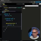
.popover {
  opacity: 0;
}

.popover:popover-open {
  opacity: 1;
}

@starting-style {
  .popover:popover-open {
    opacity: 0;
  }
}
Here, @starting-style is an easily overlooked new feature—it defines the initial style of an element as it transitions from "nonexistent" to "displayed," allowing entry animations to trigger smoothly. Without it, the popover would jump straight to visible rather than fading in.
From a specification standpoint, @starting-style is a new at-rule introduced in the CSS Transitions Level 2 specification, solving a decade-old CSS animation pain point: the "first frame problem" when an element transitions from display: none to display: block. To understand why this problem remained unsolved for so long, you need to understand how CSS transitions work—when triggering a transition, the browser needs to know the property's "starting value" and "target value" and interpolates between them using a timing function. But for an element that has just gone from display: none to visible, the browser has no way of knowing its "state before the transition," because the element didn't exist in the render tree beforehand—there is no computed style to use as a starting point. This causes the first frame of the entry animation to always be skipped, jumping directly to the target state. @starting-style solves this by explicitly declaring "when this element is first added to the render tree, treat these styles as its initial state." This feature was first implemented in Chrome 117 in 2023, followed by Safari and Firefox, and is now safe to use across major browsers. It's especially important to note that @starting-style only takes effect when an element first enters the render tree, not on every style change. This precise timing makes it perfect for the specific scenario of "entry animations," without interfering with subsequent state changes of elements already on the page.
transition-behavior: Solving the Vanishing Close Animation
Opacity transitions alone aren't enough—you'll find that the popover fades in fine, but when closing it "vanishes instantly" rather than smoothly fading out. The root cause is that changes to the display property cannot participate in CSS transitions by default.
Understanding this problem requires returning to the design principles of CSS transitions: CSS transitions were designed to support only "interpolatable" properties—properties whose values can change continuously between two states, such as opacity going from 0 to 1. "Discrete properties" like display and visibility have only a handful of keyword states and traditionally could not participate in transitions. When a popover closes, display switches instantly from block to none, causing the element to be immediately removed from the render tree, and any in-progress transition animations are cut short as well. This problem plagued countless front-end developers over the past decade. Common "hacks" included: using visibility instead of display (which leaves an invisible element still occupying space), listening for the transitionend event before switching display (introducing asynchronous timing complexity), or using setTimeout to delay execution (with the risk of timing race conditions). Each approach solved one problem while introducing new edge cases.
The solution is to add transition-behavior: allow-discrete:
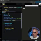
.popover {
  opacity: 0;
  transition: opacity 0.5s, translate 0.5s, display 0.5s allow-discrete;
  transition-behavior: allow-discrete;
}
transition-behavior: allow-discrete is the systematic solution proposed by CSS Transitions Level 2 for this problem. Its core mechanism changes the timing of when discrete properties switch during a transition: in the entry direction (e.g., from none to block), the discrete property switches immediately on the first frame of the transition, making the element visible first, after which other interpolatable properties (like opacity) perform the entry animation; in the exit direction (e.g., from block to none), the discrete property switches only after the final frame of the transition completes, so the exit animation can play out fully before the element actually disappears. This design precisely matches the intuitive interaction model of "show on entry, hide after exit" without requiring developers to manually coordinate any timing logic.
Advanced Techniques: Directional Movement and Anchor Positioning
Asymmetric Slide-In/Slide-Out Animations
To give the popover more depth, you can layer in movement effects—sliding in from one direction and fading out toward another:
.popover {
  translate: 0 -50px;
}

.popover:popover-open {
  translate: 0 0;
}

@starting-style {
  .popover:popover-open {
    translate: 0 50px;
  }
}
By separately setting the starting position, display position, and exit position, you achieve an asymmetric animation of "slide in from below, fade out upward," giving noticeably richer visual depth. Using the standalone translate property here (rather than the transform: translate() shorthand) is intentional—it relates to the compositing layer optimization mechanism in the browser rendering pipeline. Modern browser rendering pipelines are divided into three stages: Layout, Paint, and Composite. The compositing stage is executed by the GPU with minimal performance overhead. opacity and transform are among the very few properties that can completely bypass Layout and Paint and be handled directly in the compositing stage. However, when using the transform shorthand, the browser struggles to determine which specific transform dimension changed, potentially triggering unnecessary repaints. Standalone transform properties (translate, rotate, scale) are improvements introduced in the CSS Transforms Level 2 specification, allowing the browser to perform compositing tracking and optimization on each transform dimension individually. In high-frequency animation scenarios (such as 60fps/120fps scrolling or transitions), this effectively reduces unnecessary compositing layer repaints, making it one of the best practices for modern CSS animation.
CSS Anchor Positioning: Automatically Aligning to the Trigger Button
Finally, with CSS Anchor Positioning, you can make the popover automatically snap near the trigger button without manually calculating coordinates:
.popover {
  position-area: bottom span-right;
}
CSS Anchor Positioning is an important new layout capability in the CSS specification, spearheaded by the Google Chrome team, which officially landed in Chrome 125 in 2024. To understand its revolutionary nature, you first need to understand a fundamental limitation of traditional positioning: CSS absolute positioning (position: absolute) depends on the nearest positioned ancestor container, meaning that for two elements to establish a spatial relationship, they must share a common positioning container. But in complex component-based applications, the trigger button and the popover often live in different branches of the DOM tree—and to avoid z-index and overflow clipping issues, the popover may even need to be mounted under the <body> root node (which is precisely the fundamental reason mechanisms like React Portal and Vue Teleport exist). Once the popover is mounted to the root, it is completely detached from the trigger button's DOM context. Traditional CSS cannot establish any spatial relationship, and could only rely on JavaScript at runtime to compute the button's viewport coordinates via APIs like getBoundingClientRect(), then dynamically set the popover's top/left styles—this is exactly the core value of libraries like Floating UI and Popper.js.
CSS Anchor Positioning establishes a named anchor relationship between any two elements via the anchor-name and position-anchor properties, entirely independent of DOM parent-child relationships, lifting coordinate calculation logic up to the CSS declaration layer. The position-area property provides a nine-grid spatial description language, where bottom span-right means the popover starts below the button and extends aligned to the right, letting developers declare spatial relationships between elements with intuitive, semantic keywords—completely eliminating coordinate calculation logic.
Even more noteworthy is that CSS Anchor Positioning also has built-in automatic overflow detection and fallback mechanisms (via the @position-try rule)—when a popover would overflow the viewport boundary at its current position, the browser can automatically try preset alternative positioning schemes (such as displaying above the button instead of below). The position-try-fallbacks property even supports keywords like flip-block and flip-inline, letting the browser automatically mirror-flip the positioning direction without developers manually enumerating all boundary cases. This capability previously relied entirely on the JavaScript runtime detection of libraries like Popper.js, and can now be fully implemented declaratively at the CSS layer.
The popover expands and collapses right beneath the button, with its positional relationship automatically maintained by the browser, completely eliminating JavaScript calculation logic.
Conclusion: When Should You Prefer a Pure CSS Approach?
The core message of this approach is clear: modern CSS is already powerful enough to implement interactions that previously required JavaScript, in a more concise and maintainable way.
The native Popover API, @starting-style, transition-behavior: allow-discrete, and CSS Anchor Positioning—this combination of new features lets developers build complex interactions with declarative code rather than writing imperative event-handling logic. The advantage of declarative approaches lies not only in code brevity, but in handing the maintenance of interaction logic back to the browser engine. As browsers continue to optimize, the performance and accessibility support of these components benefit automatically, without developers needing to actively upgrade their code.
From an engineering perspective, this also means smaller JavaScript bundle sizes, lower runtime memory usage, and basic interaction capabilities that still work when JavaScript execution is blocked (such as during parse delays on low-end devices). This offers tangible performance benefits for teams pursuing Core Web Vitals performance—Core Web Vitals is a standardized set of user experience metrics launched by Google in 2020, comprising three core metrics: LCP (Largest Contentful Paint), INP (Interaction to Next Paint), and CLS (Cumulative Layout Shift), which directly affect Google search rankings. Larger JS bundles prolong main-thread parsing and compilation time, delaying the LCP moment; complex JS event handlers increase INP latency; and JS-driven dynamic layout adjustments are a common source of CLS. Replacing JS with pure CSS for popovers eliminates these performance risk points at their source.
It's worth mentioning that pure CSS interactions have a natural advantage under the "Progressive Enhancement" architecture. Progressive enhancement is one of the core design philosophies of web development, proposed by Steven Champeon in 2003. It advocates using semantic HTML as the base layer, CSS as the presentation enhancement layer, and JavaScript as the behavior enhancement layer—each layer independently degradable. This is the opposite of "Graceful Degradation"—the latter starts from full functionality and degrades downward, while progressive enhancement starts from minimal usable functionality and enhances upward. Even if JavaScript fails completely due to network failures, Content Security Policy (CSP) restrictions, or script execution errors, popovers based on native HTML attributes and CSS still work. This is especially important for web applications in domains with extremely high reliability requirements, such as government, finance, and healthcare.
Of course, JavaScript remains irreplaceable in complex business scenarios—it's still the right choice for scenarios involving dynamic data, server communication, complex state machines, or the need to polyfill for older browsers. But for common UI components like popovers, tooltips, and dropdown menus, the pure CSS approach has clear advantages in code volume, accessibility, and maintenance cost, making it worth considering first.
Key Takeaways
- The native Popover API builds complex logic like focus management, accessibility semantics, and Top Layer rendering into the browser layer, available out of the box; the Top Layer mechanism completely solves the classic positioning problem of popovers being accidentally clipped by a parent container's
overflow/transform. @starting-stylesolves the "first frame problem" of element entry animations by explicitly declaring the initial state when an element first enters the render tree, allowing from-nothing transition animations to trigger smoothly.transition-behavior: allow-discretechanges when discrete properties switch during a transition—switching on the first frame on entry (show first, then animate) and on the last frame on exit (animate first, then hide)—achieving complete open/close animations.- Standalone transform properties (
translate,rotate,scale) allow the browser to optimize each transform dimension individually in the GPU compositing stage, outperforming thetransformshorthand in animation performance, making them a best practice for modern CSS animation. - CSS Anchor Positioning breaks free from the traditional constraint that absolute positioning must depend on a common positioned ancestor. Combined with the built-in
@position-tryoverflow fallback mechanism, it completely replaces tooltip-style components' reliance on runtime coordinate calculation from libraries like Popper.js. - Progressive enhancement compatibility—implementations based on native HTML attributes and CSS still work when JavaScript is unavailable, offering significant compliance and fault-tolerance value for business scenarios with high reliability requirements.
Related articles

Three AI Researchers Debate: How Far Are We from Recursive Self-Improvement?
Three AI researchers including former OpenAI co-founder John Schulman debate recursive self-improvement and intelligence explosion, dissecting continual learning, distillation, RL success, and ASI timelines.

AI Recursive Self-Improvement (RSI): How Far Are We from the Real Thing?
How close is RSI (Recursive Self-Improvement) to reality? We analyze Acer AI's RSI Agent, a Shotcut watermark task, OS World 20 results, and OpenAI's automated researcher goal.

AI Coding Platforms Are Exploding in Popularity: Can Non-Technical People Really Build Money-Making Products?
An AI coding competition unexpectedly drew 1,000+ signups, sparking debate on whether non-technical people can build profitable products with AI. We break down the opportunities and the hype.