Qwen Image 2.1 Local 32-Test Review: Counting Fails, Anime Style Surprisingly Strong
Local RTX 5090 test of Qwen Image 2.1: text layout reliable, counting and geometry fail.
Bilibili UP host Luke's DevLab conducted a 32-prompt stress test of Qwen Image 2.1 locally on an RTX 5090, covering spelling, counting, spatial layout, human anatomy, materials and styles, and geometry. Results show: single-word spelling, color-position instructions, and spatial relationships are reliable; anime-style anatomy and scenes exceed expectations, with high consistency in multi-figure group scenes; but object counting fails (5 apples counted incorrectly), fine geometric structures like bicycle wheel spokes clearly fail, realistic human poses are structurally disordered, and scenes requiring physical consistency like a cup filled with water also have problems. A purple mark suspected to be training data residue appears repeatedly across many generated images, and the UP host asks the community for help investigating. The model can generate uncensored content, and the test image set will be made public for horizontal comparison.
Title
Qwen Image 2.1 Local 32-Test Review: Counting Fails, Anime Style Surprisingly Strong
Meta Description
Bilibili UP host Luke's DevLab ran 32 local tests of Qwen Image 2.1 on an RTX 5090: spelling and spatial layout are reliable, apple counting fails, anime style beats realistic human anatomy, and geometry like bicycle wheel spokes is a clear weak spot. A purple mark suspected to be training data residue appears repeatedly in generated images.
Article Content
With image generation models being released in droves, the Qwen team has played its Qwen Image 2.1 card. Bilibili UP host Luke's DevLab ran 32 prompt groups locally on a single RTX 5090, conducting a fairly detailed stress test covering spelling, counting, human anatomy, and material reflections. This is the channel's first foray into image generation, yet its test dimensions are broader than many established reviews. Below, we break down the genuinely valuable information from this hands-on test.
Text and Numbers: Short Words Pass, Counting Doesn't
The most basic single-word spelling test: Qwen Image 2.1 got all letters correct, and short phrases were also correctly combined. When given a simple instruction to output numbers, it likewise didn't slip up.
The real stumble was the counting task. The UP host asked the model to "generate a bowl containing exactly 5 apples," but the number of apples fell well short of 5, and some inexplicable lines appeared in the lower right. Object counting has always been a traditional weakness of diffusion models, and this test was no exception.
Another recurring phenomenon was a purple mark on the images, which the UP host described as looking like a printing trace, visible in most generated images. He speculated it might come from the training data and asked viewers for help in the video: if others running it locally encounter the same purple lines, he hoped they would tell him where to investigate.
Diffusion models are the mainstream architecture for image generation today. Their principle is to start from random noise and gradually restore an image through multi-step denoising, rather than predicting word by word like language models. This mechanism determines that the model is strong at modeling the "overall pixel distribution" but inherently weak at constraints requiring precise counting such as "discrete quantities": the training objective does not explicitly reward "getting the number of objects right"; the model merely imitates the common appearance of "a bowl of apples" in the training distribution. Therefore, when a prompt requires exactly 5 apples, the model tends to generate a visually plausible composition rather than strictly enforcing the count. Object counting and the consistency of repetitive structures (such as spokes and railings) remain recognized weaknesses of diffusion models to this day. Common mitigation methods include introducing layout control, segmentation masks, or dedicated post-processing verification.
Artifacts like the "purple mark" that recur across many generated images are not uncommon in diffusion model practice. They usually point to systematic bias in the training data—for example, if a batch of images carries watermarks, compression color shifts, or color characteristics of a specific capture device, the model will learn that color pattern as "what an image should look like" and reproduce it indiscriminately during generation. Investigation directions generally include: checking whether the weights used have been quantized or merged (different precision versions may amplify artifacts), confirming whether the VAE decoder matches the one used during training, adjusting sampling steps and CFG guidance strength, changing the scheduler, and reproducing with different seeds to rule out isolated cases. If it still appears stably under multiple configurations, it can basically be judged as residue at the training data level, and one must wait for official weight updates or community fine-tuning fixes.
Spatial Layout and Human Anatomy: Stable with Pitfalls
Color and position instructions were completed cleanly: a red cube on the left and a blue sphere on the right on the table, with no extra elements. Spatial relationships like "a cup on a closed book, with the book on the table beside it" were also answered correctly. The task of placing objects in an empty scene also passed; the model did not force in conventional furniture.
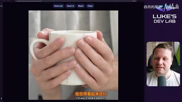
Human anatomy was another matter. When asked to have the model strike a specified pose, the structure was completely disordered, and the UP host bluntly said it was "too bad." In the test of holding a cup, the bending angle of the right index finger was unnatural, though fortunately the classic extra-finger problem did not appear.
Group scenes were instead a highlight. Multiple figures were reasonably positioned, and the presentation of different ethnicities was fairly natural, with no hands intruding or figures overlapping. The UP host checked twice and considered the consistency with real people very high. Anime-style human anatomy performed noticeably better than realistic style; after switching a yoga pose to anime style, it "looked quite accurate."
Realistic human anatomy is one of the hardest parts of image generation, because humans are extremely sensitive to their own poses, joint angles, and hand details, and any slight deviation is instantly recognized as "off." Hand images the model sees during training are often occluded or from a single angle, causing errors in finger count, bending direction, and joint connections. Anime style is instead more "forgiving": its lines are simplified and proportions exaggerated, already deviating from real anatomy, so the model only needs to conform to stylistic conventions, leaving less room for error. This is also the common reason why "anime beats realistic" in reviews—not that the model understands anime better, but that realistic tasks have extremely low tolerance for physical and anatomical consistency, and any subtle structural error will be exposed.
Style, Materials, and Geometry: Strengths and Weaknesses Are Both Clear
An anime street scene received high praise: dusk in the rain, a cyclist in a yellow raincoat, lit shops—the overall atmosphere was on point. The UP host shared a trick for identifying AI images—zoom in on power lines; AI-drawn power lines often look like messy spider webs; also, drifting eyes in figures are a suspicious signal.

Material and style tests such as an oil painting sunrise, ink-wash cliffs, polished metal, and wet neon alleys were mostly well executed. But scenes requiring physical consistency, like a cup filled with water, failed: the water volume was clearly wrong, and too much water ruined the composition.
Geometry was a clear weak spot. In the bicycle wheel spoke test, the lines gradually spiraled and forked, becoming messier and messier; the UP host commented that it was "not handled well, not clean."
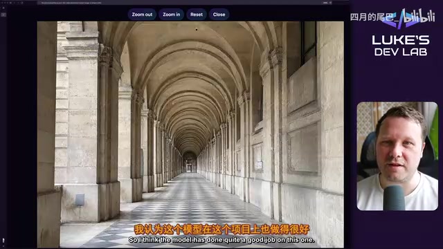
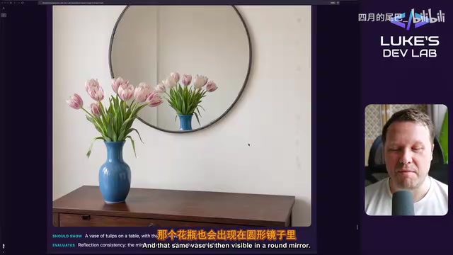
Perspective and repetitive structures (corridor arches, checkered floors) performed well, with elements aligned neatly. In the mirror reflection test, the vase's position in the mirror made the UP host feel it was "a bit off," but he considered the overall reflection effect well done.
Scene Narrative: Foreground Stable, Background Rough
Food details (ramen with egg, scallions, and steam, without hands appearing) met the standard. In a bustling market scene, the foreground figures and stalls were good, but rough structures "like headless people" appeared in the blurred background. In a cafe scene with two people pouring tea, there were strange lines on the hands, and the liquid didn't flow where it should. A tennis serve pose was questioned as not conforming to real sports mechanics. A simulated analog clock was clean and accurate, with the correct hour and no extra hands.
At the end of the video, the UP host confirmed that the model can generate uncensored content. He also explained that he would later put the test image set into the DevLab gallery for horizontal comparison with other image models, and emphasized that the channel's main focus remains Hugging Face text generation models, with image and video as supplements.
What This Round of Testing Shows
The portrait of Qwen Image 2.1 sketched by 32 tests is quite clear: text rendering and spatial layout are reliable, anime style and materials exceed expectations, counting, fine geometry, and realistic human anatomy are obvious weaknesses, and suspected training data residue like the purple mark needs community investigation. For developers who want to deploy image generation capabilities locally, this hands-on test provides a rare fine-grained reference—especially because it puts "what it can do" and "where it will fail" on the same list.
One-line Summary
Local RTX 5090 test of Qwen Image 2.1: text layout reliable, counting and geometry fail.
Paragraph Summary
Bilibili UP host Luke's DevLab conducted a 32-prompt stress test of Qwen Image 2.1 locally on an RTX 5090, covering dimensions such as spelling, counting, spatial layout, human anatomy, materials and styles, and geometry. Results show: single-word spelling, color-position instructions, and spatial relationships are reliable; anime-style human anatomy and scenes exceed expectations, with high consistency in multi-figure group scenes; but object counting fails (5 apples counted incorrectly), fine geometric structures like bicycle wheel spokes clearly fail, realistic human poses are structurally disordered, and scenes requiring physical consistency like a cup filled with water also have problems. In addition, a purple mark suspected to be training data residue appears repeatedly across multiple generated images, and the UP host asks the community for help investigating. The model can generate uncensored content, and the test image set will be made public for horizontal comparison.
Related articles
ICLR 2027 Is Still Sending Rejection Letters: Academia's Long Struggle with AI-Generated Slop
ICLR 2027 continues to issue desk rejects for low-quality submissions, with Reddit voicing support. This article analyzes the initial screening pressure on academic conferences amid the flood of AI-generated papers, the incentive distortions in evaluation systems, and how researchers should respond.

Anthropic India Predates Claude? A Curious Case Sparked by a Name
Reddit users discovered an Indian company named Anthropic that predates the AI company Anthropic, sparking discussions on brand naming and trademark protection. This article explores the story and its implications.
ComfyUI All-in-One Image Generation Workflow: 400+ Styles and Four-View Local Deployment
Based on a ComfyUI integrated workflow from a Bilibili creator, learn local deployment for text-to-image, four-view, outpainting, and mask-based generation with a 400+ style library and model placement guide.