Stop Using JavaScript: 6 Underrated Modern CSS Features

Six stable, production-ready CSS features that replace common JavaScript interaction patterns.
Frontend educator Kevin Powell identifies six mature CSS features that replace JavaScript for common interactions: `scroll-behavior` with `scroll-margin` for clean anchor navigation; `scroll-snap-type` and `scroll-snap-align` for carousel snapping; `:user-valid`/`:user-invalid` for touch-aware form validation; `:focus-visible` for smart focus ring display; the `lh` unit for precise textarea sizing; and `field-sizing: content` for auto-growing inputs. All are stable across major browsers and ready for production use.
Frontend developers often have a reflex: reach for JavaScript the moment they encounter an interaction problem. But many of these cases already have mature, widely supported native CSS solutions. In his latest video, renowned frontend educator Kevin Powell walks through a set of features where "you're still writing JS but a line or two of CSS would do the job." These aren't experimental, cutting-edge syntax — they're stable capabilities that have been supported for years and are ready for production.
Smooth Scrolling & Scroll Positioning: No More Offset Calculations
The most basic — and most overlooked — is scroll-behavior: smooth. Many developers write JavaScript for smooth anchor-link scrolling when a single line of CSS is all it takes. The real pain point that drives people to JavaScript is when a jump destination gets hidden behind a fixed navigation bar, leading to manual offset calculations.
Kevin's solution is to add scroll-margin to the target element. Using scroll-margin-block (which controls both top and bottom), the page automatically reserves space when jumping to a section, so the heading is never covered by the top nav. The ID can go on the section or directly on the heading — both work the same.
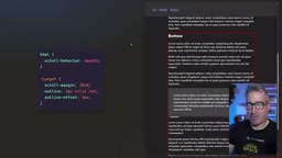
One important accessibility note: if you enable smooth scrolling, it's best to wrap it in a @media (prefers-reduced-motion) query. For users with vestibular disorders who are sensitive to motion, the page will jump instantly when animations are disabled — but the scroll-margin positioning effect is still preserved. Kevin emphasizes that scroll-behavior has been stably supported across all major browsers for over four years, and :target has been around even longer — both are safe to use.
prefers-reduced-motionis a CSS media query that detects whether the user has enabled the "Reduce Motion" accessibility option at the OS level. Users with vestibular disorders are highly sensitive to screen scrolling, parallax animations, and other visual motion, which can cause dizziness or nausea. The correct approach is to disable all animations, transitions, and smooth scrolling by default, enabling them only when the user has no special preference:@media (prefers-reduced-motion: no-preference) { html { scroll-behavior: smooth; } }. This is more accessible than enabling animations by default and using a media query to override them, because it assumes the user may be sensitive rather than assuming they can always handle motion effects. This media query is fully supported in all major browsers and is an important part of modern CSS accessibility practice.
Scroll Snapping: Scroll Snap Replaces Mountains of JS
Horizontal scroll containers — card carousels, thumbnail lists — are a hotspot for JavaScript, especially in A/B tests where you can find huge amounts of script written just for snap behavior. CSS's scroll-snap-type can replace all of that code.
It requires two parts working together: set scroll-snap-type on the parent container and scroll-snap-align on the child elements. scroll-snap-type takes two values — the axis (inline/block or x/y) and the snap strength (mandatory or proximity). Kevin recommends trying both depending on the specific use case. Alignment is straightforward: center, start, end, and so on.
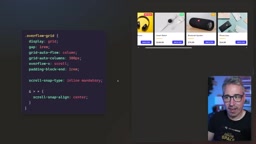
He admits the snapping experience with a desktop mouse wheel is just okay, but it feels excellent on mobile with touch swipes. For web app projects, this is a very worthwhile feature to adopt, and browser support is equally mature.
Form Validation: Replace the touched Class with :user-valid
Form validation is the most misunderstood area of CSS. Native :valid and :invalid pseudo-classes have a critical problem — they activate before the user has entered anything. An empty required input field is flagged as "invalid" the moment the page loads, showing an error before the user has done anything, which is a terrible experience. That's exactly why developers switch to JavaScript, listening for blur events and manually adding a touched class.
Kevin recommends using :user-valid and :user-invalid instead. These pseudo-classes only trigger after the user has actually interacted with the field. A name field turns valid after input; a password field shows invalid with a reason when it doesn't meet minlength — all with zero JavaScript. You can even use the pattern attribute with regular expressions for more complex validation, such as requiring a mix of letters and numbers.
To be clear, Kevin explicitly states this isn't about doing all validation in CSS. His point is: use CSS as a first line of defense to replace those blur-event-listening scripts. When the user submits the form, server-side validation is still non-negotiable. CSS is only responsible for real-time user feedback.
:user-validand:user-invalidare pseudo-classes introduced in the CSS Selectors Level 4 specification. Their core semantics are "the user has interacted with this field." Specifically, they activate after the user has typed in the field and moved away (at the moment ablurevent would fire), or after a failed form submission. This closely mirrors the "touched state management" pattern common in React/Vue projects — logic that previously required listening to events, managing component state, and dynamically toggling CSS classes is now handled natively by the browser. Currently,:user-valid/:user-invalidare stably supported in Chrome 119+, Firefox 88+, and Safari 16.5+, covering the vast majority of production users. Thepatternattribute lets developers declare regex validation rules directly in HTML, and combined with these two pseudo-classes, complex real-time format feedback requires no scripting whatsoever.
Focus Visible: Show the Focus Ring Only for Keyboard Users
This is a bonus tip rather than a JS replacement. Many developers get questioned by managers when a focus ring appears after clicking a button with a mouse, and the temptation is to just use outline: none to remove all focus styles — which breaks the experience for users who rely on keyboard navigation.
The right approach is to use :focus-visible instead of :focus. The browser intelligently determines the interaction method: it shows the focus ring when tabbing with a keyboard, but not when clicking with a mouse. This is actually already the default user-agent behavior in modern browsers.
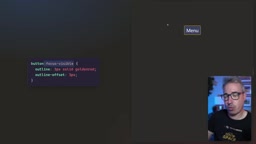
Kevin notes that the exact behavior can vary by interaction method and element type, with browsers making quite a few decisions under the hood — but overall, :focus-visible support is solid and safe to use confidently.
The lh Unit & field-sizing: Two Power Tools for Textareas
The final two tips both deal with textarea. When a designer asks for a text box that's "exactly three lines tall," many developers start trial-and-erroring with magic pixel numbers. Then the font size changes, all those numbers break, and they have to start over.
The solution is the lh unit — it represents the line height. Set height: 3lh (or, more recommended, the logical property min-block-size), and the textarea will always be exactly three lines tall regardless of font size, scaling automatically. Kevin calls lh a severely underrated unit; calculating this kind of height in JavaScript takes a fair amount of code, while CSS does it in one line.
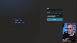
The reason to use min-height instead of a fixed height is to work with another new feature: field-sizing. When users want the input box to grow automatically as they type beyond its initial size — a historically painful requirement — it's now solved with a single line: field-sizing: content. This is especially useful for chat bubble scenarios where dynamic growth is needed.
Note the compatibility difference: the lh unit has been stably supported across all browser engines for about two and a half years (it entered Baseline in November of that year); field-sizing, on the other hand, only landed in all engines about three months ago. Kevin positions the latter as a perfect progressive enhancement case — even if some browsers don't support it, the core functionality is unaffected.
The
lhunit is a CSS relative length unit whose value equals the computedline-heightof the current element. This means it automatically updates when the font size,font-family, orline-heightproperty changes — no recalculation needed. There's alsorlh, which is relative to the root element's line height.field-sizing: contentis a newer CSS property that lets form elements (textarea,input, etc.) size themselves based on their content, similar to how block-level elements behave in normal flow. Without this property, implementing an auto-growing textarea typically requires listening to theinputevent, resetting the element's height toauto, readingscrollHeight, and reassigning it — a classic but fragile JavaScript pattern.field-sizingmoves this logic entirely into the browser's rendering layer, with better performance and no flicker risk. As a progressive enhancement, browsers that don't support it simply fall back to the fixed minimum height defined bymin-height, leaving core usability intact.
Final Thoughts
What these features have in common is that they're neither cutting-edge nor complex — yet they've long been overshadowed by JavaScript solutions. From smooth scrolling and scroll snapping, to form interaction feedback and focus management, to textarea sizing control, native CSS typically gets the job done in a line or two, while delivering better performance and accessibility. Before you reach for a script, it's worth asking: can CSS already handle this?
Related articles

Gemini 4 Argon Hands-On: Topping the Benchmarks but Fumbling in Practice?
Gemini 4 Argon is now fully open—how does it perform in real testing? Bilibili creator Chen Xiaoyan ran five hands-on tests covering 3D animation, physics simulation, a lottery tool, video understanding, and event planning.

Gemini 4 Argon Released: How Will AI Reshape the Gaming Industry and Web Novel Creation?
Google's Gemini 4 Argon officially released, with significantly improved Chinese writing capabilities, sparking heated discussion in web novel and anime-style gaming circles. This article analyzes Gemini 4 Argon's hands-on performance, AI's impact on game copywriting review and development efficiency, and AI tools' long-term impact on the anime-style gaming market landscape.

Gemini 4 Argon Released: AI Moves from Answering Questions to Completing Tasks
Google's latest flagship model Gemini 4 Argon is now available, focusing on long-content understanding, code development, and complex task processing. AI is moving from answering questions to completing tasks. This article analyzes its core capabilities and new changes in the AI competitive landscape.