TED Speaker's Visual Secrets: When and How to Use Slides

TED wisdom: Visual aids aren't essential—strong visuals need revelation, explanatory power, and aesthetic appeal.
Based on TED's official curriculum, this article explores principles for using visual aids in talks. At least one-third of top TED talks use no slides, since slides can distract—"no slides are better than bad slides." Strong visuals have three core elements: revelation (showing what words cannot describe), explanatory power (words and images complementing each other, one concept per slide), and aesthetic appeal (e.g., Hans Rosling's dynamic data visualizations). Visuals should spark curiosity, not repeat spoken words.
On the TED stage, the use of visual aids has always been a subject of debate. Some speakers rely on slides to win over their audiences, while others choose to go without a single slide throughout their entire talk. So how can you effectively use visual elements to give your talk more impact? Insights from TED's official curriculum may hold the answer.
Visual Aids: Necessary or Distracting?
Before deciding whether to use visual aids, speakers need to ask themselves one question: Do I really need visual elements? According to TED statistics, at least one-third of the most popular talks use no slides at all. Slides can distract the audience's attention from the speaker. If your talk relies on personal connection, humor, or storytelling, direct engagement with the audience may work better.
But many talks genuinely benefit from strong visual elements. Sometimes, visuals are even key to a talk's success. The rule is simple: no slides are better than bad slides.
The Three Core Elements of Strong Visuals
Strong visual elements typically have three key qualities: revelation, explanatory power, and aesthetic appeal.
Revelation: Showing What Words Cannot Describe
The most obvious reason to use visual elements is to show things that are difficult to describe in words. Edith Witter was one of the team members who first filmed the giant squid, and her talk centered on that moment of revelation. When the creature appeared on screen, the audience nearly jumped out of their seats. Revelation doesn't have to be dramatic, but you need to first explain the context, guide the audience, and then let the visual play full-screen without any additional content.
The so-called "revelation" in the TED context refers to visual elements that can reveal something the audience has never seen before and could hardly imagine through language, thereby producing a cognitive "aha moment." This kind of visual impact works because the human brain processes images much faster than text, and images can bypass abstract reasoning to directly trigger emotion and memory. The example of Edith Witter filming the giant squid is typical because it simultaneously satisfies two conditions: "seen for the first time" and "scientific importance." But revelation is not the same as spectacle—speakers need to first establish context so the audience understands why this image is worth paying attention to; otherwise, even the most stunning image becomes nothing more than brief visual stimulation.
Explanatory Power: Words and Images Working Together
Combining words and images often produces the best explanatory effect. Much of our world is visually conceived. To explain something new, showing and telling usually work best together. But visuals must match the verbal information. Complex slides distract the audience—each slide should be limited to one core concept. Multiple streams of information require mental energy to process, and speakers must guide attention so that slides support rather than compete with the spoken word.
For charts, highlight the relevant parts. If comparing rainfall in February and October, use color to distinguish the months. Don't cram everything into one slide. Headers with long bullet points tend to lose attention—turn bullets into separate slides, reduce phrases, or replace them with images.
The idea of "words and images working together" is supported by Dual Coding Theory in cognitive psychology: when information is presented through both verbal and visual channels simultaneously, the audience's memory and comprehension are significantly better than through a single channel. But this requires that the two channels carry complementary rather than redundant information—if the text on a slide is exactly what the speaker is saying, the audience gets caught in a "read or listen" competition, which actually increases cognitive load. Therefore, effective word-image complementarity should let images carry content that language struggles to describe precisely—such as space, proportion, process, or contrast—while language provides context, causality, and emotional cues, forming a division of labor rather than a duplication.
Aesthetic Appeal: Amplifying Your Talk's Power
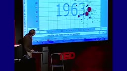
Good-looking slides add power; visually appealing slides can amplify a talk's impact. Hans Rosling was a TED speaker who excelled at this—his dynamic data visualizations made global trends intuitive and easy to understand. Not everyone can be Hans Rosling, but every speaker can ask themselves: Are visual elements necessary to explain my idea? How can I combine them effectively with words?

Even simple slides can steal your thunder. Rather than saying "A black hole is an object so massive that not even light can escape," ask "How black is a black hole?" and then convey the information through your talk. Slides spark curiosity and make your words more engaging. Visual elements should not convey words that are easy to say aloud—they should be used to share what language cannot express.
Photos, videos, animations, or data—the screen can instantly explain what might take hours to describe.
Hans Rosling was a Swedish professor of global health known for the Gapminder data visualization tool, which could transform seemingly dry development statistics from various countries into dynamic bubble charts, letting audiences see with their own eyes the historical changes of more than two hundred countries along the dimensions of income and life expectancy. His talks became TED classics not only because of the data itself, but because he used data animation as a narrative metronome, making visuals and verbal explanation fit together seamlessly. This offers a lesson for speakers: aesthetic appeal is not about pursuing flashy effects, but about making visual form serve the information structure, so that complex content becomes instantly perceptible and memorable.
Practical Guide: From Planning to Presentation
Once you've planned your visual elements, revisit your words and think about how to turn them into a compelling talk. All the lessons are designed to help you deliver a powerful talk—one that inspires, delights, and maybe even changes the world. TED's complete public speaking course guides you step by step through sharing your ideas and delivering a compelling talk.
Visual elements are not decoration—they are an extension of your talk. Use them wisely, and let your ideas reach straight into people's hearts.
One-line Summary
TED wisdom: Visual aids aren't essential—strong visuals need revelation, explanatory power, and aesthetic appeal.
Paragraph Summary
Based on TED's official curriculum, this article explores the principles for using visual aids in talks. It first notes that at least one-third of the most popular TED talks use no slides at all, that slides can distract the audience, and that the rule is "no slides are better than bad slides." It then presents the three core elements of strong visuals: revelation—showing what words cannot describe, such as Edith Witter's giant squid video; explanatory power—words and images complementing each other, with each slide focusing on one core concept and charts highlighting key parts; and aesthetic appeal—illustrated by Hans Rosling's dynamic data visualizations, showing that good-looking slides can amplify a talk's impact. Finally, it emphasizes that visual elements should spark curiosity rather than repeat spoken language, and should be used to share what language cannot express.
Related articles

Non-Coding Dad Builds 3D Earth Toy with Claude Code, Unexpectedly Goes Viral in Classrooms
A non-coding father used Claude Code to build My Earth Toy, a 3D interactive Earth with 830+ landmarks, 470+ animals, and 180+ vehicles—now used in classrooms worldwide. Discover how AI coding lowers the barrier to creation.

Meta, Google, and TikTok Sue California Attorney General: The Battle Over Youth Social Media Law
Meta, Google, and TikTok jointly sue the California Attorney General to block a state law restricting social media use by minors under 16. This article analyzes the lawsuit's background, the law's core provisions, and its potential impact on tech industry regulation.

T-Mobile Parent Company CEO on Musk's Telecom Ambitions: Welcome, But You'll Need $200 Billion
Deutsche Telekom CEO Tim Höettges responds to Musk's SpaceX Starlink Mobile plan, saying "welcome to the party" but questioning feasibility—estimating at least $200 billion needed to become a major U.S. carrier.