CSS Reset Must Include height: auto: Preventing Image Distortion in Responsive Layouts

Adding height: auto to your CSS Reset prevents responsive images from distorting when HTML width/height attributes are set.
Most CSS Resets use max-width: 100% to make images responsive but omit height: auto. When images have HTML width and height attributes (a best practice for preventing CLS), the fixed height value overrides responsive scaling, causing severe distortion on smaller screens. The fix is simple: add height: auto to your Reset so the browser calculates height from the aspect ratio instead.
Most CSS Resets include rules to make images responsive, but nearly everyone misses one critical declaration. This small oversight can cause images to become severely distorted in certain scenarios.
The Common CSS Reset Image Rule
In most CSS Reset approaches, replaced elements like images are typically handled like this:
img, picture, video, canvas, svg {
  max-width: 100%;
  display: block;
}
This code prevents images from overflowing their parent container, achieving a basic responsive effect. In most cases, it works just fine.
The term "Replaced Elements" mentioned here is an important concept in the CSS specification. It refers to elements whose content is not controlled by the CSS visual formatting model — their content is determined by external resources. Typical replaced elements include img, video, iframe, embed, and others. Unlike regular elements, replaced elements have their own intrinsic dimensions, which the browser references when rendering to determine the element's default size. This is why an img tag can display at the image's original dimensions even without any CSS width or height set.

But there's a widely overlooked problem here.
The Root Cause: Conflict Between HTML Width/Height Attributes and CSS
As a web performance best practice, we should explicitly declare width and height attributes on HTML <img> tags:
<img src="photo.jpg" width="800" height="500" alt="Example image">

The benefit is that the browser can reserve the correct amount of space based on the aspect ratio before the image finishes loading, preventing layout shift as the image loads. This is crucial for the CLS (Cumulative Layout Shift) metric in Core Web Vitals.
CLS (Cumulative Layout Shift) is one of Google's three Core Web Vitals metrics, measuring visual stability of a page. When elements on a page shift unexpectedly during loading, layout shift occurs. Images are one of the most common causes of CLS issues: if the browser doesn't know an image's dimensions, it initially renders the image position with zero height, then expands the space once the image loads, causing all content below to suddenly jump down. Google recommends a CLS score below 0.1, with anything above 0.25 considered "poor." When width and height attributes are declared in HTML, modern browsers use these values to calculate an aspect-ratio, reserving the correct space before the image loads.

Fixed Height Breaks Responsive Scaling
Here's where the problem arises. What happens when you use the max-width: 100% CSS rule alongside fixed width and height HTML attributes?
- Width:
max-width: 100%works as expected — the image width scales with the container and doesn't overflow. - Height: Since the CSS Reset doesn't handle height at all, the browser directly uses the fixed height value declared in HTML (e.g., 500px).

This means that when the container width shrinks, the image width shrinks accordingly, but the height stays fixed at 500px. The result is a severely stretched or squished image with a completely broken aspect ratio.
This problem is especially noticeable in responsive layouts — when viewing a page on mobile, images can turn into oddly narrow and tall shapes.
The Browser's Aspect Ratio Calculation Mechanism
To understand the deeper cause of this issue, you need to know how modern browsers calculate aspect ratios. Modern browsers (Chrome 79+, Firefox 71+, Safari 14.1+) introduced an important UA stylesheet rule: when an img element has both HTML width and height attributes, the browser automatically generates an aspect-ratio style for it. For example, width="800" height="500" is internally converted by the browser to aspect-ratio: 800 / 500 (i.e., 16:10). This mechanism was collaboratively implemented by major browser vendors between 2019 and 2020. It allows developers to enjoy both "reserving space to prevent layout shift" and "responsive scaling" — but only if height: auto is set in CSS to override the fixed pixel value from the HTML attributes. Without height: auto, the fixed height value from the HTML attributes is applied as a CSS presentational hint, taking priority over the browser's automatic aspect-ratio behavior.
The Solution: Add a height: auto Declaration
The fix is remarkably simple — just add one line of height: auto to your CSS Reset:
img, picture, video, canvas, svg {
  max-width: 100%;
  display: block;
  height: auto;
}
height: auto tells the browser: ignore the fixed height declared in HTML and automatically calculate the height based on the image's actual aspect ratio and current rendered width.
With this in place:
- The
widthandheightHTML attributes still help the browser reserve space and calculate the aspect ratio - The CSS
max-width: 100%ensures images don't overflow their container - The CSS
height: autoensures height always scales proportionally
All three working together guarantee both performance (no layout shift) and visual correctness (proper responsive scaling).
Practical Recommendations and Checklist
This is a classic case of a "small detail, big impact" CSS technique. I recommend checking your project's CSS Reset or global styles right now:
- If you're using a custom Reset, manually add
height: auto - If you're using a third-party Reset library (such as Normalize.css, Modern CSS Reset, etc.), check whether it already includes this declaration
- Include this as a standard configuration in your team's coding guidelines
Comparison of Popular CSS Reset Approaches
Popular CSS Reset approaches in the community handle this issue differently. Eric Meyer's classic Reset CSS (2011 version) does not include a height: auto declaration. Normalize.css, positioned as a "correction" rather than a "reset," also doesn't address this issue. Josh Comeau's Custom CSS Reset explicitly includes height: auto. Andy Bell's Modern CSS Reset added this declaration in newer versions. Tailwind CSS's Preflight (based on modern-normalize) correctly includes height: auto. When choosing a Reset approach, developers should pay attention to this detail.
This declaration is essentially a safety mechanism — even if your current project hasn't encountered the problem, adding it has zero side effects while preventing potential layout bugs in the future.
Key Takeaways
- Having only
max-width: 100%in your CSS Reset is not enough — it must be paired withheight: autoto achieve truly responsive images - The
widthandheightHTML attributes are critical for performance optimization (preventing CLS) and should not be removed height: autolets the browser automatically calculate height based on the aspect ratio, overriding the fixed value from HTML attributes- These three rules (
max-width: 100%,display: block,height: auto) should be standard configuration in every project's CSS Reset
Related articles
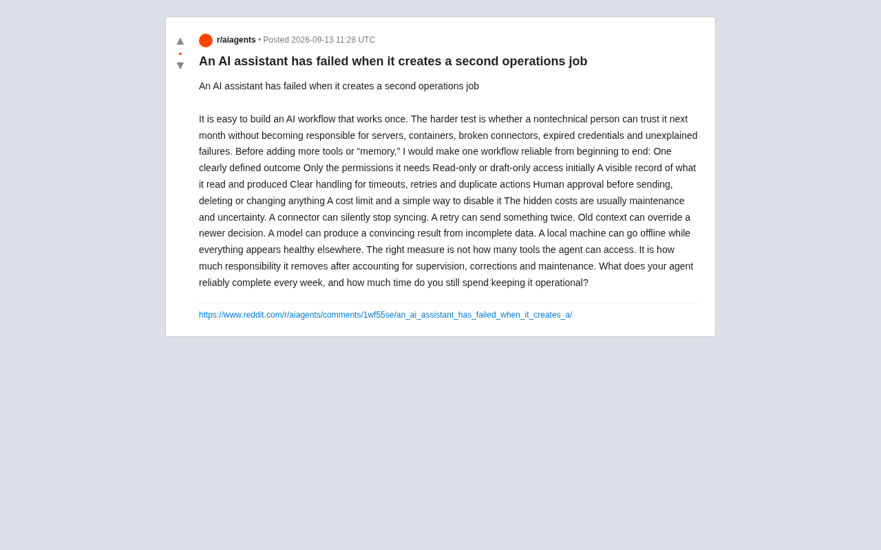
The True Failure of an AI Assistant: When It Creates a Second Operations Job
A Reddit user reframes how to judge AI assistants: they fail when they create a second ops job. Learn how to build end-to-end reliable workflows and measure Agent value by net benefit, not tool count.
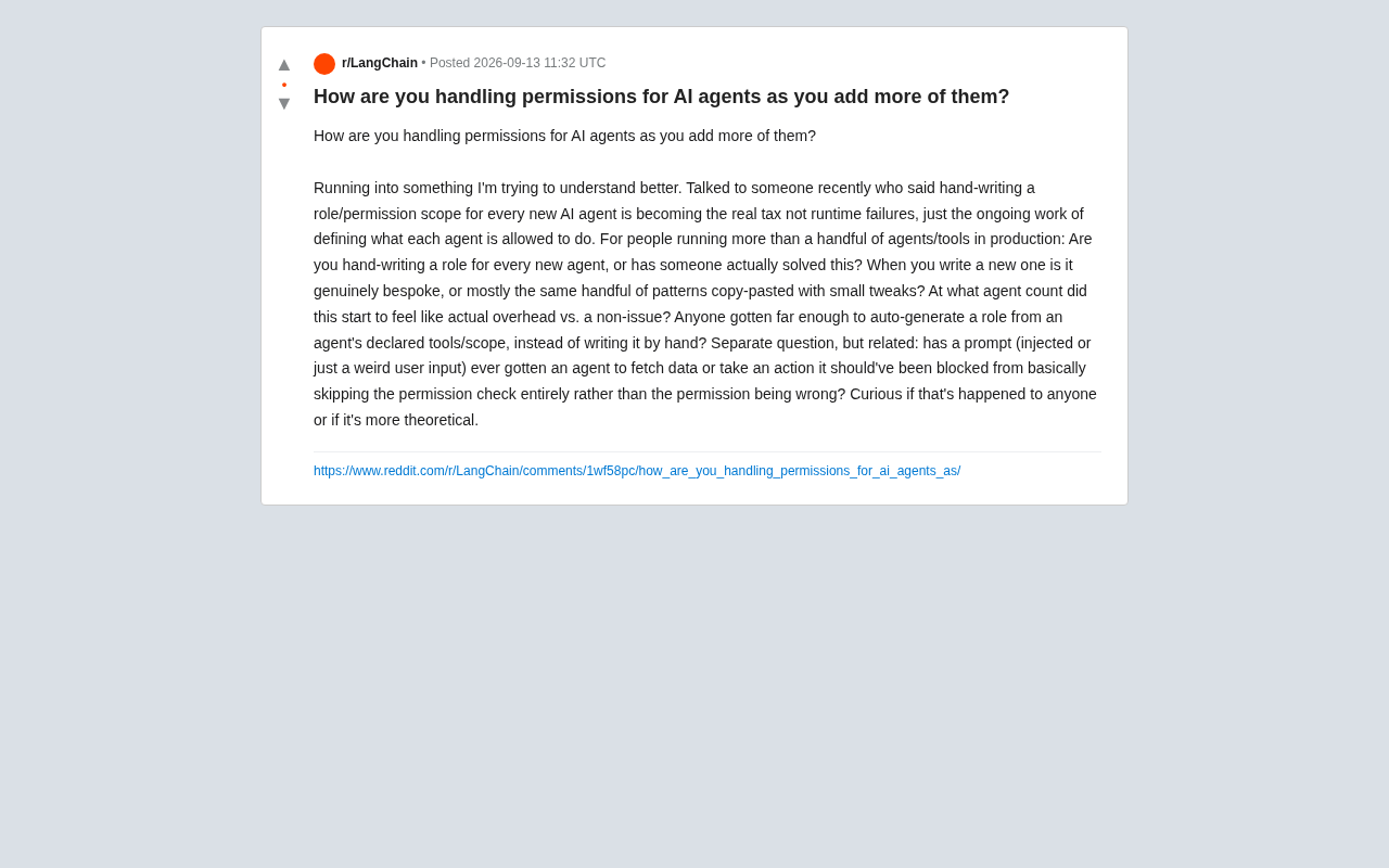
AI Agent Permission Management: Is Writing Roles Manually the New Hidden Tax?
As AI Agent counts grow, manually defining permission roles is becoming a hidden operational burden. This article explores scalability challenges, auto-generated roles, and the security risk of prompt injection bypassing permission checks.
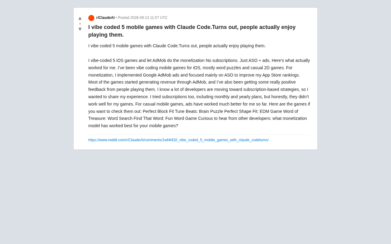
Vibe Coding 5 Mobile Games with Claude Code: Ad Monetization Beats Subscriptions
An indie dev built 5 iOS casual games with Claude Code vibe coding. His verdict: AdMob ads plus ASO optimization outperform subscriptions for casual games.