Why Do All AI-Generated Projects Look the Same? The Aesthetic Homogenization Problem in Vibe Coding
AI-assisted development drives visual uniformity in web projects — and taste is the only thing that can't be outsourced.
A Reddit observation struck a chord: nearly all vibe coding projects share the same purple gradients, dark backgrounds, glassmorphism cards, and centered hero sections — a visual signature now instantly recognizable as "AI-generated." The technical causes are twofold: training data overrepresents recent design trends, converging the model's sense of "good-looking" into a statistical average; and default Tailwind palettes plus component libraries like shadcn/ui create a path of least resistance that fills any vague prompt with identical output. While this templated aesthetic works fine for MVPs, it undermines brand identity at scale. Breaking out doesn't require design expertise — it requires giving AI tighter constraints: specific hex values, named references, and explicit exclusions. The scarce resource in the AI era isn't the ability to build something, but the taste and intention to build something different.
An Observation That Keeps Coming Up
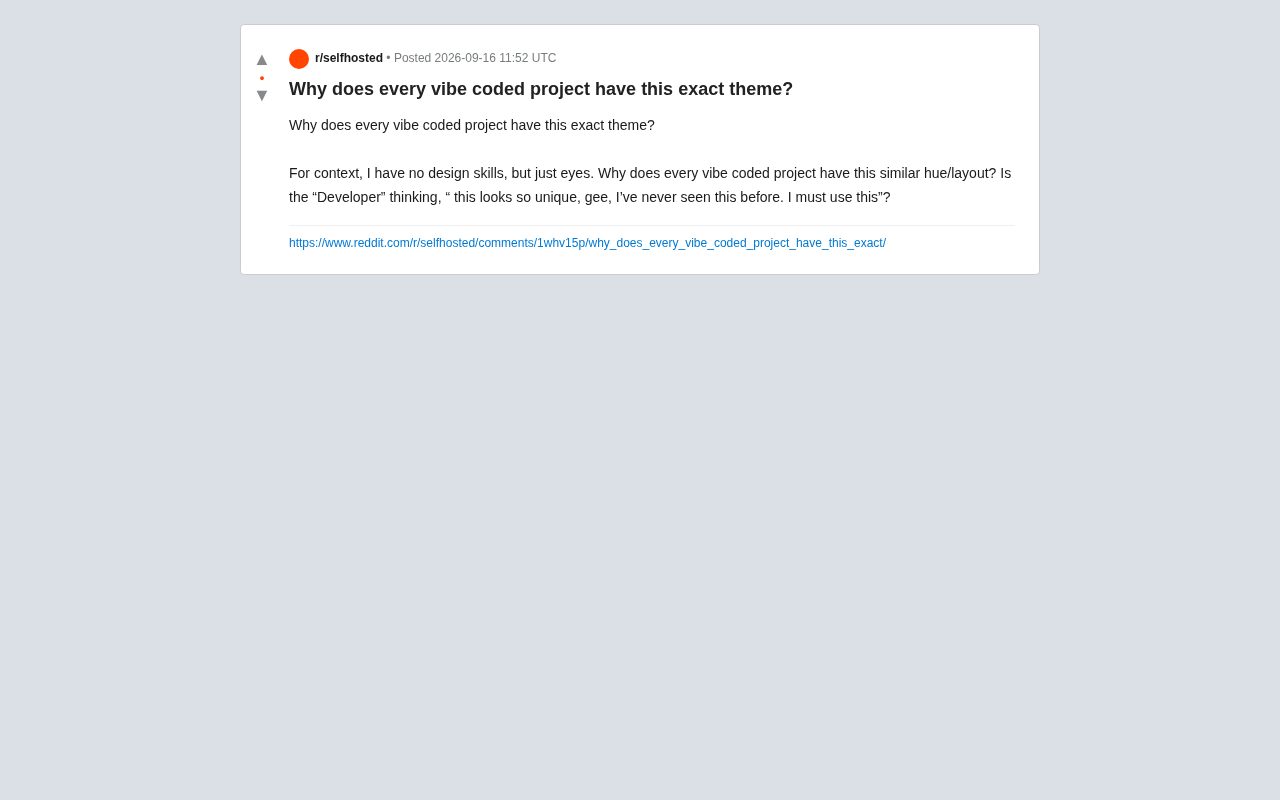
A developer on Reddit — someone with no design background but a sharp eye — asked a question that hit a nerve: why does virtually every project built through vibe coding (quickly assembled with AI assistance, guided by feel) end up with nearly identical color schemes and layouts?
This observation is far from isolated. Anyone who has browsed a large number of AI-assisted web projects recently will recognize that familiar visual language — a kind of uncanny déjà vu: dark gradient backgrounds, purple-to-indigo color transitions, rounded cards, centered hero sections, large sans-serif headlines paired with soft subtext, and a few buttons dressed up with glow effects.
The original poster's sarcasm was sharp: do these developers actually think "this looks so unique — wow, I've never seen this design before, I have to use it"? The reality is the opposite: this aesthetic has become so pervasive it's now a recognizable "AI-generated signature."
The Technical Roots of Homogenization
Training Data Amplifies Preferences
When large language models generate front-end code, they are essentially reproducing the most frequent and "safe" patterns from their training data. When massive amounts of Tailwind CSS tutorials, component library examples, trending Dribbble work, and modern SaaS landing pages flow into a training set, the model's concept of "good-looking" converges toward a statistical average.
Purple gradients, glassmorphism, and dark themes appear so often because they dominated design trends over the past few years and are overrepresented in training data. The model has no aesthetic preference — it's simply outputting whatever answer is most likely to be judged as "reasonable."
Glassmorphism is a visual design style that emerged around 2020, defined by semi-transparent frosted-glass backgrounds, blur effects (
backdrop-filter: blur), subtle border highlights, and soft shadows — simulating the refraction and translucency of real glass. It spread widely following the design language update in Apple's macOS Big Sur, and was quickly adopted as a shorthand for "modern" in countless UI kits and component libraries. Because the effect is especially striking against dark gradient backgrounds, it formed a nearly fixed pairing with blue-purple color schemes, making it a heavily repeated visual pattern in training data. This explains why AI-generated interfaces feature this style far more than any other — it happened to be at the peak of its popularity during the window in which models were "seeing" it.
The Inertia of Defaults
The defining characteristic of vibe coding is that the developer surrenders precise control over details, delegating the "make it look good" decision to the AI. When the prompt is simply "make a modern, clean landing page," the model unhesitatingly fills in whatever combination it considers most reliable. Tailwind's default color palette and the default styles of popular component libraries like shadcn/ui further entrench this convergence.
In other words, homogenization isn't a bug — it's the inevitable result of the path of least resistance. When everyone uses the same tools, the same prompts, and the same defaults, uniform output is only a matter of time.
shadcn/ui is a React component collection that went viral in 2023. What makes it unusual is that it doesn't distribute as a traditional npm package — instead, it copies component source code directly into the user's project. It uses Radix UI for accessible interaction logic and relies entirely on Tailwind CSS for styling. Because of its high-quality documentation and deep integration with the Next.js ecosystem, a huge number of tutorials and open-source projects adopted it as their starting point, giving it an outsized weight in AI training data. When a developer asks in natural language to "build a login page," the model will often default to shadcn/ui's
Card,Button, andInputcomponents — outputting their preset border-radius values, spacing ratios, and font-weight choices along with them, further narrowing the range of visual output.
Is This a Problem, or Does It Not Matter?
The Trade-off Between Efficiency and Differentiation
For many projects aimed at quickly validating an idea, this templated aesthetic is genuinely good enough. It's professional, modern, and unlikely to offend — capable of taking a prototype from zero to "looks like something real" in minutes. For MVPs, internal tools, and weekend projects, visual uniqueness is rarely the top priority.
But when all products look the same, a problem emerges: brands can't build recognition, users develop aesthetic fatigue, and the "AI-generated feel" itself begins to signal something cheap and careless. It's like the early days when every website used Bootstrap's default styles — that "obviously off-the-shelf" quality erodes a product's credibility.
How to Break Out of the Template
Escaping homogenization doesn't require professional design skills. The key is giving the AI more specific constraints. Instead of saying "make a modern interface," specify exact brand colors, font pairings, layout references, or explicitly ask to avoid purple gradients and glassmorphism. Providing a real design reference — say, a product whose aesthetic you admire — is enough to immediately push the output away from the default mean.
Going further, bring design decisions back under human judgment. Even just manually adjusting colors, swapping fonts, or rearranging the layout is enough to shed that assembly-line quality. AI is good at generating "average" — and differentiation comes precisely from intentional deviation from the average.
At the prompt engineering level, there are several proven techniques for meaningfully increasing visual variety. First, provide hex color values instead of color names — use
#E8DCC8paired with#2C1810rather than "warm tones." Second, reference specific design systems by name, such as "follow Linear's minimalist style" or "mimic Stripe's high-density information layout." Third, define explicit exclusions: "no gradients, no cards with border-radius above 8px." Negative constraints are sometimes more effective than positive descriptions, because they directly compress the model's output distribution. Additionally, swapping the default Inter or system font for something with a strong personality — like Fraunces or Space Grotesk — is often the single lowest-cost change that most dramatically shifts a project's overall character.
A Metaphor About Tools and Taste
On the surface, this debate is about complaining about color palettes and layouts. But at a deeper level, it touches on a fundamental tension in AI-assisted creation: tools have dramatically lowered the barriers to production, but they've also pulled output toward the same statistical center. When the marginal cost of creating approaches zero, what becomes scarce isn't the ability to make something — it's the ability to make something different.
For developers, this is a reminder: AI can write your code, but taste, judgment, and the willingness to differentiate are parts that can't be outsourced. In the age of vibe coding, the truly scarce resource may be exactly what the original poster had: a pair of eyes sharp enough to notice that every project looks the same.
Related articles
AI Agent Learning Roadmap: A Four-Stage Guide for Complete Beginners
A four-stage AI Agent learning roadmap for beginners: from core concepts and model deployment to RAG, LangChain, LoRA, and interview-ready projects.
Free Access to Mystery Model & DeepSeek V4 via Cline: Complete Setup Tutorial
Learn how to use DeepSeek V4 and the mystery "Niumai" model for free on Cline — covering IDE extension and CLI installation, account setup, and model selection.
Cline + VS Code in Practice: Generate a To-Do App from a Single Prompt
Cline is an autonomous coding agent inside VS Code. This hands-on guide shows how to generate a to-do app from one prompt and compares Claude, Ollama, and Groq integrations.